Download
1 / 2
20 likes | 205 Views
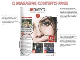
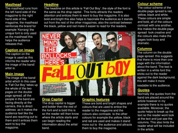
NME magazine double page spread analysis. The colour scheme consists of mainly baby pink, bright pink, white and black. These colours infer the feminine and fun qualities of the artist, whilst the black also connoted edginess. Typically, these colours would also appeal to a young female audience.

E N D
The colour scheme consists of mainly baby pink, bright pink, white and black. These colours infer the feminine and fun qualities of the artist, whilst the black also connoted edginess. Typically, these colours would also appeal to a young female audience. The title is placed to the left of the image, with a part of it hidden which infers that she is recognisable by just her surname. Part of the title is in a more posh, curly font which is unconventional for the genre of music she produces. Her name is in big, bold lettering which makes a statement as it is salient. It is also the biggest font on the page which indicates that she is being perceived as very important. The colours of the title represent the two sides of her: feminine yet edgy. The main image is of the music artist and takes up the majority of the page, separating the interview in half. Her make up and outfit are both very striking and clash with the background, making her stand out even more. Her facial expression and body position matches her quirky outfit, combined with her staring directly at the audience resulting in a very salient image. The body of text is in a smaller font to not overcrowd the page or take away from the main image. The interview is arranged in a simple question and answer format to make it more coherent and easy to read. The change in colour and font also helps to distinguish between the question and the answer. Pull quotes from the interview are in a larger font and also highlighted by a contrasting colour which easily grabs the readers’ attention. This makes them want to read the full interview, whilst also giving the gist of what the interview is about. The unique image and overly pink colour scheme also gives a clue to the tone of the interview before you even read it. The indented ‘W’ adds some diversity to the page as it is an interesting and different way to start the article.