Download
1 / 12
130 likes | 313 Views
Double Page Spread Analysis. Double Page spreads hold the main stories of the magazine. These are some of the double page spreads that I have analysed. Colour.

E N D
Double Page spreads hold the main stories of the magazine. These are some of the double page spreads that I have analysed.
Colour • The colour of the magazine is based upon the background image and nothing else. The colour shows that the setting of the image is based at a sort of night of night club as there are dark patches within and the lighting suggests this also. • The lighter areas of the image are on the people having a “good time” and shows the emotions of the people to be positive and joyful.
Text • The text of the double page spread is not very long, but this does not matter as the main part of the DP spread is the image. • The text font has a white based colour which stands out from the background’s darker tone colours. The main heading of the text is in big bold text to capture the eye and too show the reader what the page article is about. • The article text is down in an italic based handwritten font that makes the page have a sense of professionalism within it.
Layout • The layout of the DP spread is set pout to make the image take up the majority of the page as that is the main eye catcher of the pages, as it has the main article within it. The text of the page is the minority of the page as the viewers attention would be more towards the image itself.
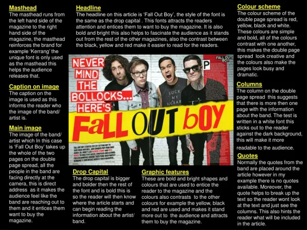
Colour • The colours of this DP spread are used with each other to make everything stand out from each other. • The colours of black and white show the gothic side of the main image which it does present with the stereotypical long lack fringe hair style that gothic characters present. • The red shows the slight hints of danger and rebellion. Rebellion is also something that a stereotypical gothic character shows.
Text • The text of the DP Spread (especially the headings of the articles) have the graphic of a ran down affect with the dimming of colours on the white of “THE BEST MRC”. This is also a different colour due to the fact that it is more of a priority than the other headings that are in the DP spread. Also at the beginning of the article, the starting letter of “M” is bigger than the text to show where it starts.
Layout • The layout is similar to the previous magazine in the sense that the main image dominates the majority of the pages. But there is a lot more text and a much more detailed article and has more pictures and features within it . It has the main image not being dominated by text and other images as it is the main image of the DP spread.
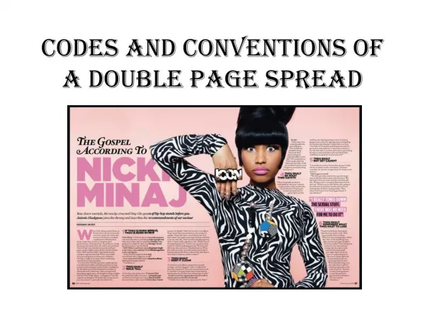
Colour • The colours of the DP spread are very simple but use the same colour set as the previous DP Spread. Except that the main colour of this one I white therefor making the black the standing out text colour. The colour of the red this time is to show the priority of the red box that is in the bottom left hand corner, showing information on the band of “Linkin Park” and their recent activity. • The article itself is place within the bottom of the page to avoid the interruption with the main image.
Text • The text of the Pages show the sizes priorities the text. The biggest font size is the title whilst the smallest font size and then the main article is the smallest as hat contains the most amount of information and is not the main eye catcher of the DP Spread.
Layout • The layout of the DP Spread, again, puts the text in the position that does not invade the view of the main image which is the dominator of both pages. The main article is tucked away in the corner of the page so there is no interference with the main image. Apart from the lower body of the models, but they do not hold the expressions and do not hold the faces of the band members.
Similarities • They are all laid out in a way puts all text not in the way of the m ain image. • All min Headings are bigger that the articles themselves. • They all have just one article within them which is the main article.