Download
1 / 11
110 likes | 214 Views
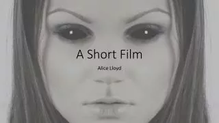
Q2) How effective is the combination of your main product and ancillary texts?. Laura Cusick. Research.

E N D
Q2) How effective is the combination of your main product and ancillary texts? Laura Cusick
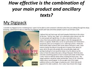
Research • I researched different conventions of a horror/thriller genre and the most common forms and conventions which gave me a starting point in terms of brain storming and forming ideas for our film. • For my poster, I looked at posters of other thriller films and tried to replicate the colour scheme and composition whilst ensuring that it linked to our films theme and style. • In terms of the magazine article, I just wanted to keep the black and white theme continuous throughout everything to do with my film.
Narrative We wanted to create a film that the audience had to become active in and think about what was going on and in a sense make the links themselves into the past and present sections that we have created. We created a film that focused on jealousy as we feel that is a relatable topic and emotion. We then portrayed the idea that this ex girlfriend is so jealous of her ex and his new bride that she’s out for revenge. However we wanted to play the film backwards so that the actual action of murder isn’t discovered until the end – therefore making the audience feel sorry for this character at the beginning.
Film - Colour - We used both black and white and colour sections in our film as we felt that this would make a clear distinction between the past and present. We also thought this would make our film more original and exciting for the audience. This also meant that during the black and white main sections of the film, the focus would be entirely on the characters, rather than the locations. - Another key aspect of why we decided to film in black and white was because we wanted to match the genre of the 1900s and give our film an old fashioned feel.
Film - Sound We used one main song ( ) that ran throughout our film, it started off slowly with piano and picked up as the action progressed. The music then had a climax during our church scene and the main point of action, before slowly fading out again into piano. This was a really effective piece of music to have because it wasn’t noticeable, it fit in with our film perfectly and was able to tell the story. We discussed having a different piece of music over the flashback scenes – a more floaty sound – because it would of helped more with the distinction and would of made the film more exciting. We attempted to do this but found it difficult to get the two pieces of music to flow together.
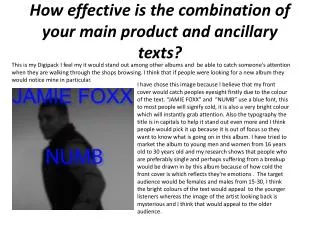
Poster – Text and Font I used a simplistic font for both pieces of text so that they would match each other. I included a biblical quote to tie in with the idea of marriage and religion and to give a hint to the audience about what our movie is all about.I decided to place it over the models mouth as she is the victim in the movie and has no say about anything that is occurring between her husband and his ex girlfriend. The text at the bottom is a bigger font and simply states the actors and directors of our film. I also felt that it was important to include a quote from a reliable source like ‘The times’ as most film posters do. I placed it at the bottom so that it didn’t over crowd the poster of take away from the main picture.
Article – Text and Fonts My title was in a larger and bold font to ensure that it stood out and was the only different font I used. My text was set up into two columns with smaller paragraphs within them. I also linked the standard text from my poster at the top and bottom of my article. And added page numbers to make it a real magazine article. I added a quote over the picture totie in the second page of writing and connect the pages together.
Poster - Colours Much like my film, I wanted to create a black and white and a colour mix in my poster. The main photograph is in black and white along with the text – a larger proportion, much like the film. Whilst I added a glair of colour to the top corners of the poster. I felt that this better linked the film and the poster together, and also replicated the idea of a stain glass window in a church.
Article - Colours I kept the magazine article very simplistic in terms of colour as I wanted to keep the theme of black and white, whilst making the article look professional and realistic. I did think about having the picture in colour but thought it looked better as a connected piece to have the colour scheme the same.
The combination I feel that the combination between these three pieces is very strong – I like that the theme of black and white has run throughout and links them all together. I have used simplistic text on both my poster and my article and have also added a burst of colour where appropriate, in my film and poster. I also like that all three of them contain a different character as it gives each piece a unique style.
Changes… If I had to change something about this project I would change certain bits of the film, however there wasn’t enough time for this. I feel that the running scenes with the main character (Kate) could have been more exciting and considering it was backwards, there was a lot more filming wise that could have made the film stronger. One idea would be to have the main character rip up a picture of herself and Edward (Tam) to stronger relate the characters and to show that they were once in love. I think that would have been very visually interesting backwards. We also felt that the church scene was the main focus and main source of action to the film, that all the build up had come to, therefore we would of made this scene longer and more dramatic – however I am pleased with the scene as it is currently because of certain artistic elements, like the point of view shots of the knife before and after the murder.