Download
1 / 7
70 likes | 138 Views
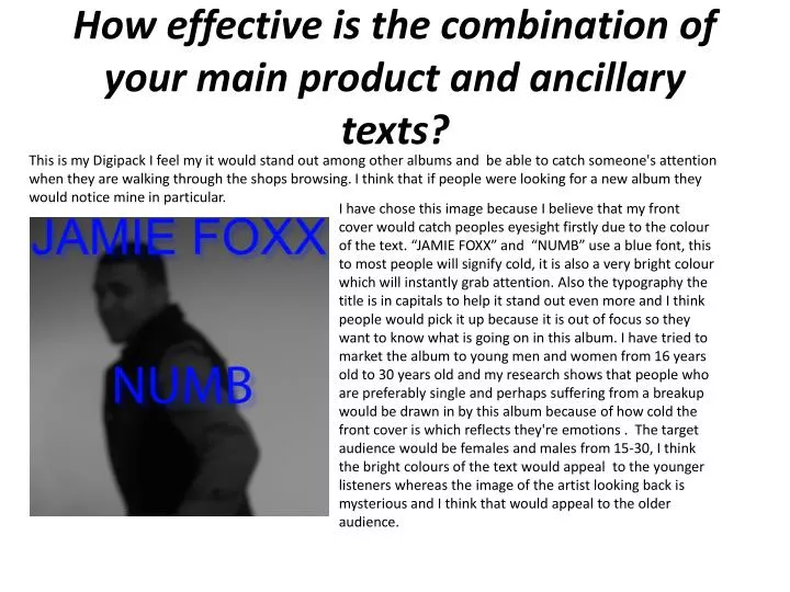
This is my Digipack I feel my it would stand out among other albums and be able to catch someone's attention when they are walking through the shops browsing. I think that if people were looking for a new album they would notice mine in particular.

E N D
This is my Digipack I feel my it would stand out among other albums and be able to catch someone's attention when they are walking through the shops browsing. I think that if people were looking for a new album they would notice mine in particular. How effective is the combination of your main product and ancillary texts? I have chose this image because I believe that my front cover would catch peoples eyesight firstly due to the colour of the text. “JAMIE FOXX” and “NUMB” use a blue font, this to most people will signify cold, it is also a very bright colour which will instantly grab attention. Also the typography the title is in capitals to help it stand out even more and I think people would pick it up because it is out of focus so they want to know what is going on in this album. I have tried to market the album to young men and women from 16 years old to 30 years old and my research shows that people who are preferably single and perhaps suffering from a breakup would be drawn in by this album because of how cold the front cover is which reflects they're emotions . The target audience would be females and males from 15-30, I think the bright colours of the text would appeal to the younger listeners whereas the image of the artist looking back is mysterious and I think that would appeal to the older audience.
My Digipack I think my back cover could have been improved in terms of typography as I feel the font could have been better but I have made it large enough for the person to read it Although I think the CD cover would be an affective marketing tool as the artist takes up most of the cover which is eye catching and even more eyes catching is that you might look at the picture before the text and wonder who it is. The consumer will look at the back to learn what songs are on the album. The artist is wearing a designer jacket with a shiny watch with diamonds in it and portrays a real celebrity, in society many people idealise celebrities therefore the better he looks in the pictures the more likely a member of the public is to pick up the CD . I think the colour of the writing is good as it matches the theme of the cd and is easily visible against the background. I chose this image as it is bold, the artist looks like a real star, and the spacing made it perfect as the artist was on the right side leaving space for the song. I think the image is connects with the consumer as it points at them and appears to be looking straight at you almost to say that he is making a connection with the consumer.
My magazine advertisement I felt my magazine advertisement was effective as I think it would really stand out next to an article as it is black and white so instantly it would catch there eye and the image is out of focus so you would wonder who it was. After noticing the image the consumer would look to the bright blue titles in the article and know who the artist is. As well as what the album is called and when it will be released. I’ve made it the same image on the front cover of the cd in order to imprint it on the brain so even if the person sees it out the corner of they're eye they will remember who’s album it is. As the picture is blurry the reader will try stare and try and identify what is in the photo meaning they will stare at it for a while. The facial expression on the artists face is sad but almost as if there is still hope and looking back almost to check if someone is there. I feel I have used space effectively in order to catch the persons eye as if it was a little image the reader might not notice it. I believe the advertisement is an effective marketing tool as it is big and bright in which I feel would make the consumer want to read and maybe buy the album.
My Digipack This is one of two inserts that I have created to go inside the CD case. I chose the image as the artist is staring with a serious face almost staring into the consumers eye . His facial expression is annoyed but almost upset looking. This sort of image is keeping in line with the theme of the music video which is an emotional song. I used the heart breaking to symbolise heartbreak the artist has gone through, I then used the blue lines to show my heart is open and I’m expressing it in my songs. I believe this insert would work as an effective marketing tool due the to the bright colours and . The main reason I chose the image is due to the pose it was fitting with the mood of the album as it is cold.
My Digipack This the second insert that will go inside the CD case. This mirrors the other part of the album cover as it’s like a flow of his feelings and conciesnous
My inspiration form my digipack • This is the inspiration for my cd cover, I felt it had the same them as my album as he is heart broken. You can see he used the lines to show he’s expressing his feelings.
Brand Identity I believe that this album cover also shows a resemblance to mine as it uses the artist on the cover with a distorted face to give a feel of distancing or emotion. Ihave constructed a brand identity for my artist which is the same about most r&b artists , especially those like drake or miguel. I purposely chose this image as the artists body was facing away but his face was looking back almost as if he was going to say something. I think this helps create my artist his own identity as a cold, mysterious character. I want the consumer to use the music to gather the information about the artist so I made the cover mysterious in order to get them to listen instead of just making an assumption based on the photo.