Download
1 / 12
120 likes | 236 Views
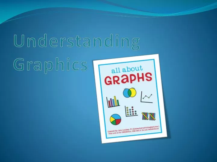
Understanding Graphics. Line Graphs:. Is used to show how one variable changes with respect to another variable. Contains two parts: an x-axis going (horizontally), and a y-axis , going (vertically). Bar Graphs:.

E N D
Line Graphs: Is used to show how one variable changes with respect to another variable. Contains two parts: an x-axis going (horizontally), and a y-axis, going (vertically)
Bar Graphs: • Contains an x-axis going (horizontally) and a y-axis going (vertically) • The main variable is given on the y-axis and from each main variable, a bar extends horizontally across the graph. • Values for the changing variable are on the x-axis. Y-Axis Y-Axis X- Axis
Column Graph: • Similar to a bar graph, except that the main variablesappear on the x-axis, and the horizontal bars are replaced by vertical columns.
Pie Charts: Takes its name from its shape. It is circular and divided into wedges, like a pie, that represent the percentages of the whole. Each part is given as a percentage or part of 100.
A table consists of information arranged in rows & columns with headings identifying the information. To read a table, simply locate a heading for the variable that is of interest and run your finger down and across or across and up. Tables:
Illustration • Any kind of drawing, painting, sketch or other artwork that accompanies, enhances, and or provides information about written material. • Often have captions, special text accompanying and explaining them.
Diagram Is an illustration that shows the parts of something. Usually has labels that identifies the parts.
Plots: A plot is an illustration that shows the physical layout of something. Common types of plots include floor plans and blueprints.
Maps: • Are scale drawings that show the relative size and locations of physical feature such as oceans, rivers, forests, mountain ranges, islands, and highways, as well as the locations and relative sizes of cities, states and countries. • Often contain legends or keys that show the relative size, or scale of the map. • May contain special icons, little symbols that indicate such features as cities, recreation areas, or monuments.
Analyzing Info graphics: • Read the title of the graphic to make sure that you understand what the graphic represents. • If the graphic has a caption, study this caption for further information about the graphic. • Locate the main variables or headings on the graphic. • If the graphic has a legend or key, study it to make sure that you can locate the important parts of the graphic. • If the graphic is a diagram, look for labels that identify its parts. • Study the graphic for interesting or important relationships among the headings or variable. Look for relationships such as greater than, smaller than, equal to, percentage of, part of and so on. • For line graphs, trace with your finger a line from the main variable axis to the line. At the point where your fingers crosses the line on the graph, trace a straight line to the axis that gives the value for the other variable • For bar graphs and column graphs, trace with your finger a line from the end of the bar from the main variable to the axis that gives the value for the other variable.
For pie charts, determine weather the amounts shown on the graph for each variable are given in percentages, in ordinary numbers, or simply as wedges showing relative size. Determine how the wedge for each variable relates to the whole represented by the pie. • For tables, read the table by tracing with your finger imaginary lines from the heading above the column and to the left of the rows. The values appear at the intersection of these imaginary lines.