Download
1 / 7
70 likes | 182 Views
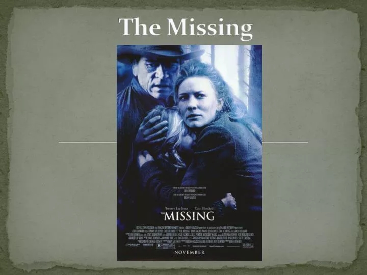
The Missing . An Overview of the film. A 19 th Century Thriller takes place in New Mexico. A father comes home attempting to reconcile with his Daughter Maggie. Unfortunately Maggie’s daughter is kidnapped. Maggie and her father work together to bring back her little daughter. .

E N D
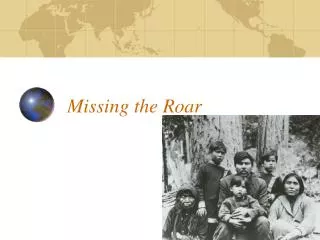
An Overview of the film A 19th Century Thriller takes place in New Mexico. A father comes home attempting to reconcile with his Daughter Maggie. Unfortunately Maggie’s daughter is kidnapped. Maggie and her father work together to bring back her little daughter.
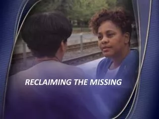
The Main Feature Like all posters which we have established so far, the missing posters main feature is the large image. However, contradicting the common conventions the main image consisted within the poster instead of consisting of one main character, includes three characters. Through a medium close up, the greyscale image shown is portrayed almost as if it has been illustratively drawn. Within the medium close up, the characters convey some emotions of their faces. From fact that the woman, who we assume is the mother, is holding her young girl tightly we are able to insinuate they are fearful of something. Although a lot of the male figure in the back is not as established, we are able to interpret the conventional stereotypical roles consisted within the characters, which are carried out in day to day life. For example the representation of the mother is typically shown as protective and caring over her child, where as the male comes across as dominant and strong. The representation is commonly seen as positive and together within the image represents unity. Mainly through the use of the greyscaleimage we are able to establish a key lighting, as the image especially within the top right hand corner consists of a bright light. On the other hand the use of lighting has shadowed half of the male characters face, and therefore from this specific feature we may be able to insinuate that he has something to hide. This creates the feeling of mystery. Furthermore, through the use of clothing which the characters are wearing we are able to establish the use of western culture. This is especially emphasised through the male’s hat. The overall image is portrayed as positive, however, some representation of unity and vulnerability through the idea of them hiding together is portrayed within the image. The gloomy greyscale overall look of the poster allows foreshadows the ‘thriller’ genre, and creates the idea of suspense and mystery allowing the audience to feel curious and wait in anticipation.
The Text The text presented on the film poster has been presented in very simplistic font, colour combination and text sizes in order to establish different purposes to each text. The most distinctive and acknowledgeable text we establish is the large, simplistic title ‘The Missing’, which is currently located at the bottom centre. The text as we are able to see uses contrasting colours of black and white, which enables the title portrayed in a white font to become more established. Cleverly, it is also important to acknowledge the use of the word ‘the’ written in the title in a very small font compared to the word ‘missing’. From this we are then able to insinuate that the word ‘the’ is obviously not as important as the lexis ‘missing’ for the audience to engage with. Above the title, are much smaller sized texts which establish the names of actors and actresses, as well as film endorsements. These pieces of information have been presented in a darker white colour, simplistic font. The use of the colour scheme chosen, allows the text to be acknowledge, however, doesn’t come across as striking as the title of the film, but works well with the colours conveyed within the large image, allowing the large title to be the most striking text. The billing block as we have always come across within a film poster is conventionally placed at the centre bottom of the page. This has been shown through the same darker white as the endorsements and names of actors/actresses had been portrayed in. The size of the text has also been presented in a readable sized text. Specific words, for example the production company name, or the producers name have been written in larger sized fonts in uppercase. This may have been done in order to make the audience aware of the production of film so that it can gain recognition for future films produced. Additionally, the fact that the production and distribution had been carried out by Revolution Studios and Imagine Entertainment shows that they had a low budget to produce this film. The logos of these film institutions have also been conveyed below the billing block. Lastly, at the very bottom, below the billing block the month of which the film is being released has been portrayed in an uppercase, bold and simplistic font. The choice of presenting this text in uppercase, may be to grab the attention of enthusiastic fans. The choice of colour combination of black and white, allows this significant piece of text to really stand out as an eye catching feature.
Other Features Within the film poster also includes a various range of logos. These logos as we have also establish within previous film posters, represent logos of the films distribution and production companies. As we have also been informed within the billing block that Revolution Studios as well as Imagine Entertainment carried out the production of the film. The logos of these companies have been incorporated to support this idea. Moreover other conventional logos to do with the production of film have also been incorporated. It is essential to acknowledge that Revolution Studios is formally in partnership with Sony Picture, a large conglomerate. Moreover, Imagine Entertainment a film and TV production company is also associated with Universal Pictures. Therefore through the background knowledge of these production and distribution companies, we are able insinuate that there had been a high budget when producing this film. From this vital information the audience are able to relate to this information and produce an opinion about the film overall.
The Background The background of this current film poster is not as significantly distinguished, as a large medium close up of the three characters is conveyed through the majority of the distinctive area of the poster. This therefore portrays the image is an iconic feature of the page, which may havebeen incorporated to gain the attention of the target audience. However, within the top right hand corner, a small section of the background is visible through within the greyscale image. From what is being conveyed, we are able to establish the characters are within the woods. Through the effects, not much of the woods is portrayed, however we are still able to make this interpretation through the iconic feature of the trees. The inclusion of this small section of the background foreshadows where the film may be located. Moreover, the use of mystery and tension is added as this gloomy image created leaves the demographics waiting in anticipation.
The Unique Selling Point There are many unique features about ‘The Missing’ film poster, these features; although they may contradict the common conventions it allows the poster to gain eye catching characteristics which grab the audience’s attention. Firstly the use of the large image consists of a medium close up of the three main characters. Through the use of this type of camera shot, as we have already established portrays clear, visual emotions and feelings which the characters may be feeling, therefore also producing an insight of the type of emotions faced within the film. The use of the greyscale image, and the special illustrated effect added allows the image to create a feeling of mystery and suspense which, therefore allows the audience to engage with the unique style of image. Moreover, unlike previous film posters which we have come across, this current film poster includes the names of names of actors and actresses within the film, as well as film endorsements. The use of this strategy, can allow the audience to really engage with the poster, and become persuaded to watching the film as hype is created. Overall, a clear distinctive idea of the genre of the film has also been incorporated through the gloomy greyscale image and the emotions established within the characters facial expressions. Additionally, other features such as the large image, film taglines and the inclusion of names of actors and actresses are also included and can make the film poster really become acknowledged.