Download
1 / 15
160 likes | 174 Views
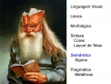
PowerPoint 101. CS 1308 Computer Literacy and the Internet. PowerPoint Considered Harmful. One of Dijkstra’s last e-mails Why did he feel this way?. What this is?. A quick overview of some things I’ve learned about PowerPoint and using overhead projectors. Typefaces. Sans Serif Typefaces

E N D
PowerPoint 101 CS 1308 Computer Literacy and the Internet
PowerPoint Considered Harmful • One of Dijkstra’s last e-mails • Why did he feel this way?
What this is? • A quick overview of some things I’ve learned about PowerPoint and using overhead projectors
Typefaces • Sans Serif Typefaces • Are often more legible • Can be used for page titles and headings • This typeface is “Tahoma” • Serif Typefaces • Often used for long passages of text because it is considered “more readable.” • This typeface is “Times New Roman”
Type Styles • Some possibilities • Italics for special terms • Bold for titles and headings • ALL CAPS (NOT USED VERY OFTEN ANYMORE) • Underlining looks a lot like a hyperlink • Normal weight text is usually called Roman • Avoid overusing special types or too many different types on one page.
Point Sizes (44 point) • The size of characters is measured in points. • 1 point is approximately 1/72 inch (24 point) • Printed text is usually between 9 and 12 points. (This is 12 point). • PowerPoint text must be much larger. (This is 28 point text.) • Note that not all typefaces are exactly the same size at the same point size. • Make sure the print is large enough! • Be especially careful with code, IDEs and doc cameras.
Backgrounds • Keep it simple • PowerPoint (and third party vendors) offer an almost unlimited number of templates and you can create your own. • Make sure you have good contrast between the text and the background.
Page Layout • The most common layout is a header with a bulleted list. • Keep down the text density. • Only use numbers if they are significant. • Too much text will tempt you to just read the text to try and get the point across and then it looks like you’re just reading the text and students hate that. Keep the amount of text to a minimum.
Don’t get crazy • With the transitions • And special effects • I like this one • And exits
Colors • Make sure that the colors you use are consistent and mean something. • For example, my using a color here makes no sense.
Pictures • Cute clip art is out.
Tips • Keep the number of slides to a minimum and expand on each point. • Use the PowerPoint presentation as a guide. • My personal opinion is to not use the “strip tease” method on slides. Makes the audience feel like they can’t keep up.
I don’t like this • When • They just • Show me a little • Bit at a time
I like this better • When • They just • Show me a little • Bit at a time