Download
1 / 23
230 likes | 234 Views
exploring enron – visualizing anlp results (an aanlp project) Jeffrey Heer – jheer@cs.berkeley.edu. the problem. ANLP technologies are highly valuable but often less than usable and reliable…

E N D
exploring enron – visualizing anlp results (an aanlp project) Jeffrey Heer – jheer@cs.berkeley.edu
the problem • ANLP technologies are highly valuable but often less than usable and reliable… • Can be hard to make sense of results… how to go from reams of textual output to new knowledge and insight? • Completely automated processing can be dangerous! Can be wrong or obscure patterns, especially when trusted training data is not available.
one possible solution • Turn ANLP technologies into tools usable within exploratory data environments • Enable users to directly visualize and analyze the results of processing, always providing access to the underlying source data. • Users can then use these tools to further analysis, while simultaneously making their own decisions of the quality of processing results and possibly even correcting algorithms as they go.
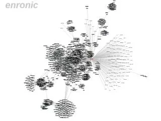
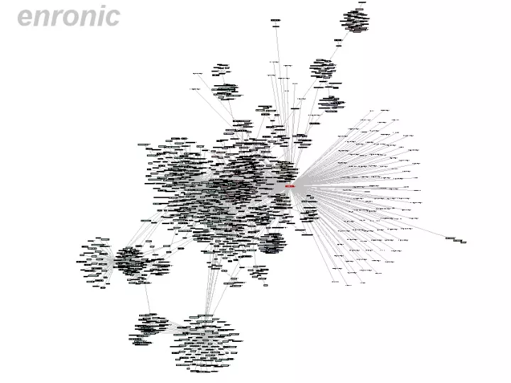
visualize inferred social network view message traffic and actual e-mail text
visualize clustering results – color coded to enron business e-mails pie charts indicate categorizations of e-mail traffic
filter, zoom, details on demand! view all messages to or from a given person…
networks form various communities … some obvious, some not can we process the inferred network to automatically identify communties at various granularities? attempt social network analysis using a hierarchical agglomerative clustering approach, greedily combining groups into communities based on a criterion function that compares within-community edges against total connectivity.
show results of community analysis at various stages of progress… allowing interactive exploration of the agglomerative cluster tree
analysis scenario • filtered graph to isolate “power players” • looked for “california” color labels on edges • found John Shelk reporting on congressional meetings to Tim Belden – all one way e-mails • looking at Time Belden revealed ALL one-way e-mails sent to him, no responses, etc • seemed a bit suspicious… where is that info going?
Analysis scenario All one way e-mails to Tim Belden about various legal issues…
future work a plenty • improved colors, filtering, and brushing • category filtering, brushing from e-mails to graph • histogram visualization over sliders • visualize network of messages themselves? • temporal dimension of data • time-selection range slider • animate evolution of the network • search search search • tie to additional analyses • automated clustering • finer social network analysis • duplicate identification, acronym resolution, etc…
please send me any ideas you have to improve this!!! jheer@cs.berkeley.edu