Download
1 / 55
570 likes | 755 Views
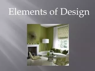
Design Elements. Chapter 3. Basic Design Elements. C ontrast R epetition A lignment P roximity. Contrast. Definition: Degree of noticeable differences in something Application: Color Alignment Typography (font/typestyle) Size Shape. Color Contrast. A simple logo with no contrast:.

E N D
Design Elements Chapter 3
Basic Design Elements • Contrast • Repetition • Alignment • Proximity
Contrast • Definition: • Degree of noticeable differences in something • Application: • Color • Alignment • Typography (font/typestyle) • Size • Shape
Color Contrast • A simple logo with no contrast: AcmeTechnologies
Color Contrast • Same simple logo with color contrast: AcmeTechnologies
Color Contrast • A little color goes a long way: AcmeTechnologies AcmeTechnologies
Alignment Contrast • Centering AcmeTechnologies Technology for the rest of us 123 Oak Street Jackson, KY 41339 Phone: 606-666-1234 Fax: 606-666-3456
Alignment Contrast • Contrast: AcmeTechnologies Technology for the rest of us 123 Oak Street Phone: 606-666-1234 Jackson, KY 41339 Fax: 606-666-3456
Alignment Contrast • A change in alignment goes a long way: AcmeTechnologies Technology for the rest of us 123 Oak Street Jackson, KY 41339 Phone: 606-666-1234 Fax: 606-666-3456 AcmeTechnologies Technology for the rest of us 123 Oak Street Phone: 606-666-1234 Jackson, KY 41339 Fax: 606-666-3456
Alignment Contrast • A little contrast goes a longer way: AcmeTechnologies Technology for the rest of us 123 Oak Street Jackson, KY 41339 Phone: 606-666-1234 Fax: 606-666-3456 AcmeTechnologies Technology for the rest of us 123 Oak Street Jackson, KY 41339 Phone: 606-666-1234 Fax: 606-666-3456
Typography Contrast • Choose typestyles that differ GREATLY • Most common typography contrast involves serif vs. sans serif • Good: • Times New Roman and Impact • Bad: • Times New Roman and Garamond
Type Contrast • Example: Grand Opening Bulls eye Department Store SAVE SAVESAVE! September 21, 2014 123 North Main Jackson, KY 41339
Putting It All Together Grand Opening Bulls eye Department Store SAVE SAVESAVE! September 21, 2014 123 North Main Jackson, KY 41339
Putting It All Together Grand Opening Bulls eye Department Store SAVE SAVESAVE! September 21, 2014 123 North Main Jackson, KY 41339 Grand Opening Bulls eye Department Store SAVE SAVESAVE! September 21, 2014 123 North Main Jackson, KY 41339
Size Contrast • Make it count • Two basic reasons to use size contrast: • Emphasis • Shock Value (Stress)
Size Contrast • A little size makes a big difference:
Size Contrast • Change the size, Change the message
Size Contrast • Change the size, Change the message
Shape Contrast • Angular vs. Rounded
Contrast Review • Differences stand out • Emphasis • Stress • Color is easy • Be Creative With: • Typestyles • Type Sizes
Repetition • To Repeat • The antithesis of Contrast • Repetition is comfortable • People like patterns • The thing you see the most without realizing it
Repetition • Things to repeat: • Color • Typestyle • Shapes • Sizes • People are very good at intrinsically associating a repeated element with its function
Repetition • Page 4 of a very long book:
Repetition • Page 694 of the same book:
Repetition • What is repeated? • The page numbering format • The heading font, size, and weight • The body text size and font • The weight of emphasized text
Repetition • What is Repeated? • Alignment • text is justified and aligns uniformly on each page and across the spread (mirrored) • Contrast • meaning of the words contrasts with the handwriting/typestyle used for the text directly below each image • The handwriting/typestyle also contrasts with the image itself • White Space
Repetition • What is Repeated? • The number 5 • 5 on the clock • 5 on the tape measure (which becomes part of the page title "5 things i do every day") • the list of five things • the 5 lines above and 5 lines below the number 5 on the list • the 5 fingers of the hand
Repetition • Repeated Elements With Distinct Function
Repetition Review • Create patterns where patterns are important • Headings • Body • Theme • Alignment • White space • Main menu and Navigational elements should be repeated • Be careful not to overdo
Alignment • Alignment • The arrangement of text or graphics relative to a margin • brings order to chaos • Types: • Left Edge—lines up with the left margin • Right Edge—lines up with the right margin • Center—horizontal, vertical, or both • Grid--This layout relies on a grid to guide placement and alignment of the various text and graphic elements. It combines edge alignment with horizontal and vertical alignment as well as an example of breaking alignment for emphasis • Visual--the objects may not be precisely aligned but to the eye they appear lined up. • Hanging punctuation—ignoring punctuation and lining up text • Breaking--serves a specific purpose such as to intentionally create tension or draw attention to a specific element on the page
Alignment • Left
Alignment • Right
Alignment • Center
Alignment • Grid
Alignment • Visual
Alignment • Hanging Punctuation
Alignment • Breaking
Alignment Review • No one alignment is best • Pick alignments that are visually appealing • Break alignment to stress or call attention to what’s important
Proximity • The spatial relationship between two items • We naturally make associations between proximate items • If things are close together, they must be related • If they are far apart they must be different • Good designs take advantage of this trait
Proximity • Avoid overwhelming the viewer when there are a lot of individual elements on the page by using proximity to group items into discrete units. • Keeping captions close to images not only makes it clear that the caption goes with the image, it creates a single visual unit from two separate ones. • Grouping elements such as address, phone number, email address, and Web address not only puts all the contact information into one easy-to-spot unit it creates a single spot for the eye to rest (and get information) rather than four spots to jump around to and possibly overlook. • If there are many elements to be grouped, consider sub-grouping. Using the contact information as an example, group them together but use spacing (or other means) to create a sub-group of, for instance, multiple phone numbers.
Proximity • Proximity Tips • Place related information closer together than non-related information. If they are not related move them apart • Allow extra spaces between separate stories, elements, or sections. • Avoid too many grouped items. Simple grouping of related elements creates organization, but don't over-do it!
Proximity • Gestalt Theory • Gestalt is a psychology term which means "unified whole". It refers to theories of visual perception developed by German psychologists in the 1920s. These theories attempt to describe how people tend to organize visual elements into groups or unified wholes when certain principles are applied. • These principles are: • Similarity • Continuation • Closure • Proximity • Figure and ground
Proximity • Similarity
Proximity • Anomaly—an object can be emphasized if it is different
Proximity • Continuation • The eye is compelled to move through one object and continue to another • viewer’s eye will naturally follow a line or a curve