Download
1 / 67
680 likes | 711 Views
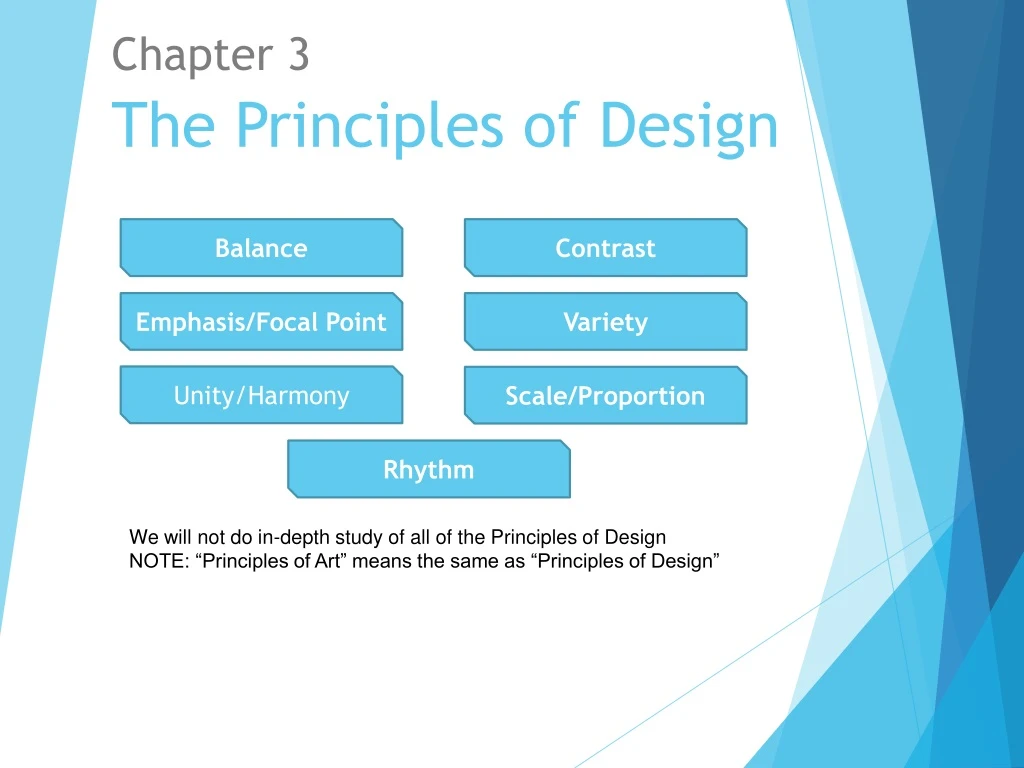
Balance. Contrast. The Principles of Design. Emphasis/Focal Point. Variety. Unity/Harmony. Scale/Proportion. Rhythm. Chapter 3. We will not do in-depth study of all of the Principles of Design NOTE: “Principles of Art” means the same as “Principles of Design”.

E N D
Balance Contrast The Principles of Design Emphasis/Focal Point Variety Unity/Harmony Scale/Proportion Rhythm Chapter 3 We will not do in-depth study of all of the Principles of Design NOTE: “Principles of Art” means the same as “Principles of Design”
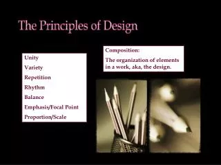
What are The Principles of Design? The Principles of Design are the ways that artists use the Elements of Art to create good Compositions (or artwork) Composition means the sameas Design
There are 11 Principles of Design Balance Contrast Emphasis Variety Unity/Harmony Proportion Rhythm Movement Pattern Repetition We will not do in-depth study of all of the Principles of Design NOTE: “Principles of Art” means the same as “Principles of Design”
Balance: This principle of design refers to the visual equalization of the elements in a work of art.
Actual Balance means that the actual piece of art is literally balanced by physical gravitational force . It is usually 3D and can stand upright on its own, such as a sculpture.
Pictorial Balance • Refers to 2D works • Equilibrium is created by an even distribution of visual weight on each side of a central axis • It also refers to an even distribution of weight among all elements of a composition
Visual Weight refers to the relative visual attraction or visual weight of elements in a composition
0 The are three major types of pictorial balance Horizontal balance - elements on the left and right side of the composition seem to be about equal. Vertical balance - the elements at the top and bottom of the composition are in balance. Radial balance - design elements radiate from the center point. Frequently used in ceramics, jewelry, basketry, stained glass, and other crafts.
Horizontal BalanceBalance on left and right sides of the of the image. Axis
Vertical Balance We also have to consider vertical balance. (Balance on the top and bottom of the image.) The Viewer is more comfortable when there is more visual weight at the bottom of the composition. It gives a feeling Stability, calmness, balance.
Radial Balance • The elements radiate or circle out from a common central point. • Radial balance is common in nature.
Imbalance Occurs when opposing forms are out of equilibrium in a composition • An artist may chose to use imbalance in a composition to enhance a theme or topic, or to elicit a response. • Imbalance can create shock and discomfort. • It can be used to capture a sense of movement. • More visual weight on top elicits a feeling of instability. Marc Chagall - The Flying Rabbi
Imbalance Sometimes artists aim to shock the viewer or to play into the viewer’s discomfort by creating works with imbalance By allowing the composition to remain unbalanced, or weighted on the left, the drama of the moment is intensified. The long shadow seems to pull the soldier to the ground, as he stumbles from the impact of the bullet. The imbalance of the composition is a response to the imbalance of the soldier.
Using Imbalance to Create Tension The further up in the format the main visual interest occurs, the more unstable and dynamic the image becomes. Tightrope Walker W. Kandinsky
Symmetrical Balance • Also called bilateral or formal balance • Shapes or forms repeated in a similar position on either side of a central axis • Mirror image • Can be static or even boring • Can create a feeling of calmness, and stability • Used for a formal or dignified feeling
Symmetrical Balance is a response to the design of our own bodies Vertical Axis and the Body (The body is symmetrical.)
Symmetrical or Formal Balance • Dignified • Stiff • Proper • Strict
Symmetrical or Formal Balance Has a classical feel Creates a feeling of permanence, strengthorder, predictability, and stability. Also considered sedate,calm and dignified. Used a lot in architecture.
Sometimes we want to use symmetrical balance to imply formality and dignity
2. Asymmetrical Balance or Informal Balance • When the right and left sides of a composition bear visibly different shapes, colors, textures, or other elements, and yet they are arranged or “weighted” in such a way that the work feels balanced. • Appears casual and less planned, but in fact, is harder for the artist to create.
2. Asymmetrical Balance or Informal Balance • a way of organizing the parts of a design so that one side differs from the other without destroying the overall balance and harmony. • Comfortable • Casual • Easy
Asymmetrical Balance in Sculpture. Fig. 3.13, p.74: DEBORAH BUTTERFIELD. Verde (1990). Found steel. 79” x 108” x 31”.
What type of balance is shown here? George Seurat, (French) 1859-1891, Sunday Afternoon on the Island of La Grand Jatte Here the larger figures to the right are balanced by the many smaller figures to the left. Also, Seurat added additional "light" to the left. How does this add balance to the painting?
Contrast A design principle that emphasizes differences between the art elements. For example, a painting may have bright colors that contrast with dull colors or angular shapes that contrast with rounded shapes. Sharp contrast draws attention and can direct a viewer to a focal point within a work of art. The bright, angular shapes of this boat are a sharp contract to the muted, organic shapes in the background.
In this work we see sharp lines and shapes against softer lines and shapes. We also see sharp contrast between colors. Marlene Healey, Sections of my Destiny
Focal point or Area of Emphasis • Area where the eye tends to center. It is the focus of the viewer's attention. • A focal point is created by making one area or element most important visually with all other areas contributing but subordinate.
Ways to Achieve Emphasis: • Emphasis by Contrast • Emphasis by Isolation • Emphasis by Placement or Central Placement • Strategically placing objects and images
Ways to Achieve Emphasis: 1. Contrast Most visually dominant Emphasis by contrast of Color (& size)
Ways to Achieve Emphasis: 1. Contrast Emphasis by contrast of Style, or Technique This head stands out because the style in which it was rendered is realistic, while all of the other heads were rendered in an abstract style. This head is the focal point of the painting
Ways to Achieve Emphasis: 1. Contrast Emphasis by contrast of Shape This football player stands out because the numeral shapes are different from all of the other shapes in the photo
Ways to Achieve Emphasis: 2. Isolation If an element is set apart from a group of elements, that isolated element attracts more attention and is the focal point.
Ways to Achieve Emphasis: 2. Placement • In the Dining Room by Berthe Morisot • The young woman appears to be in the center of this painting. A lot of times, we naturally look in the center of the picture
In Francisco Goya’s, The Shootings of May Third 1801, where is the area of emphasis?
Goya "lights" up the painting in much the same way a spotlight lights up the actors on a stage. Goya creates a very light value around the area he wants you to see. The man in the white shirt is the focal point of the painting. He uses value contrast to emphasize this area. The bayonets act as directional lines to point the viewers eye to the man under fire.
Variety Variety is achieved when the art elements are combined in various ways to increase visual interest. For instance, an assortment of shapes that are of a variety of sizes attracts more attention than an assortment of shapes all the same size.
Kandinsky used a variety of lines, shapes and colors to give this painting interest.
Unity/Harmony This principle refers to the visual quality of wholeness or oneness that is achieved through effective use of the elements of art and principles of design Repetition of a color, shape, or other element is one way to create unity in and artwork By repeating horizontal and vertical geometric shapes, Frank Lloyd Wright has achieved a high degree of unity in this architectural design
Unity • Unity– Means that there is a consistency or agreement among the elements in design; they look as though they belong together. • How is unity achieved in this painting? • Stir sticks , & ellipses repeat • Vertical lines on the cans and in the reflections repeat • Shadows all point the same direction • The gray reflective texture of the cans is repeated Unity means the same as Harmony
What do you think Cezanne used to keep this painting, Mt. Victoria,unified or working together?
Cezanne used blues, yellows and greens. By using related colors (remember blue and yellow make green), the piece appears to work as a whole.Angular shapes are repeated throughout the painting. The repetition of shapes also helps unify the painting.
Ways to Achieve Unity and Variety with Unity • Grid • Color harmony • Keeping one or more aspects of the work constant • Continuity
Unity with Variety Fig. 3.1, p.68 ANDY WARHOL Ethel Scull Thirty-Six Times (1963). Synthetic polymer paint silkscreened on canvas. 79-3/4” x 143-1/4”. Unity is created by using a grid, photos of the same person, and the same size rectangles throughout Variety is created by contrast of position or poses of the person. Various different colors.
Types of Unity • Visual Unity - Artwork that is unified by color, shape, composition or some other visual design principle. • Conceptual Unity - artwork that has a common theme or concept throughout it. • Sometime an artwork will have both conceptual and visual unity.
Conceptual Unity vs. Visual Unity Conceptual unity Example – elements have common theme; they have unity of idea or concept. Example: a family album There is unity of theme
Example of Visual Unity means that the visual elements of design are seen a cohesive whole (The Design Works) • The repetition of similar colors, shapes, & textures help to create the visual unity in this painting “The whole must be predominant over the parts. You must first see the whole pattern before you notice the individual elements.”
Conceptual Unity Example A stamp collection has unity of theme
Is there Visual Unity? Is there Intellectual unity?Both have been used.