Download
1 / 13
150 likes | 301 Views
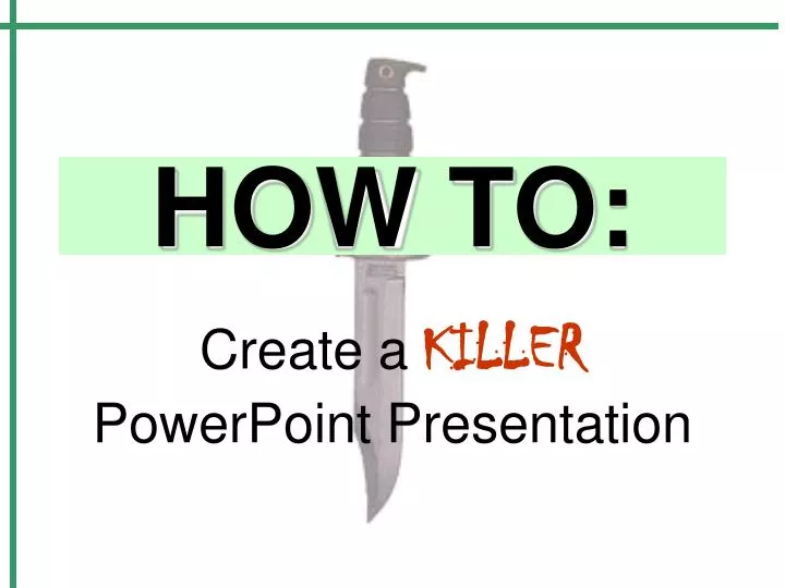
HOW TO:. Create a KILLER PowerPoint Presentation. This Presentation Will Cover:. Slide Layout and Information Colours & Contrast On Slides Fonts & Font Size Backgrounds, Animations, Pictures and Themes Creating Links to Websites Presentation Style & PowerPoint. Slide Layout.

E N D
HOW TO: Create aKILLERPowerPoint Presentation
This Presentation Will Cover: • Slide Layout and Information • Colours & Contrast On Slides • Fonts & Font Size • Backgrounds, Animations, Pictures and Themes • Creating Links to Websites • Presentation Style & PowerPoint
Slide Layout • A slide is easy to read when there is a minimum of information present. Every slide should contain a maximum of 8 (eight) lines of information and be big enough so that every person in the classroom can read the slide from where they are sitting. Too much information on slides can be distracting and overwhelming. Also, limiting the amount of information on the slide will keep the audience’s attention on you rather than them focusing on reading your slide. This way, you can make a great impression and showcase your brilliant presentation skills
Slide Layout • The previous slide contained too much information! • Each slide should contain no more than 8 lines of info. • Too much information is distracting! • Font must be large enough for everyone to read.
Colour& Contrast • Colours can be confusing and distracting if they are not used properly • Slides should follow a consistent colour scheme in order to show continuity • Add some interesting touches like a colour scheme (FormatSlide Colour Scheme) but make sure you use the same scheme throughout!
Colour & Contrast • Colours can be confusing and distracting if they are not used properly • Slides should follow a consistent colour scheme in order to show continuity • Add some interesting touches like a colour scheme (FormatSlide Colour Scheme) but make sure you use the same scheme throughout!
Fonts & FontSize • Fonts are a greataddition to a presentationIFused correctly. • A general rule for fonts: no more than 3 fonts in any one presentation. • The font must be large enough to read
Fonts & Font Size • Fonts are a great addition to a presentation IF used correctly. • A general rule for fonts: no more than 3 fonts in any one presentation. • The font must be large enough to read
Backgrounds, Animations & Pictures • Adding pictures, backgrounds and animations to a presentation can create interest • Too much of a good thing is distracting and tacky! • This can make your presentation difficult to read and follow.
Backgrounds, Animations & Pictures • Adding pictures, backgrounds and animations to a presentation can create interest. • Too much of a good thing is distracting and tacky! • This can make your presentation difficult to read and follow.
Creating Links to Websites • Links to websites that relate to your topic are useful. • To create a link: • InsertHyperlink Copy and Paste Hyperlink into the file or website name. • How To Clone A Mouse
Presentation Style & PowerPoint • Slides are to be used as a guide for the direction of your presentation. • Speak clearly, loudly and face the audience. • DO NOT read from your slides!
NOW YOU ARE READY To Create your ownKILLERPowerPoint Presentation!