Download
1 / 45
450 likes | 600 Views
WCM Prototype. Prototype Planning. Planning and Summary for <Customer>. create. experience. moderate. deploy. plan. Presenter Name Company name August 2, 2013. WCM. Design. Publish. Engage. Use familiar tools to design rich and beautiful sites that represent your brand.

E N D
WCM Prototype Prototype Planning Planning and Summary for <Customer> create. experience. moderate. deploy. plan. Presenter Name Company name August 2, 2013
WCM Design Publish Engage Use familiar tools to design rich and beautiful sites that represent your brand Create, reuse and consume content for any device and language Surface the right content to the right user with adaptive experiences
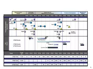
Process Flow 1 1 2 3 4 State Goals/Objectives Review Activities Establish Measurements State Goals/Objectives Review Activities Establish Measurements • Review Overall Summary • Agreement to “Go” forward • Discuss Next Steps • Deployment Planning Activities and Summary for each Stage Perform Activities for Stage Review Participation Summarize, Review and Discuss Adoption Perform Activities for Stage Review Participation Summarize, Review and Discuss Adoption create. experience. experience. moderate. deploy. plan.
Establishing WCM Capabilities Designing a Responsive Website Building a SharePoint HTML Master Page Adapting a Master Page to be Responsive Prototype Experience Stages and Activities
Establishing WCM capabilities will provide an understanding of some basic concepts using the following SharePoint features throughout all activities: Design Manager Device Channels Managed Navigation Stage 1 – Overview Establishing WCM Capabilities
During this first stage of the engagement, users will get familiar with the basic WCM features such as Design Manager, Snippet gallery, Device Channel, and Managed Navigation. The users will learn how to use these features to enhance the design of their own sites and discuss how these features can be leveraged to enhance the design of their organizational sites. Provision the Service Identify Users for Prototype Setup publishing sites for users Add Identified Users to Sites Actively use new WCM features Add content to sites Stage 1 – Activities Establishing WCM Capabilities
Summarize the members that have not logged in and the members that have logged in, their connections and contributions that have occurred during this first stage. This information will be used to encourage participation during the end of this stage and the beginning of the next stage. Frame the Scenario for the WCM Prototype • Provision the Service • Identify Users for Prototype • Setup publishing sites for users • Add Identified Users to Sites • Actively use new WCM features • Add content to sites Business Scenario Engagement • Map Scenario to Activities in Guide • Share Scenario and Activities with Participants
Responsive Web Design is a methodology, supported by new WCM capabilities provides by HTML5 (primarily CSS3) that will enable the next generation of web sites to provide the best user experience across a wide variety of devices and browsers. Stage 2– Overview Designing a Responsive Website
There are three major components that make up any responsive web design: Fluid Grid - Building your designs on a grid so that it can adjust to different environments. The driving force behind leveraging a grid system in your designs is alignment. The alignment helps visitors recognize patterns and these patterns simplify designs to make them easily recognizable. Media Queries - Driven by CSS, allow the web designers to apply different CSS style rules based on characteristics (most commonly used, the screen width) Flexible Media - Rich assets (for example, images) can adapt to grow or shrink to fit with a flexible grid column. Depending on the device and the resolution, the content may be displayed with a higher resolution (for example on a desktop), or it may not display at all (for example, on a smart phone) Using the right tools to design and develop responsive web sites: HTML5 CSS3 jQuery Stage 2 – Activities Designing a Responsive Website
Summarize the participant's activities and show their response during this stage of the experience. Highlight the following activities: Business requirements User-Centered Design activities responses Proposed site structure Proposed global navigation Proposed taxonomy Proposed wireframe This information will be used to encourage participation during the end of this stage and the beginning of the next stage. • Understand Responsive Web Design • Understand three major components that make up any responsive web design • Understand the fundamentals of HTML5, CSS3 and many of the new JavaScript APIs • Understand how to use HTML5, CSS3, and jQuery to design and develop responsive web sites • Capture design requirements for customer's organizations using these tools and features • Design a Responsive Web Site • Understand User-Centered Design Activities • Understand site structure with a case study • Understand global navigation with a case study • Understand taxonomy with a case study • Understand wireframes with a case study
In this stage, we walk through the process of transforming an HTML prototype (i.e., HTML, CSS, Images, and JavaScript) into a SharePoint 2013 HTML master page in a new SharePoint 2013 site with Publishing enabled. We will continue to use our Specter Group case study as our working example. Stage 3– Overview Building a SharePoint HTML Master Page
Activities in this stage will demonstrate the features and process of transforming an HTML prototype into a SharePoint 2013 HTML master page: Prepare the HTML file for conversion to an HTML master page Map the Master Page Gallery to a local drive and upload the Design folder that contains all of the site HTML, CSS, JavaScript, and Images Create an HTML Master Page from an HTML Prototype Modify the HTML master page: Fix common warnings, clean up newly created HTML master page files, and make common CSS adjustments HTML master page SharePoint-generated markup: Review the markup Add snippets from the Snippet Gallery Publish and Assign a Site Master Page Create a Design Package Stage 3– Activities Converting HTML Prototype to SharePoint HTML Master Page
Summarize the actions, the users that participated with examples of how they leveraged these capabilities to be shared with the other participants and capture the user's feedback for how they expect to leverage this across their team and/or organization. This information will be used to encourage participation during the end of this stage and the beginning of the next stage. Have a basic understanding of the process of transforming an HTML prototype (i.e., HTML, CSS, Images, and JavaScript) into a SharePoint 2013 HTML master page in a new SharePoint 2013 site with Publishing enabled.
To demonstrate the process of making a SharePoint master page Responsive, we will perform the following activities: Prepare the design for a Responsive framework Leverage the grid system to adapt the design to follow the grid system Use the Responsive framework to make the solution responsive Device Channels and responsive web design Stage 4– Overview Adapting a Master Page to be Responsive
To demonstrate the process of making a SharePoint master page Responsive, we will perform the following activities: Prepare the design for a Responsive framework Leverage the grid system to adapt the design to follow the grid system Use the Responsive framework to make the solution responsive Device Channels and responsive web design Stage 4– Activities Building a Responsive Master page
Summarize the actions, the users that participated with examples of how they leveraged these capabilities to be shared with the other participants. Summarize how these activities tie directly to the business objectives that were defined in the initial requirements. If there were gaps in the usage scenarios that didn't address the requirements, identify them and begin building a list of potential resolution steps, configuration changes and/or customizations that might address this usage scenario gap. This information will be used to encourage participation during the end of this stage and the beginning of the next stage. To demonstrate the process of making a SharePoint master page Responsive using a Responsive framework or using the Device Channel feature, we will perform the following activities: • Prepare the design for a Responsive framework • Leverage the grid system to adapt the design to follow the grid system • Use the Responsive framework to make the solution responsive • Device Channels and responsive web design
Time to review the overall experience, feedback from the community participants, learnings and next steps Assessment by stage Values gained from the experience Moving business initiatives to full realization Wrap Up – Summary Next Steps
Next Steps Plans for next stage of activities to move your business initiatives to planning and deployment
WCM Design Publish Engage Use familiar tools to design rich and beautiful sites that represent your brand Create, reuse and consume content for any device and language Surface the right content to the right user with adaptive experiences
Design with any tool • Use familiar web design tools & standards to create stunning sites • Customize faster with simplified • markup and style sheets • Optimize layout and content for context and device
Import and convert designs automatically Integrated workflows help manage designs Follow simple step-by-step process for designing sites
Web Designer & Developer Enablement in SP2013 SharePoint HTML Auto Convert Channel settings Snippet Gallery Sketches Upload CSS • Ribbon • Placeholder Main • Custom Minimal Master • It just works! • Navigation • Catalog Integration • Content Search Webparts • Channel Panels Dreamweaver
Optimize for any device • Tailor designs and target devices withdevice channels • Easily create mobile apps with REST API’s • Smart management of media assets
Create and manage channels for different devices Tailor experiences for any device
Managed navigation Content driven topic pages generated by search Refiners based on context and content type
Responsive Web Design Fluid Grid Media Queries Flexible Media
Media Queries Media queries allows us to filter style by viewport values. <link rel="stylesheet" media="screen and (max-device-width: 480px)" href=“small.css" /> <link rel="stylesheet" media="screen and (min-width: 600px)" href="large.css" /> Achieve media queries with CSS declarations using a @media CSS block @media screen and (max-width: 600px) { .sixhundredmaxwidth { clear: both; font-size: 1.3em; } }
Flexible Media Flexible image cssproperty img, embed, object, video { max-width: 100%; // support for IE5.5, IE6, IE7 width: expression(this.width > 400 ? 400 : true); } Hide large images for small viewport display: none
Using the Right Tools HTML5 CSS3 jQuery
User-Centered Design Activities Vision, goals, and objectives User analysis Task analysis Information architecture and interaction design Wireframing and design
Case Study – Responsive Wireframes Desktop - 1200x800 resolution iPad iPhone
Case Study – Sample Page Layouts Home Page Blog Page
Case Study – Sample Page Layouts General Site Page Property Page
Case Study – Sample Page Layouts Community Home Page