Download
1 / 25
250 likes | 401 Views
XmR Chart. Farrokh Alemi, Ph.D. Purpose of Control Chart. Real or random. Tell a story of changes in outcomes of the process. Moving Range. Moving Range. Moving Range. Moving Range. Most common approach. Which Chart is Right?. Assumptions of XmR chart. Assumptions.

E N D
XmR Chart Farrokh Alemi, Ph.D.
Purpose of Control Chart • Real or random. • Tell a story of changes in outcomes of the process. Farrokh Alemi, Ph.D.
Moving Range Farrokh Alemi, Ph.D.
Moving Range Farrokh Alemi, Ph.D.
Moving Range Farrokh Alemi, Ph.D.
Moving Range Most common approach Farrokh Alemi, Ph.D.
Which Chart is Right? Assumptions of XmR chart
Assumptions • There is one observation per time period • Observations are measured in an “interval” scale • Observations are independent of each other Farrokh Alemi, Ph.D.
Selection of Time Period Pre-intervention Farrokh Alemi, Ph.D.
Pre-intervention Selection of Time Period Farrokh Alemi, Ph.D.
Number of observations Observation at time “t” Absolute value of difference of two consecutive observations Calculate Average Moving Range for 2 Consecutive Values Farrokh Alemi, Ph.D.
Formula for Calculating Upper and Lower Control Limits Upper Control Limit = Average of observations + E * Average of moving range Lower Control Limit = Average of observations - E * Average of moving range Farrokh Alemi, Ph.D.
Typically we look at two consecutive periods E Depends on Number of Time Periods in the Range Farrokh Alemi, Ph.D.
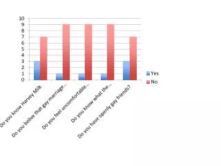
Example • Diabetes patient measured weight for 16 weeks • First 7 weeks were pre-intervention • Has the patient’s weight changed? Farrokh Alemi, Ph.D.
1. Check Assumptions • One observation per time period • Interval scale • Independent observations Farrokh Alemi, Ph.D.
Pre-intervention 2. Select Pre- Or Post-Intervention Period Farrokh Alemi, Ph.D.
3. Calculation of Moving Range Farrokh Alemi, Ph.D.
=abs(B3-B2) Farrokh Alemi, Ph.D.
=Average(C3:C8) Farrokh Alemi, Ph.D.
=Average(B2:B8) Farrokh Alemi, Ph.D.
4. Calculation of Control Limits • UCL = 197.43 + 2.66 * 2.67 = 204.52 • LCL = 197.43 - 2.66 * 2.67 = 190.33 Farrokh Alemi, Ph.D.
5. Plot the Control Chart • Plot the x and y axis, plot the observations • Plot the limits as line with no marker • Plot solid line for pre-intervention period Farrokh Alemi, Ph.D.
6. Interpret the Chart • Points outside the limits show real changes in outcomes of the process Farrokh Alemi, Ph.D.
7. Distribute the Chart • Distribute the chart by electronic media, as part of company newsletter, or as an element of a story board display • Keep following in mind: • Show that you have verified assumptions • Check that your chart is accurately labeled • Include your interpretation of the finding Farrokh Alemi, Ph.D.
Take Home Lesson How and When to Construct an XmR chart