Download

1 / 10
100 likes | 226 Views
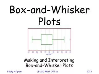
Box And Whisker Plots. BY: Katie Benson Stephanie Ko Natalie Zglinicki. Definition. A plot that represents a distribution by a box, the ends of which mark the maximum and minimum values, and in which the median and first and third quartiles are marked by lines parallel to the ends.

E N D
Box And Whisker Plots BY: Katie Benson Stephanie Ko Natalie Zglinicki
Definition • A plot that represents a distribution by a box, the ends of which mark the maximum and minimum values, and in which the median and first and third quartiles are marked by lines parallel to the ends. • A single set of data is required to make this graph.
Why Use a Box and Whisker Plot? • They are very effective and easy to read. The graph summarizes data from multiple sources and displays the results in a single graph. It is easy to compare data from different categories.
How to Create the Graph Part 1 (Setting up the data): When constructing a box and whisker plot, you must first find the median, the upper quartile, and the lower quartile. Median First find the median. The median is the value exactly in the middle of an ordered set of numbers. Upper Quartile When finding the Upper quartile, only consider the numbers to the right of the median. Find the median of this set of numbers. That is your upper quartile. Lower Quartile When finding the lower quartile, only consider the numbers to the left of the median. Find the median of this set of numbers. That is your lower quartile.
How to Create the Graph Part 2 (Constructing the graph) • Make a line graph with a scale that will suit your data well. • Draw a short vertical line above your median. • Draw a short vertical line above your upper and lower quartiles. • Connect the vertical lines with two horizontal lines (One on the top and one on the bottom). • Mark the highest and lowest number in the data on the line graph with a dot. • Connect these dots to the upper and lower quartile lines that you made in step 3. • Notice how the plot looks like a box with whiskers. That is why it is called a box and whisker plot. • Here is an example:
Advantages and Disadvantages Advantages Represents the median very well A good visual representation of how the data is spread out and how much variation there is. Disadvantages Does not show exact values clearly Only shows a simple summary of the results
Problem • Find the interquartile range of the graph (Formula: Q3 – Q1 =Interquartile) Number of Pets . . 0 1 2 3 4 5 6 7 8 9 10
Problem Answered After finding the median, the lower quartile, and the upper quartile, put the quartiles into the formula to find the interquartile. • Q3 – Q1 =Interquartile • 2-1 = 1 . . 0 1 2 3 4 5 6 7 8 9 10 One is the Interquartile.
Works Cited • http://dictionary.reference.com/browse/box+plot • http://asq.org/learn-about-quality/data-collection-analysis-tools/overview/box-whisker-plot.html • http://www.webquest.hawaii.edu/kahihi/mathdictionary/images/boxplot.png • http://www.srh.noaa.gov/images/tae/Fig2.jpg • http://sph.bu.edu/otlt/lamorte/EP713/Web_Pages/BS704_SummarizingData/BS704_SummarizingData7.html • http://images.sodahead.com/polls/000543969/polls_cat_1341_811773_answer_6_xlarge.jpeg • http://www.netanimations.net/cats.htm