Download
1 / 31
320 likes | 439 Views
Lecture 20: Color Design and Typography. PS3, RS3 due Sunday GR4 due one week from Sunday. UI Hall of Fame or Shame?. Source: UI Hall of Shame. Nanoquiz. closed book, closed notes submit before time is up (paper or web) we’ll show a timer for the last 20 seconds. 10. 12. 13. 14.

E N D
Lecture 20: Color Design and Typography PS3, RS3 due Sunday GR4 due one week from Sunday 6.813/6.831 User Interface Design and Implementation
UI Hall of Fame or Shame? Source: UI Hall of Shame 6.813/6.831 User Interface Design and Implementation
Nanoquiz closed book, closed notes submit before time is up (paper or web) we’ll show a timer for the last 20 seconds 6.813/6.831 User Interface Design and Implementation
10 12 13 14 15 11 17 18 19 20 16 1 3 4 5 6 2 8 9 0 7 Position is effective for displaying data variables that are: (choose all good answers) A. nominal B. ordinal C. quantitative Hue is effective for displaying data variables that are: (choose all good answers) A. nominal B. ordinal C. quantitative Value is effective for displaying data variables that are: (choose all good answers) A. nominal B. ordinal C. quantitative Position maps directly to data variables in: (choose all good answers) A. treemap B. scatter plot C. table lens D. tag cloud 6.813/6.831 User Interface Design and Implementation
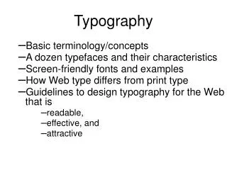
Today’s Topics • Color • Human vision • Color models • Design guidelines • Typography • Readability • Font metrics • Spacing • Typefaces 6.813/6.831 User Interface Design and Implementation
The Eye 6.813/6.831 User Interface Design and Implementation
Photoreceptors • Rods • Only one kind (peak response in green wavelengths) • Sensitive to low light (“scotopic vision”) • Multiple nearby rods aggregated into a single nerve signal • Saturated at moderate light intensity (“photopic vision”) • Cones do most of the vision under photopic conditions • Cones • Operate in brighter light • Three kinds: S(hort), M(edium), L(ong) • S cones are very weak, centered in blue wavelengths • M and L cones are more powerful, overlapping • M centered in green, L in yellow (but called “red”) 6.813/6.831 User Interface Design and Implementation
Signals from Photoreceptors • Brightness M + L + rods • Red-green difference L - M • Blue-yellow difference weighted sum of S, M, L 6.813/6.831 User Interface Design and Implementation
Color Blindness • Red-green color blindness (protanopia & deuteranopia) • 8% of males • 0.4% of females • Blue-yellow color blindness (tritanopia) • Far more rare (~50 people in a million) • Guideline: don’t depend solely on color distinctions • use redundant signals: brightness, location, shape 6.813/6.831 User Interface Design and Implementation
Chromatic Aberration • Different wavelengths focus differently • Highly separated wavelengths (red & blue) can’t be focused simultaneously • Guideline: don’t use red-on-blue text • It looks fuzzy and hurts to read 6.813/6.831 User Interface Design and Implementation
Blue Details Are Hard to Resolve • Fovea has few S cones • Can’t resolve small blue features (unless they have high contrast with background) • Lens and aqueous humor turn yellow with age • Blue wavelengths are filtered out • Lens weakens with age • Blue is harder to focus • Guideline: don’t use blue against dark backgrounds where small details matter (text!) 6.813/6.831 User Interface Design and Implementation
Color Models • Red-Green-Blue (RGB) • Red: 0% - 100% • Green: 0% - 100% • Blue: 0% - 100% • Cyan-Magenta-Yellow • Used for printing 6.813/6.831 User Interface Design and Implementation
More Color Models • Hue-Saturation-Value (HSV) • Hue is wavelength of color • Saturation is amount of pure color • 0% = gray, 100% = pure • Value is brightness • 0% = dark, 100% = bright • Hue-Lightness-Saturation (HLS) • White has lightness 1.0 • Pure colors have lightness 0.5 6.813/6.831 User Interface Design and Implementation
Obtaining Accurate Color Y human-visible colors typical CRT gamut X Z outputintensity Gamma correction y = xγ input voltage 6.813/6.831 User Interface Design and Implementation
Color Guidelines • Avoid saturated colors • Use few colors • Be consistent with expectations 6.813/6.831 User Interface Design and Implementation
Avoid Saturated Colors 6.813/6.831 User Interface Design and Implementation
Use Few Colors 6.813/6.831 User Interface Design and Implementation
Background Colors 6.813/6.831 User Interface Design and Implementation
Be Consistent With Expectations 6.813/6.831 User Interface Design and Implementation
Choosing Good Colors • Copy colors from other interfaces • FireBug, EclipsePalette, Digital Color Meter • Pick colors out of a photograph with natural colors • Pick one color and several shades of gray (safe choice) • Or pick two colors that seem coordinated (ask for other opinions on this) • Use color tools • Colour Lovers • NASA Color Tool 6.813/6.831 User Interface Design and Implementation
Typography • Displaying text on the screen • Key decisions: font and whitespace • Reading • Reading process: fixations and saccades • Readability vs. legibility • Speed, comprehension, subjective preference 6.813/6.831 User Interface Design and Implementation
Dimensions of a Font xdgmenA ascender bowl aperture ascent x-height baseline descent stem m-width n-width descender serif 6.813/6.831 User Interface Design and Implementation
Spacing Vott Four score and seven years ago, our forefathers brought forth uponthis continent a new nation, conceived inliberty and dedicated to the proposition that all men are created equal. 20/20 Vott Four score and seven years ago, our forefathers brought forth uponthis continent a new nation, conceived inliberty and dedicated to the proposition that all men are created equal. 20/24 kerning rnm Four score and seven years ago, our forefathers brought forth uponthis continent a new nation, conceived inliberty and dedicated to the proposition that all men are created equal. 20/28 6.813/6.831 User Interface Design and Implementation
Spacing Guidelines • Use whitespace • Always leave margins around body text; never pack it tightly against an edge • Use generous leading • Make sure body text is not overcrowded • e.g. CSS: line-height: 120%; • Keep text paragraphs narrow • About 60-75 characters / 12 - 15 words / 30-45 em 6.813/6.831 User Interface Design and Implementation
Typeface Abcg Abcg Abcg Abcg Abcg Abcg Abcg Abcg Abcg Georgia Courier New Trebuchet MS Gill Sans MT Verdana Arial Garamond Times New Roman Tahoma 6.813/6.831 User Interface Design and Implementation
Typeface Abcg Abcg Abcg Abcg Abcg Abcg Abcg Abcg Abcg Georgia Courier New Trebuchet MS Gill Sans MT Verdana Arial Garamond Times New Roman Tahoma 6.813/6.831 User Interface Design and Implementation
Style Abcg Abcg Abcg Abcgabcg Abcg Abcg small caps roman style italic style bold style roman style italic simulated by oblique 6.813/6.831 User Interface Design and Implementation
All Caps vs. Mixed Uppercase/Lowercase 0123456789 0123456789 LEDGER Ledger uppercase digits all caps lowercase digits mixed case 6.813/6.831 User Interface Design and Implementation
Font Selection • Simplicity & contrast • Don’t use more than 2 or 3 typefaces • E.g., one for body text, one for display text • Use size, weight, style (e.g. italic/small caps), hue to establish essential contrasts • But 4-5 font varieties should be enough 6.813/6.831 User Interface Design and Implementation
Tools • Picking colors • use browser developer tools to look at CSS style • DigitalColorMeter (Mac), ColorPic (Win) identifies colors from screen • ColourLovers (crowdsourced palettes) • Identifying fonts • use browser developer tools to examine CSS style • Indentifont (20 questions about fonts) • WhatTheFont (image lookup) 6.813/6.831 User Interface Design and Implementation
Summary • Don’t rely solely on color distinctions • Color blindness is common • Keep your color design simple • Use few colors, weakly saturated • Whitespace matters for text • Use generous margins, line spacing, short lines • Keep font choices simple • Few typefaces, few sizes and styles 6.813/6.831 User Interface Design and Implementation