Download
1 / 16
190 likes | 489 Views
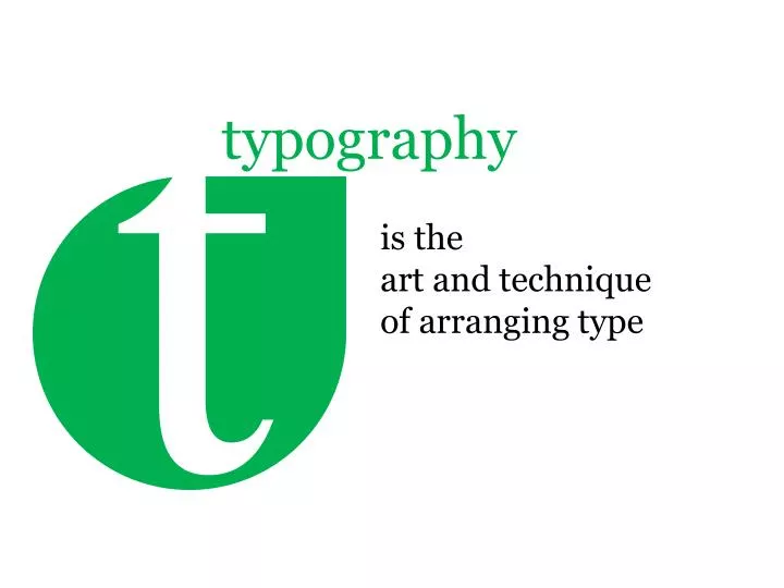
t. is the art and technique of arranging type. typography. We generally think that correcting grammar, deciding the order of items in a page’s layout, alignment and choosing a legible font is sufficient. But the art of typography involves several factors that are …. typography.

E N D
t is the art and technique of arranging type typography
We generally think that correcting grammar, deciding the order of items in a page’s layout, alignment and choosing a legible font is sufficient. But the art of typography involves several factors that are … typography
Readability is our chief concern as designer. It is influenced by layout, the placement of blocks of content and the presentation of individual items. We can do many things to ensure readability, many of which are influenced by reader's behavior. Fundamentally, people “read” the Web differently than printed material. Understanding and designing for this behavior – which is the point of user experience design – is crucial. Web typography brings key considerations. readability is the ease in which text can be read and understood.
When it comes to legibility, many designers agree on certain conventions, heuristics and typographic techniques. For instance, uppercase letters are considered more difficult to scan than lowercase letters, while regular type is more legible than italics. Good contrast between the body copy and background increases legibility, as does an appropriate line length and line height. The upper half of letters are relied on more for scanning than the lower half, while the height of ascenders and descenders play an important role in the reader’s recognition of letters. Many consider serifs more legible for this reason. is the degree to which glyphs (individual characters) in text are understandable or recognizable based on appearance and it is affected by typeface design, screen optimization. legibility
The optimal length will depend on the context, but somewhere between 45 and 75 characters (including punctuation and spaces) is recommended for substantial blocks of text set flush left, ragged right. 66 characters is regarded as optimal: this line length allows for comfortable reading and doesn’t require the eye to travel too far from the end of one line to the beginning of the next. One shouldn’t make lines too short, either, because having to jump too frequently to the next line tires out the eye as well. line height - Leading is the vertical space of an individual line of text. It is the space between two consecutive lines of text or, in other words, the distance between the baselines of two lines of text. is the length of individual lines of text. measure
When experimenting with tracking, make sure that “AV”, “ft” and “co” are clearly readable, and check that “vv” and “w” are distinguishable: the smallest inaccuracy can make text completely unreadable. The negative letter spacing of pairs of characters is also called kerning; it may be necessary to adjust character pairs such as “ff”, “fl” and “ffl” that actually should be set as ligatures. In some situations, kerning may be useful for improving the appearance of type; for instance, to move a “T” and small “e” closer together. the space between letters, or the density of blocks of text, can also be adjusted relative to the measure. letter & word spacing
A block of text should have a uniform tone if you squint and look at it on the screen. Nothing should jump out. If it does, then reading the text will be interrupted and the flow broken. This should only be done deliberately to call attention to something. Color can also be affected by kerning. is not pigmentation or hue, but rather the consistency of glyphs on the page. color
general typographic terms a brief overview of typography-related terms
serifs are semi-structural details on the ends of some of the strokes that make up letters and symbols. A typeface with serifs is called a serif typeface (or seriffed typeface). A typeface without serifs is called sans serif or sans-serif. On computer screens, sans-serif fonts are considered easier to read than serif fonts. difference between serif & sans-serif fonts
setting type withfonts Probably one of the most annoying aspects of modern Web typography is the limits facing the designer who wants to create a rich and truly cross browser, uniform typographic design. Because of the variety of operating systems coming with pre-installed system fonts, it is hardly possible to predict whether a particular font will be correctly displayed on a user’s machine or will create typographic noise, making the text harder to read and the layout harder to navigate. So-called “Core Web fonts”, the set of 10 fonts that were designed in the 1990s-2000s to serve as the standard pack of fonts for the Web. Nowadays, these fonts are installed on over 95% of machines worldwide by default and are therefore often the first choice of designers for body copy.
font-face rule css3 Up until now, if you wanted to use fonts on a website, you were limited to one of the dozen or so ‘web-safe’ fonts (Verdana, Times, Helvetica—you know, the ones you see everywhere on the web). Using other fonts required you to convert the text into images, or to use some hacky Javascript or Flash solution such as sIFR or Cufón. In a relatively recent development, browsers which support the @font-face rule can access fonts embedded in websites. Now If you want to make Web use of your already licensed desktop fonts, you can embed them from your own server.
TrueType This format was developed in the late 1980s as a competitor to Adobe’s Type 1 fonts used in PostScript. As a scalable outline format, it replaced the common bitmap fonts that were used for screen display at that time. Microsoft took up the TrueType format as well and it soon evolved into the standard format for system fonts due to the fact that it offered fine-tuned control for a precise display of font in particular sizes. OpenType Microsoft and Adobe teamed up in developing this font format. Based on the TrueType format, OpenType offers additional typographical features such as ligatures, fractions or context sensitive glyphs and the like. However, browser support of these features which are common in sophisticated layout and illustration programs is still unsatisfactory. There are two different versions of OpenType fonts, depending on the outline technology used. There are: OpenType fonts with TrueType Outlines (OpenType TT) and OpenType fonts with PostScript Outlines (OpenType PS) web font formats
Reading Behavior People search for things and read that they want to know. People read what is most important to them. Our most important job is to find , understand, connect with the words, ideas and information they seek. People read in 3 ways: • Casually – scanning over headlines, paragraphs here and there to get the sense of what it says. ( example : User behavior on online new s portals looking for their articles of interest ) • Scan with purpose - Jumping from place to place on a page looking for specific information , they may only read the first item or character of that particular article ( for example : user behavior searching for contact email on contact us page will be looking only for a word that starts with letter “c”) • Engaged – People read in a engaged manner whet they find the article of their interest , focusing deeply on that particular article. Good Typography promotes reading. Font choice in size keep text legible and meaningful. Good line length and line height can help guide the readers eye. Vertical spacing, hierarchy, break up text into meaningful and manageable chunk of information makes the information more readable.
more on typo innext tech-talk typography