Download
1 / 32
370 likes | 668 Views
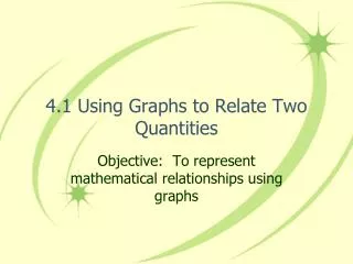
Using Graphs to relate Two Quantities. Chapter 1.3. Using Graphs. Graphs can be used to visually represent the relationship between two variable quantities as they each change. A graph is the most understandable way of showing how one variable changes with respect to another variable.

E N D
Using Graphs to relate Two Quantities Chapter 1.3
Using Graphs • Graphs can be used to visually represent the relationship between two variable quantities as they each change. • A graph is the most understandable way of showing how one variable changes with respect to another variable. • Graphs can show changes in speed, altitude, distance, volume, time, and other variable quantities.
Graphing Relationships State whether each word or phrase represents an amount that is increasing, decreasing, or constant. 1. stays the same 2. rises 3. drops 4. slows down constant increasing decreasing decreasing
Warm Up State whether each word or phrase represents an amount that is increasing, decreasing, or constant. 1. stays the same 2. rises 3. drops 4. slows down constant increasing decreasing decreasing
Graph I indicates a quantity that does not change with time. Graph II shows an increase over time. Example: Using Graphs Which graph in Example 3 could show a car sitting at a stoplight? How do you know? A car sitting at a stoplight would stay in the same place over time. Graph I could show a car sitting at a stoplight.
Example: Using Graphs A pelican flies above the water searching for fish. Sketch a graph of its altitude from takeoff from shore to diving to the water to catch a fish. Label each section.
Your Turn: This graph shows someone taking a walk in the neighborhood. Describe what it shows by labeling each part.
Example: To relate a graph to a given situation, use key words in the description. Each day several leaves fall from a tree. One day a gust of wind blows off many leaves. Eventually, there are no more leaves on the tree. Choose the graph that best represents the situation. Step 1 Read the graphs from left to right to show time passing.
Example: Continued Step 2 List key words in order and decide which graph shows them. Never horizontal Graph B Slanting downward rapidly Graphs A, B, and C Slanting downward until reaches zero Graphs A, B, and C
Example: Continued Step 3 Pick the graph that shows all the key phrases in order. Never horizontal, slanting downward rapidly, slanting downward until reaching zero. The correct graph is B.
Your Turn: The air temperature increased steadily for several hours and then remained constant. At the end of the day, the temperature increased slightly before dropping sharply. Choose the graph that best represents this situation. Step 1 Read the graphs from left to right to show time passing .
Your Turn: Continued Step 2 List key words in order and decide which graph shows them. Slanting upward Graph C Graphs A, B, and C Horizontal Slanting upward and then steeply downward Graph C
Your Turn: Continued Step 3 Pick the graph that shows all the key phrases in order. Slanting upward, horizontal, slanting upward and then steeply downward The correct graph is graph C.
y Speed x Time Example: Sketching Graphs Sketch a graph for the situation. A truck driver enters a street, drives at a constant speed, stops at a light, and then continues. As time passes during the trip (moving left to right along the x-axis), the truck's speed (y-axis) does the following: • initially increases • remains constant • decreases to a stop • increases • remains constant
Helpful Hint When sketching or interpreting a graph, pay close attention to the labels on each axis.
Water tank Water Level Time Your Turn: Sketch a graph for the situation. Henry begins to drain a water tank by opening a valve. Then he opens another valve. Then he closes the first valve. He leaves the second valve open until the tank is empty. As time passes while draining the tank (moving left to right along the x-axis), the water level (y-axis) does the following: • initially declines • declines more rapidly • and then the decline slows down.
Example: Writing a Situation for a Graph Write a possible situation for the given graph. Step 1 Identify labels. x-axis: time y-axis: speed Step 2 Analyze sections. over time, the speed: • initially decreases, • remains constant, • and then decreases to zero. Possible Situation: A car approaching traffic slows down, drives at a constant speed, and then slows down until coming to a complete stop.
Your Turn: Write a possible situation for the given graph. Possible answer: The level of water in a bucket stays constant. A steady rain raises the level. The rain slows down. Someone dumps the bucket.
Example: Relating Tables and Graphs In Algebra, we use multiple representations (verbal description, table, graph, equation) to describe data or a relationship between two variables. Marcus and Janine made the table shown below to represent the difference between their ages during different years. Which graph matches the information in the table? Answer: D
Your turn: Ethan heard a weather report that stated the temperature in Wichita would drop from 5 degrees Fahrenheit at a rate of 2 degrees every hour. Which table matches the information in the graph that Ethan made? Answer: A number of hours
Increasing House Value $200,000 House A Initial Cost $100,000 $0 0 4 8 Time (years) Example: Interpreting Graphs and Tables House A cost $100,000 and increased in value as shown in the graph. House B cost less than house A and increased in value at a greater rate. Which graph on the next slide illustrates this situation.
$200,000 A A $200,000 B B $100,000 $100,000 $0 $0 0 4 8 0 4 8 Time (years) Time (years) $200,000 $200,000 $200,000 A B $100,000 $100,000 $100,000 $0 $0 $0 4 8 0 Time (years) Example: Continued House A cost $100,000 and increased in value as shown in the graph. House B cost less than house A and increased in value at a greater rate. (1) Which One? B A (4) (2) 4 8 0 Time (years) A B (5) (3) 4 8 0 Time (years)
Investment A $2000 Investment B Amount of Investment $1000 $0 0 4 8 12 Time (years) Your Turn: The changing values of two investments are shown in the graph below.
Investment A $2000 Investment B Amount of Investment $1000 $0 0 4 8 12 Time (years) Your Turn: Continued How does the amount initially invested and the rate of increase for investment A compare with those of investment B?
Investment A $2000 Investment B Amount of Investment $1000 $0 0 4 8 12 Time (years) Your Turn: Continued • Compared to investment B, investment A had a • lesser initial investment and a lesser rate of increase. • lesser initial investment and the same rate of increase. • lesser initial investment and a greater rate of increase. • greater initial investment and a lesser rate of increase. • greater initial investment and a greater rate of increase.
$400 $200 Profit/Loss in Thousands of Dollars $0 0 4,000 8,000 12,000 -$200 Video Games Sold Your Turn: The profit, in thousands of dollars, that a company expects to make from the sale of a new video game is shown in the graph.
$400 $200 Profit/Loss in Thousands of Dollars $0 0 4,000 8,000 12,000 -$200 Video Games Sold Your Turn: Continued What is the expected profit/loss before any video games are sold? (1) $0 (2) -$150 (3) -$250 (4) -$150,000 (5) -$250,000
Your Turn: A B D C
Your Turn: Analyzing a Graph The graph below shows the amount of gasoline in Jamie’s tank after she fills up her car. (1) What are the variables? (2) Describe how they are related at various points on the graph. Answers: (1) The variables are the amount of gas (in gallons) and time (in days). (2) The amount of gas decreases each time Jamie drives somewhere and stays constant when she is not driving.
Your Turn: Matching a Table and a Graph The table shows the total number of customers at a car wash after 1, 2, 3, and 4 days of its grand opening. Which graph could represent the data shown in the table? Answer: A
Your Turn: Sketching a Graph When Malcolm jogs on the treadmill, he gradually increases his speed until he reaches a certain level. Then he jogs at this level for several minutes. Then he slows to a stop and stretches. After this he increases to a speed that is slightly lower than before and jogs at this speed for a short while before slowing to a stop again. What is a possible sketch of a graph that shows Malcolm’s jogging speed during his workout? Label each section.