Download
1 / 79
840 likes | 1.56k Views
Statistic Graphs What is a Survey Organising Data Reading Pictographs Reading Bar Graphs Constructing Line Graphs www.mathsrevision.com Constructing Bar Graphs Constructing Histogram Constructing Harder Pie Charts Constructing Polygon Graph Reading Pie Charts Resource Surveys

E N D
Statistic Graphs What is a Survey Organising Data Reading Pictographs Reading Bar Graphs Constructing Line Graphs www.mathsrevision.com Constructing Bar Graphs Constructing Histogram Constructing Harder Pie Charts Constructing Polygon Graph Reading Pie Charts Resource Surveys Created by Mr.Lafferty Maths Dept Constructing Pie Charts Pie Chart templates
Aims of the Lesson • Understand the key points of a survey. • 2. Construct a survey. www.mathsrevision.com Created by Mr. Lafferty
Think of a survey that you have seen on TV, online or in the street and explain what it was about. Survey’s • What is a survey ? • Why do we use survey’s ? • What kind of data does a survey have? • What makes good question ? Measurements Categories Counts www.mathsrevision.com Created by Mr. Lafferty
Good or Bad survey question Survey’s www.mathsrevision.com Created by Mr. Lafferty
Good or Bad survey question Survey’s www.mathsrevision.com Created by Mr. Lafferty
Good or Bad survey question Survey’s www.mathsrevision.com Created by Mr. Lafferty
Good or Bad survey question Survey’s www.mathsrevision.com Created by Mr. Lafferty
Easy Survey’s www.mathsrevision.com Created by Mr. Lafferty
Harder Survey’s www.mathsrevision.com Created by Mr. Lafferty
Survey Complete the survey you have been given. www.mathsrevision.com Created by Mr.Lafferty Maths Dept
Starter Questions www.mathsrevision.com Created by Mr.Lafferty Maths Dept
Aims of the Lesson 1. Understand the term Frequency Table. 2. Construct a Frequency Table. 3. Interpret information from Frequency Tables. www.mathsrevision.com Created by Mr. Lafferty
Easy Survey’s www.mathsrevision.com Created by Mr. Lafferty
We will look at favourite food survey represents a tally of 5 llll Frequency tables Raw data from a survey can often appear untidy and difficult to understand. Organizing such data into frequency tablescan make it much easier to make sense of (interpret) the data. Sum of Tally is the Frequency
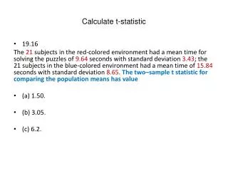
We will look at the height survey represents a tally of 5 llll Frequency tables Raw data from a survey can often appear untidy and difficult to understand. Organizing such data into frequency tablescan make it much easier to make sense of (interpret) the data. Sum of Tally is the Frequency
Frequency Table Pick suitable question from your survey and construct a frequency table. www.mathsrevision.com Created by Mr.Lafferty Maths Dept
Starter Questions www.mathsrevision.com Created by Mr.Lafferty Maths Dept
Aims of the Lesson Interpret pictographs. www.mathsrevision.com Created by Mr. Lafferty
What does 1 computer represent You have 1 minute to come up with a question Pictographs www.mathsrevision.com
What does 1 snowflake represent You have 1 minute to come up with a question Pictographs www.mathsrevision.com
Pictograph Your turn Do exercise www.mathsrevision.com Created by Mr.Lafferty Maths Dept
Starter Questions www.mathsrevision.com Created by Mr.Lafferty Maths Dept
Bar Graphs Learning Intention Success Criteria • To explain the main points of a Bar Graph and how to construct them. • 1. Be able to read information from a Bar Graph. 2. Be able to construct a Bar Graph. www.mathsrevision.com Created by Mr.Lafferty Maths Dept
Bar Graphs www.mathsrevision.com Created by Mr.Lafferty Maths Dept
Bar Graphs www.mathsrevision.com Created by Mr.Lafferty Maths Dept
Bar Graphs www.mathsrevision.com Created by Mr.Lafferty Maths Dept
Bar Graphs A survey of S1 pupils asked what their favourite pet was. The results are shown below www.mathsrevision.com Lets construct a Bar graph for the following table Remember graph has to be labelled and neat ! Created by Mr.Lafferty Maths Dept
What labels should we use for the Bar Chart Title, Scale, Labels and Units where appropriate Favourite Pets 12 10 8 Number of Pupils 6 4 2 0 Cat Dog Rabbit Hamster Snake Pets
Bar Graphs Pick a suitable question from your survey and draw a Bar Graph. www.mathsrevision.com Created by Mr.Lafferty Maths Dept
Histograph The heights in (cm) of 20 S1 pupils are recorded below. www.mathsrevision.com Lets construct a Histogram graph for the following table Remember graph has to be labelled and neat ! Created by Mr.Lafferty Maths Dept
Histograph First use a table to organise the data. www.mathsrevision.com Now we can create a Histogram graph Created by Mr.Lafferty Maths Dept
Pupils’ Height What key features should we use for the Histogram Title, Scale, Labels and Units where appropriate 12 10 8 Number of Pupils 6 4 2 0 Height 140-144.9 145-149.9 150-154.9 155-159.9
Making a Polygon Graph Out of a Histograph Pupils’ Height 12 10 8 Number of Pupils 6 4 2 0 Height 135-139.9 140-144.9 145-149.9 150-154.9 155-159.9 160-165.9
Histograph Graph and Polygraph Pick a suitable question from your survey and draw a Histograph and Polygraph. www.mathsrevision.com Created by Mr.Lafferty Maths Dept
Lesson Starter Q1. Q2. How long between 8:12am to 2.09pm Q3. 75.9 x 7 www.mathsrevision.com Find arrow value Q4. 1300 1200 Q5. The answer to a question is 81. Write down the question. Created by Mr. Lafferty
Aims of the Lesson • Interpret information from Line Graphs. • 2. Construct a Line Graph. www.mathsrevision.com Created by Mr. Lafferty
Starter Questions www.mathsrevision.com Created by Mr.Lafferty Maths Dept
Line graphs What does trend mean Line graphs are most often used to show trends over time. If the temperature in Aberdeen, in ºC, over a 12-hour period is plotted, the line graph shows the temperature trend. Created by Mr. Lafferty
103 102 101 100 99 98 97 6:00 am 7:00 am 8:00 am 9:00 am 10:00 am 11:00 am 101 102 102 101 100.5 101 Temp C Constructing a Line Graph A hospital nurse recorded a patient’s temperature every hour Temperature versus Time TemperatureC Time Hours
Line Graphs Pick a suitable question from your survey and draw a Line Graph. www.mathsrevision.com Created by Mr. Lafferty
Pie Charts Learning Intention Success Criteria • To explain the main points of a Pie Chart and how to construct them. • 1. Be able to read information from a Pie Chart. 2. Be able to construct a Pie Chart. www.mathsrevision.com Created by Mr.Lafferty Maths Dept
Pie Charts Come up with a question that we can answer using this Pie Chart. www.mathsrevision.com Created by Mr.Lafferty Maths Dept
Pie Charts Come up with a question that we can answer using this Pie Chart. www.mathsrevision.com Created by Mr.Lafferty Maths Dept
Pie Charts Pie charts can be thought of as circle graphs. 360o How many degree in a circle 90 How many degrees in one slice 90o What fraction is each slice of the circle Created by Mr. Lafferty
Pie Charts Pie charts can be thought of as circle graphs. 360o How many degree in a circle 120 How many degrees in one slice 120o What fraction is each slice of the circle Created by Mr. Lafferty
Pie Charts Work out the fraction and degrees for each slice of the circles.
Pie Charts Let’s make up our own question www.mathsrevision.com Created by Mr.Lafferty Maths Dept
Chinese Indian Italian French Pie Charts The pie chart shows the results of a class survey into favourite restaurant food. Write down the fraction of the class that choose Indian Chinese Italian French Created by Mr. Lafferty
Pie Charts 50 people were asked what was there favourite holiday Spain How many chose America www.mathsrevision.com Created by Mr.Lafferty Maths Dept
Pie Charts Count the number of parts the circle is divided into. Whole circle is divide into 20 equal pieces 1 piece is equal to The whole circle represents 100 bottles. How many bottles does 1 piece represent. 5 Created by Mr. Lafferty