Download
1 / 13
130 likes | 281 Views
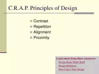
Understanding the C.R.A.P. principles—Color, Repetition, Alignment, and Proximity—is crucial for creating effective page designs. Utilize high-contrast colors and consistent color schemes to improve text readability and visual appeal. Repeated use of fonts and graphic elements helps tie related content together while maintaining a clean layout. Proper alignment organizes text and graphics, enhancing comprehension. Additionally, strategic use of white space allows for clear separation of elements, improving the user experience. Implement these principles to create aesthetically pleasing and organized pages.

E N D
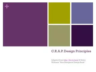
C.R.A.P. Color, Repetition, Alignment, Proximity
Color • Avoid busy backgrounds • Use high contrast colors for text • Use the same color for your titles, a different color for your subtitles • The font colors, types, and size of this page are different for titles & subtitles • Background colors can also help organize a page
GOOD EXAMPLE Purple background, not too busy Important things in different-colored text Text is easy to read. Green and purple clash together well
BAD EXAMPLE Busy background that is not related to subject Font colors are random & no complimentary colors are used
Repetition • Repeat fonts (type, size, color) and graphics to tie related items together • Do the same to divide the page into separate pieces; as in the two columns of this page • Use titles and subtitles of same font, decoration, color, weight to identify parts of the page
GOOD EXAMPLE Font type, size, and color are the same for each related header Page divided into columns Every link is the same font color; easy to recognize
BAD EXAMPLE Different fonts and sizes Random colors; no relation to other colors used.
Alignment • Use vertical align, text-align (left, right, center, justify), and indent (blockquote) to align graphics and text • Use DIV tags to group items • Use graphics such as lines and rectangles to organize page elements
GOOD EXAMPLE Important text & headers justified Page organized with columns Important parts of page identified with rectangular pictures
BAD EXAMPLE All text pushed to left of page Text alignment is random Pushed to bottom of page; no attempt at alignment
Proximity • Keep related things close to each other and less related divided by space • White space is important in separating elements of a page
GOOD EXAMPLE “white space” used to divide text Important things in center of page Related things are close to each other
BAD EXAMPLE Impossible to tell what is important; too much text on one page No white space or attempt at organization Related things not close to each other anywhere