C.R.A.P
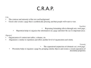
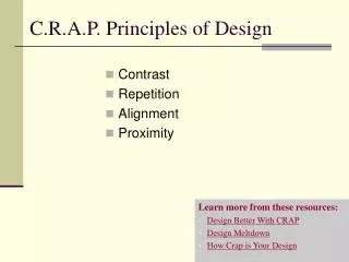
This guide explores the good and bad uses of color, repetition, alignment, and proximity in webpage design. Good examples demonstrate complementary colors, organized repetition of fonts, clean vertical alignment, and appropriate spacing between elements, enhancing navigation and readability. In contrast, poor examples illustrate the pitfalls of overwhelming rainbow colors, unrelated repetitions, mixed alignments, and cluttered layouts. By understanding these principles, designers can create aesthetically pleasing and user-friendly websites that effectively communicate their message.

C.R.A.P
E N D
Presentation Transcript
Good Use Of Color Title and subtitles are different colors, orange and white. The orange and blue compliment each other
Bad Use of Color Title and subtitles are the same color, because they are all rainbow and it is too much. The colors are too much with all of the different ones and they are repeated making it confusing because they aren’t related.
Good Use of Repetition The colors are repeated in a way, that they are related and it makes it easy to navigate through the page. Font is repeated throughout the webpage.
Bad Use of Repetition The orange is repeated throughout the webpage and they aren’t all related which makes it confusing.
Good Use of Alignment Good vertical alignment that makes it easy to find what you are looking for and gives it a clean look while reading it. Uses rectangles to organize the different page elements.
Bad Use of Alignment Too many different alignments, vertical and horizontal mixing with each other. Which makes it confusing and hard to figure out where you need to read. Too cluttered in the center it should be spread out more.
Good Use of Proximity The headers and everything on the page is spaced out so it shows what is related and what is not. Making it easier to navigate and find what you are looking for on the page.
Bad Use of Proximity Did a good job with having the title and subtitle in different colors showing the difference between them. Brands are too cluttered and makes it hard to find what you are looking for they need more spacing in between them.