
Histograms: Construction and Interpretation
E N D
Presentation Transcript
Histograms When to Use Univariate numerical data How to construct Discrete data • Draw a horizontal scale and mark it with the possible values for the variable • Draw a vertical scale and mark it with frequency or relative frequency • Above each possible value, draw a rectangle centered at that value with a height corresponding to its frequency or relative frequency Constructed differently for discrete versus continuous data
Histograms For comparative histograms – use two separate graphs with the same scale on the horizontal axis
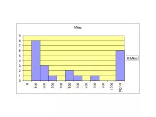
Frequency Distributions & Histograms For example, a survey of local law firms in a medium sized town gave
The number of lawyers in the firm will have the following histogram. Clearly, the largest group are single member law firms and the frequency decreases as the number of lawyers in the firm increases.
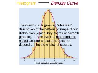
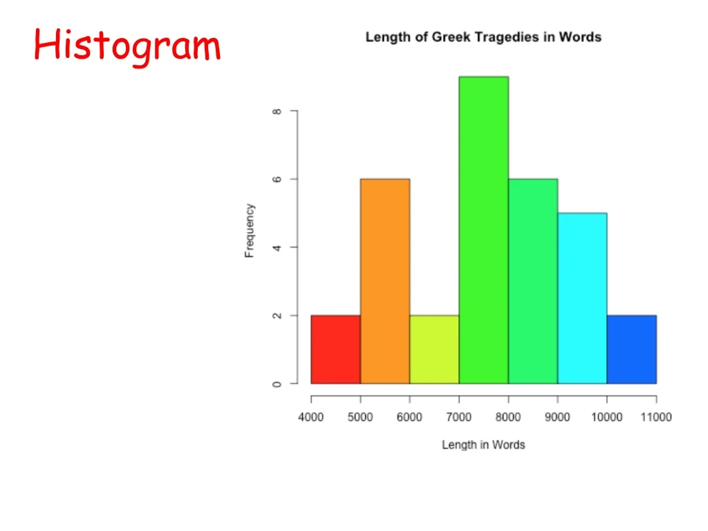
Histograms for continuous data How to construct • Mark the boundaries of the class intervals on the horizontal axis • Draw a vertical scale and mark it with frequency or relative frequency • Draw a rectangle directly above each class interval with a height corresponding to its frequency or relative frequency
A study examined the length of hours spent watching TV per day for a sample of children age 1 and for a sample of children age 3. Below are comparative histograms.(taken from the text book (of other edition) on p-106)
Children Age 1 Children Age 3 Notice the common scale on the horizontal axis
When working with continuous data at which class interval is not given, • Decide into how many groups or “classes” you want to break up the data. Typically somewhere between 5 and 20. • Determine the “starting point” for the lowest group. • A quick estimate for a reasonable number of intervals is
Histograms with unequal intervals How to construct - construct similar to histograms with continuous data, but with density on the vertical axis
Example: For many reasons, either for convenience or because that is the way data was obtained, the data may be broken up in groups of uneven width as in the following example referring to the student ages.
If a frequency (or relative frequency) histogram is drawn with the heights of the bars being the frequencies (relative frequencies), the result is distorted. Notice that it appears that there are a lot of people over 28 when there is only a few.
To correct the distortion, we create a density histogram. The vertical scale is called the density and the density of a class is calculated by This choice for the density makes the area of the rectangle equal to the relative frequency.
The resulting histogram is now a reasonable representation of the data.
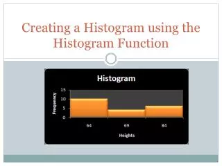
TI-nspire • Step-1: Enter the data in to Lists and spreadsheet • Step-2: Press menu and choose # 3 Data and #4 Quick graph • Step-3: Did you see dot plot? • Press Menu and choose #1 plot type, #3 Histogram
* By clicking on the bars, you can see the size of the bars and the number of values represented by each bar • ** To adjust the histogram, press Menu then choose #2 plot properties and #2 Histogram properties
Essential Question:How well do I understand how to explore data? Histograms Used for both _____ and ____ variables Drawn with ___ spaces between bars. vs. Bar Graphs used for ----------variable Drawn with _____between bars.
How to use TI-89 to make Histogram? If you have Stat/List Editor If you don’t have Stat/List editor 1. Press Apps and and scroll to Data/Matrix editor 2. Choose 3 (new) 3. File-----data Folder-----main Variable---- Give your own name Enter 4. Enter the data under C1 • Press Apps and scroll to the Stat/List Editor. Press Enter • Press F1 then 8 to clear the list editor of the data • Give a name to it (press 2nd ALPHA to type in) • Enter the data
Stat/List Editor Data/Matrix 5. Press F2 for plot setup press F1 and choose Histogram 6. Tell it the x-variable will be in C1 7. press diamond key then F3 for graph * If you don’t see the histogram, either you set the window manually or press F2 and choose Data • 5. Press F2 Enter and F1 to define plot type • 6. Choose 4 Histogram • 7. Scroll down to “x” and type the name you gave for the data • 8. assign bucket width • 9. Press the diamond key then F3 for graph
When you press F3, you can trace the function Use the left and right scroll keys to move from one bar to another. This will tell you how many items are in each class.