Responsive Website Design Best Practices
50 likes | 63 Views
With mobile devices generating 54.8 percent of global website traffic, thereu2019s no way you can overlook the mobile-first approach in building a website. Check out the blog to learn the best practices for designing a responsive website. https://bestemsguide.com/responsive-website-design-best-practices/

Responsive Website Design Best Practices
E N D
Presentation Transcript
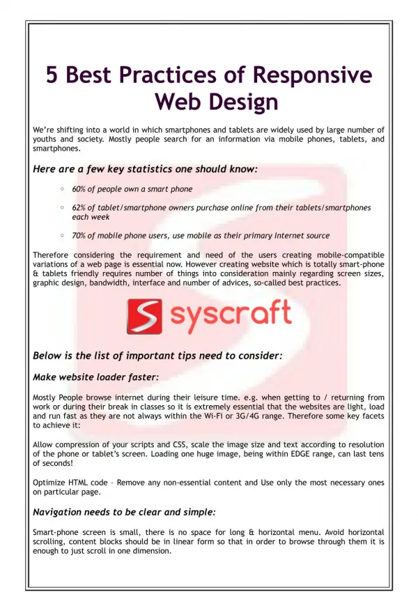
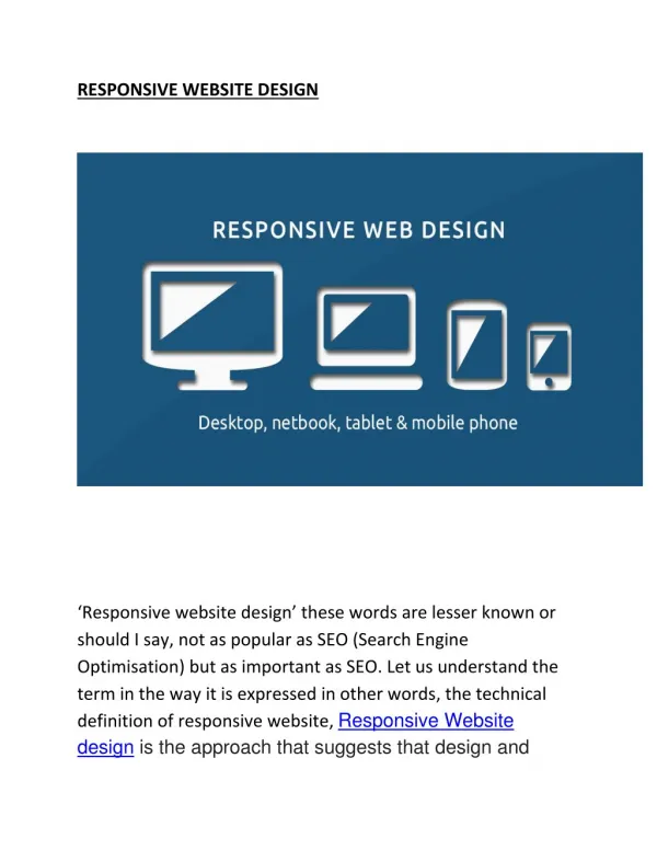
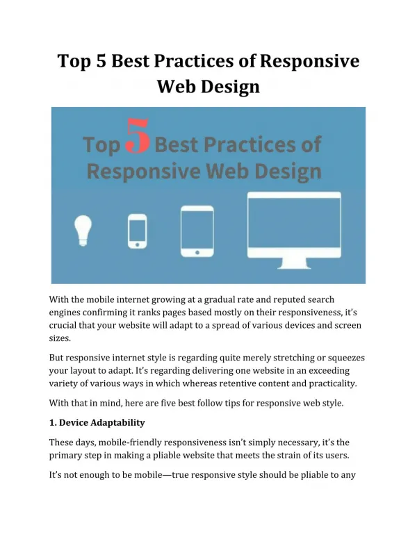
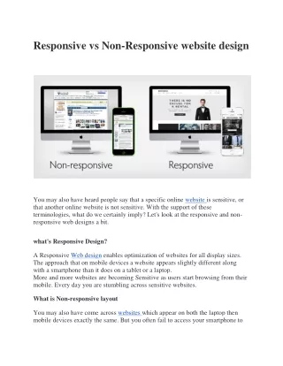
Responsive Website Design: Best Practices Responsive websites are the ones that automatically adapt to different screen sizes and resolutions. Therefore, these can be easily accessed on mobile, tablet, and even smart TVs. If you are managing a hosting website then integrate it with WHMCS and customize it with the help of WHMCS website development company to customize your website as per your business requirements. Statista informs that mobile devices generated 54.8 percent of global website traffic. In fact, Google has started offering a high rank to the sites that are built with a mobile-first approach. In such a condition, owning a responsive website is paramount. Today, we will explore some of the best practices diligently followed by the experts at any reputed website development company to build a responsive website. Let’s check it out. A-Z Guide to Designing a Responsive Website
Mobile-First Design Approach We have already discussed about a mobile-first web design approach is appreciated by Google. But what exactly is that? We will explore here. Mobile-first design means that a mobile site is designed first and then it is worked up to the desktop version. Here’s why it is the ideal approach: Mobile sites often have usability concerns due to their limited screen size. Therefore, it’s practical to make the mobile design the prime focus. Mobile-first designs will help you to evaluate which features and functionalities are essential. That way, you can build a minimal and sophisticated website. The designers found that it’s easier to scale up a mobile version of a site than to scale down the desktop version. While designing the website, it’s always recommended to outline the primary objective and then determine which elements help to reach that goal. Popular Web Browsers Wondering why you should take web browsers into account while designing a responsive website? That’s because different web browsers render web pages in different ways. Therefore, websites should be properly tested to ensure that they are compatible with a wide range of web browsers. Some of the most popular web browsers include Chrome, Safari, UC Browser, Firefox, and Opera. Most Relevant Screen Resolutions With different devices with varied screen sizes operating in the market, it’s tricky to determine the most relevant screen resolutions. Usually, 375×667 is the perfect resolution for small mobile and 1366×768 is widely used for the average laptop. However, the range of screen resolution from small mobile to a large desktop remains somewhere between 360×640 and 1920×1080 respectively. Thumb-Centric Design While designing a responsive website, you must bear in mind that most of the users will interact with the mobile version of the site. As you may have noted that most of the users interact with the site with their thumbs by holding the device in one hand. Therefore, the design must be optimized for swipes, touch, and taps. It is logically different from a website that is solely optimized for desktop where the users interact with clicks.
Make sure to keep the main icons at an equal distance from the left and right thumb so that people can easily interact with the site. Here are a few more aspects to keep an eye on: Instead of sticky headers, use the hamburger menu to keep all the navigation elements in one place. It will declutter the appearance of the site – an essential aspect of a mobile website. Keep the CTA buttons large enough to tap with thumb. Too small a button may not encourage people to tap on it. If you show a pop-up, make sure to feature a close button, large enough to tap and escape from the window. Also, it’s better to keep the pop-up window smaller so that it doesn’t occupy the entire screen and let people escape by touching the space around the pop-up. Fluid Layout The experts of website design services focus on adaptive layout these days. A fluid layout comprises adaptive elements that can offer a smooth user experience on every device – small or large. For instance, as opposed to JPS and PNG images, SVG image formats can be scaled up or down without compromising quality. These are resolution-independent. Further, a minimum and maximum width for each element should be set before designing the website. It will help the elements to naturally stretch or squeeze with the device size. Leverage In-Built Features Unlike a desktop, a mobile enables you to get better insights into the users. For instance, you can track the geolocation of the users, their camera, Bluetooth, and so on. It will make the site adapt to the capabilities of the device in the truest sense. From voice search to social media sharing – everything is easier on mobile. Make sure that your site is optimized for all these. From voice search optimization to social media integration in a visible place – a responsive website is much more than adapting to different screen sizes. Orientation Unlike desktop, a smartphone or tablet can be rotated and the site must instantly adapt to the screen orientation. For instance, a portrait viewport is very much different from a landscape viewport.
From content to navigation element and scrolling feature – everything should be changed with the orientation. For instance, scrolling is usually easier in portrait mode while the content display is better in landscape mode. Therefore, you need to be cautious while presenting your website features vertically and horizontally. These days, sliders are often used for displaying multiple elements. The users can check these with the left and right navigation, without having to scroll. Responsive Typography If you are yet to be introduced to responsive typography, it’s high time that you do! Many often, the designers use pixel units while designing a website. However, on the web, one point doesn’t really equal a pixel. The reason? Different resolutions of different devices. For example, the iPhone X has 458 pixels per inch. The smaller the pixel sizes, the better the graphics. This principle is called hDPI in Android and Retina technology in iOS. As you can understand, depending on the resolution, specific font size may look bigger or smaller on different devices. Therefore, before launching the site, test how the typography looks on different devices. Leverage Lazy Loading and Conditional Loading Loading speed is the key to modern-day websites. And large images and videos often slow down a website. The best way to deal with it is by leveraging lazy loading. Here, the below- the-fold content (say a large video, or an infographic) can be loaded when the users start scrolling. This practice is called lazy loading that delays the loading of heavy elements and thereby improves page performance. Conditional loading hides some elements of the site that are unessential for the mobile version. These elements are present in the desktop version of the website. It helps to save browser resources and bandwidth on mobile devices. Following the above-mentioned practices will help you to build a user-friendly responsive website. Hope you have found the tips insightful. Best wishes. Resource: https://bestemsguide.com/responsive-website-design-best-practices/ ………………………………………………………………………………………………………
WebGuru Infosystems Y8, Block-EP, Sector V, Salt Lake Kolkata-700091, India Website: https://www.webguru-india.com/ Email: enquiry@webguru-india.com Phone: +91-8420197208 Follow us on: