Download
1 / 37
370 likes | 387 Views
Learn the process of developing visualizations, identifying your purpose, choosing the right metrics, chart types, and enhancing visualizations for clear communication. Improve data visualization skills.

E N D
Visualizing Data and Communicating Information Larry Jerome: Data Architect KIPP DC
Introductions • Name • Organization/Role • Most commonly used platform (e.g. excel, R, Tableau, Qlik, etc. ) • What are you currently working on or what’s currently challenging you?
What is data visualization? A primary goal of data visualization is to communicate information clearly and efficiently to users via graphics, plots, information graphics, tables, and charts Source: Wikipedia; Jen Underwood: Business Intelligence and Predictive Analytics, April 10, 2013
What is data visualization? Two basic types of visualization Source: Wikipedia; Jen Underwood: Business Intelligence and Predictive Analytics, April 10, 2013
Identifying Your Purpose What questions do you need to answer? • Who is your audience? • What questions do they have? • What action will be taken? Source: Rebecca Vichniac: KIPP Data Summit, June 2014
Identifying Your Purpose: Who is your audience • Role: what decisions do they make? What questions do they need answered? • Work flow: in what context will it be used? What information is needed regularly? How much time do they have? • Comfort and skills: how sophisticated are they with using the data? Do they enjoy digging into the numbers? • Business and data expertise: How familiar are they with the metrics? Do they understand where the data comes from? Are they familiar with the organization and terminology? Source: Rebecca Vichniac: KIPP Data Summit, June 2014
Choosing the right metric The Perfect Metric • Align to organizational mission or strategy • Identify specific, quantifiable outputs/outcomes • Establish targets against which results can be evaluated Actionable
Choosing The Right Metric: Evaluating Metrics Source: Rebecca Vichniac: KIPP Data Summit, June 2014
http://goo.gl/r0tNYN Choosing The Right Chart Type
Choosing The Right Chart Type: Comparison • Among Items • Over Time
Choosing The Right Chart Type: Distribution • Single Variable • Two (or more) Variables
Choosing The Right Chart Type: Composition Changing over time • Static
Choosing the right chart type: Relationship Comparison of two or more sets of values
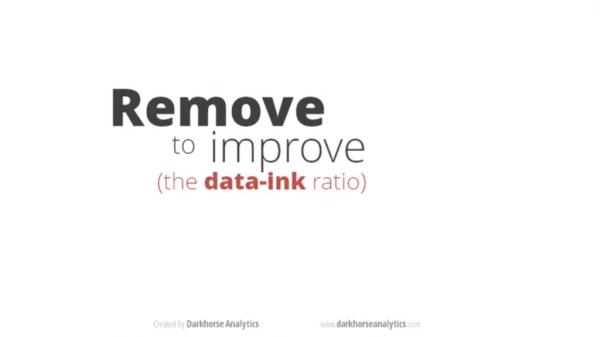
Enhancing Visualizations Use Complimentary Colors for Comparisons
Enhancing Visualizations Identify Groups of Attributes Use fewer than 6 colors
Enhancing Visualizations Highlight Metric Patterns Less saturation: small values More saturation: larger values
Enhancing Visualizations: Color Saturation Add Size to Emphasize Metric Trends
Best in Data Visualization Larry.Jerome@kippdc.org @larryfredjerry • Dadaviz.com • https://public.tableau.com/s/gallery • http://www.tableau.com/learn/whitepapers • http://www.perceptualedge.com/blog/ • http://www.edwardtufte.com/bboard/q-and-a • Fivethirtyeight.com • Qz.com • Vox.com • NYT Upshot