Homepage Deconstructed
In today's lecture, Gabriel Spitz emphasizes the importance of a user perspective in homepage design. The homepage serves as a signpost that shapes visitors' first impressions—whether the site is perceived as serious or fun. An effective homepage informs, promotes, and impresses users, guiding them to stay, explore, and engage with content or services. Key design principles include clarity, usability, and compelling calls-to-action (CTAs). Understanding visitor types, their questions, and needs is crucial for creating a resonant homepage.


Homepage Deconstructed
E N D
Presentation Transcript
Homepage Deconstructed Gabriel Spitz
Objective of Today’s lecture • Demonstrate the User Perspective within the Business Goals
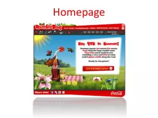
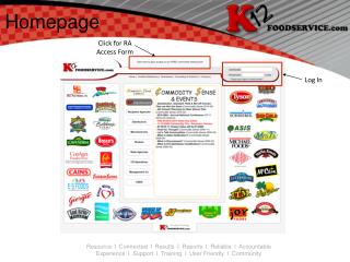
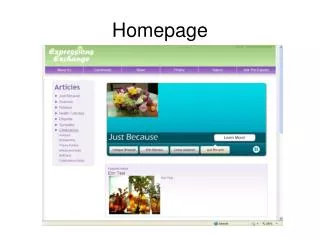
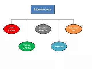
What is a Homepage • Sign post • Indicates the “direction” the website will take me in • First impression • Is it a serious site, is it a fun site… • Gateway to a site • Provides links to different sections of the site
Homepage is like the rest area along the Internet Highway; You can zip through it or Stop and enjoy the facility
Visitors Types & Questions/Needs New user Returning user Accidental user What do you do/ have I just want to do it Where am I Do I trust you Show me the latest Should I stick around Let me contact you Help me decide Is this the correct site How Do I… - Help
Role of the Homepage Effective Homepages Inform Promote Impress • In order to get the user to: • Stay on the site • Explore its content • Buy or use its services
Great Homepage Design Jessica Meher, (2013) HubSpot • Is Informative – tells the visitor • What is the site/tool about • What can the visitor do on the site with the tool • What can the site/tool do for the visitor • Resonate with target audience • Narrowly focused • Speaks the language of visitorsof interest • Has Compelling value-proposition • Convince the user to stick around
Great Homepage Design • Is Usable • Easy to navigate • No interruptions • Mobile optimized • Has Clear Primary and secondary Call-to-action (CTA) • Free Trial, Schedule a demo, Buy now, learn more • We want the user to dig deeper into the website and move them further down the Purchas-funnel • Reflect current needs, problems, and questions of visitors
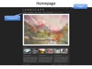
Great Homepage Design • Is Good design • Use of layout • Call-To-Action placement • Use of whitespace • Colors • Fonts • Etc.
Simple design with strong headline • Feels secure, but easy to use • Good CTA-Free! Get Started • Clear supporting image
Simple and effective headline - Remember Everything • Arranged into 3 clear benefits that jump out because of the rich green background • Eye path leads us to the CTA – “Get Evernote, its free”
Great headline • Placement of customers at the center • Sign-up form directly on the homepage