Download
1 / 4
40 likes | 203 Views
Gilson, D., & Perot, C. (2011, April). It's the Inequality, Stupid: Eleven Charts that Explain Everything that's Wrong with America. Mother Jones . Retrieved from http://motherjones.com/politics/2011/02/income-inequality-in-america-chart-graph. Rich Are the Superrich?

E N D
Gilson, D., & Perot, C. (2011, April). It's the Inequality, Stupid: Eleven Charts that Explain Everything that's Wrong with America. Mother Jones. Retrieved from http://motherjones.com/politics/2011/02/income-inequality-in-america-chart-graph
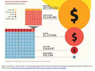
Rich Are the Superrich? A huge share of the nation's economic growth over the past 30 years has gone to the top one-hundredth of one percent, who now make an average of $27 million per household. The average income for the bottom 90 percent of us? $31,244. Note: The 2007 data (the most current) doesn't reflect the impact of the housing market crash. In 2007, the bottom 60% of Americans had 65% of their net worth tied up in their homes. The top 1%, in contrast, had just 10%. The housing crisis has no doubt further swelled the share of total net worth held by the superrich. Gilson, D., & Perot, C. (2011, April). It's the Inequality, Stupid: Eleven Charts that Explain Everything that's Wrong with America. Mother Jones. Retrieved from http://motherjones.com/politics/2011/02/income-inequality-in-america-chart-graph
Winners Take All The superrich have grabbed the bulk of the past three decades' gains. Gilson, D., & Perot, C. (2011, April). It's the Inequality, Stupid: Eleven Charts that Explain Everything that's Wrong with America. Mother Jones. Retrieved from http://motherjones.com/politics/2011/02/income-inequality-in-america-chart-graph
Out of Balance A Harvard business prof and a behavioral economist recently asked more than 5,000 Americans how they thought wealth is distributed in the United States. Most thought that it’s more balanced than it actually is. Asked to choose their ideal distribution of wealth, 92% picked one that was even more equitable. Gilson, D., & Perot, C. (2011, April). It's the Inequality, Stupid: Eleven Charts that Explain Everything that's Wrong with America. Mother Jones. Retrieved from http://motherjones.com/politics/2011/02/income-inequality-in-america-chart-graph