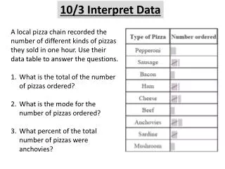
SPI 0807.Inq.3 : (Interpret Data)
Instructions 1) First click on "View" from the top-menu bar. 2) Then click on "Slide Show" from the drop-down menu. 3) Then use the right-arrow button on your keyboard to advance through this presentation. SPI 0807.Inq.3 : (Interpret Data). Notes. Science.

SPI 0807.Inq.3 : (Interpret Data)
E N D
Presentation Transcript
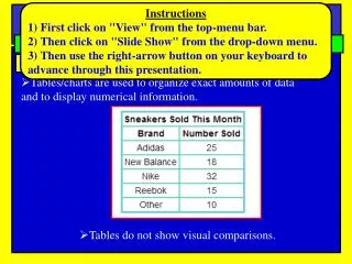
Instructions 1) First click on "View" from the top-menu bar. 2) Then click on "Slide Show" from the drop-down menu. 3) Then use the right-arrow button on your keyboard to advance through this presentation. SPI 0807.Inq.3: (Interpret Data) Notes Science Different types of charts, tables, and graphs Tables • Tables/charts are used to organize exact amounts of data and to display numerical information. • Tables do not show visual comparisons.
SPI 0807.Inq.3: (Interpret Data) Notes Science Different types of charts, tables, and graphs Pie Charts • A pie chart is a circular chart divided into sectors • Best used for comparing parts to a whole • The total amount should equal 100% • Works well for comparing 6 or fewer items, but more than • six items becomes difficult to view and interpret
SPI 0807.Inq.3: (Interpret Data) Notes Science Pie Charts: Examples
SPI 0807.Inq.3: (Interpret Data) Notes Science Different types of charts, tables, and graphs Bar Graph • Bar graphsare used to compare facts. The bars provide a visual display for comparing quantities in different categories • Bar graphs help us to see relationships quickly.
SPI 0807.Inq.3: (Interpret Data) Bar Graph: Example Notes Science • Example: A survey of student's favorite after-school activities was conducted at school The table shows the results • Note: Since the data is not changing over time, a line graph would not be best for displaying this data. A bar graph is better.
SPI 0807.Inq.3: (Interpret Data) Notes Science Different types of charts, tables, and graphs Line Graph • Line graphs are used to display data or information that changes continuously over time. • Line graphs allow us to see overall trends such as an increase or decrease in data over time.
SPI 0807.Inq.3: (Interpret Data) Line Graph: Example Notes Science