Intro to Stats
This guide provides an overview of frequency distributions in statistics, illustrating how to represent the frequency of scores. It outlines the steps for choosing class intervals, counting scores, and presenting the data in tables or figures. Additionally, it explains how to create histograms, frequency polygons, and other visual representations like bar graphs and line charts. The concepts of variability, skewness, and kurtosis are also discussed, enhancing the understanding of data distribution characteristics and trends.

Intro to Stats
E N D
Presentation Transcript
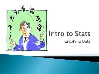
Intro to Stats Graphing Data
Frequency Distributions • Represents how often scores occur • Scores grouped into ranges of numbers • First, choose a class interval • Second, count the number of scores in each interval • Third, put the information in a table or figure
Choose a Class Interval • A range of numbers to be used in a frequency distribution 1. Select class intervals that have meaning (A,B, etc. for grades) and/or easily interpreted numbers (5,10,20) 2. Select interval that will allow 10-20 to cover all data 3. Start list with multiple of interval (e.g., 0) 4. Largest interval is placed at the top of the frequency distribution
Creating a Histogram • Visual representation of frequency distribution • The frequencies are the bars
Skewness • Measure of lack of symmetry(a long tail) • Positive or negative in the direction of the tail • Mean > Median, then positive skew • Mean < Median, then negative skew
Kurtosis • The flatness of the distribution • Platykurtic – flat relative to a bell • Leptokurtic – peaked relative to a bell
Column Charts / Bar Graph • Used to compare the frequency of different categories • Categories on X, frequency/number on Y
Line Charts / Line Graph • Used to show trends in the data