Optimizing web content for mobile/responsive design
Optimizing web content for mobile/responsive design. Eric Craypo Recreational Sports Matt Matsuoka University Relations Patrick McMahon Graduate Division. Introduction. Mobile internet use will continue to surge More than half of Facebook users are using mobile

Optimizing web content for mobile/responsive design
E N D
Presentation Transcript
Optimizing web content for mobile/responsive design Eric CraypoRecreational Sports Matt MatsuokaUniversity Relations Patrick McMahonGraduate Division
Introduction • Mobile internet use will continue to surge • More than half of Facebook users are using mobile • Mobile use is increasing at Berkeley
Mobile use at Berkeley • 577% increase mobile visits to newscenter.berkeley.edu compared to two years ago • This year: • 13% of visitors to Grad Division grad.berkeley.edu • 16% of visitors to the alumni network, cal.berkeley.edu • 20% of visitors to Rec Sports, recsports.berkeley.edu
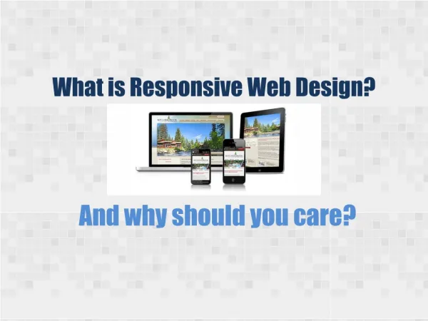
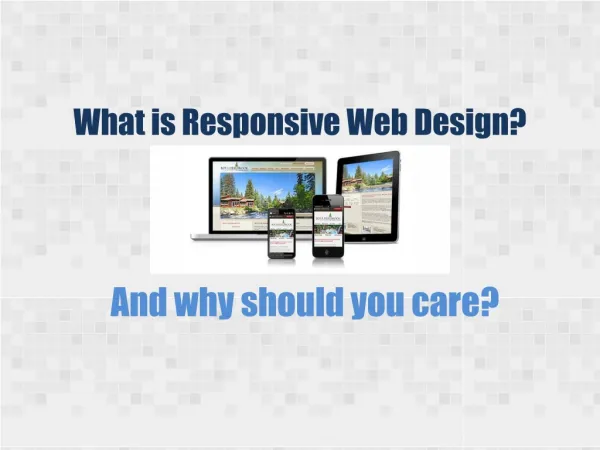
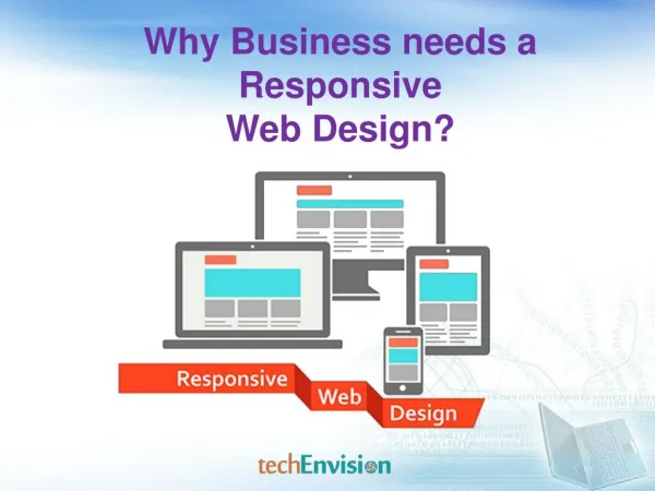
How can we better serve our increasingly mobile users? • Design: Build responsiveness into your websites and applications • Content: Think about content from a mobile first perspective
Design: Build responsiveness into your websites and applications
Content: Think about content from a mobile first perspective • A responsive website does not make responsive content • Curate your content down to its essential points • Consider the needs of the mobile user first
Deciding what to do and when to do it. • What can you do right now? • Test your website:http://responsinator.com • Use Google Analytics • CSS/HTML skills are needed to make a site responsive • Change what is not mobile friendly: Flash, hover states • Decide if you really need all those API bells and whistles • Read-up mobile content strategy, mobile first
What should you plan for the future? • Make changes during a site redesign • Leverage responsive themes for Drupal or Wordpress • Use a responsive framework such as Foundation CSS or Bootstrap • Consider Sec. 508 accessibility • Consider waiting for a responsive Berkeley template based on the new brand
Other topics • What about native apps? • What about HTML newsletters? • Questions? • Campus resources:http://ux.berkeley.eduhttp://webaccess.berkeley.edu • Resources:http://foundation.zurb.comhttp://twitter.github.io/bootstrap/http://screenqueri.eshttp://www.responsinator.com