
WHY BUSINESS NEEDS A RESPONSIVE WEB DESIGN?
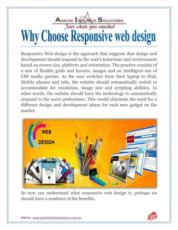
Responsive Web design is the approach that suggests design and development should respond to the user’s behavior and environment based on screen size, platform and orientation. Responsive means the website should have the technology to automatically respond to the user’s preferences for mobile devices and desktop resolutions.<br>Aim of responsive web design is easy reading and navigation with a minimum of resizing, panning, and scrolling—across a wide range of devices like different mobile devices and desktop screens. Spectrum of screen sizes and resolutions is increasing every day and creating website version for each device is not a practical approach. Responsive web design is collection of technology and ideas.

WHY BUSINESS NEEDS A RESPONSIVE WEB DESIGN?
E N D
Presentation Transcript
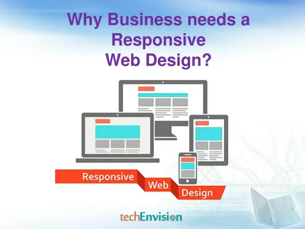
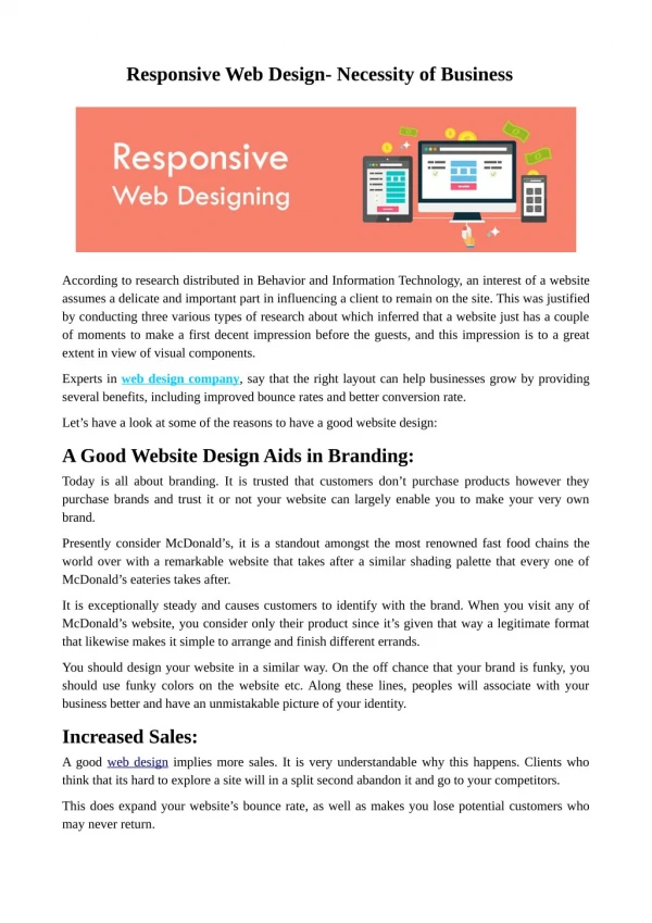
Why Business needs a Responsive Web Design?
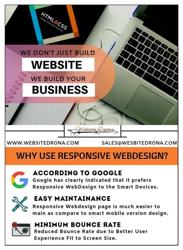
Responsive web design (RWD)is an approach to web design aimed at allowing desktop WebPages to be viewed in response to the size of the device one is viewing with like desktop computer monitor, a laptop, a 10-inch tablet, a 7-inch tablet, or a 4-inch Smartphone screen. Actually a Responsive Web design has become one of the hottest trends in 2013. This is due in part to the growth of Smartphone’s and other mobile devices. Now a day’s more people are using smaller-screen devices to view Web pages.
What Does Responsive Web Design Look Like? Let’s take a traditional “fixed” website. When viewed on a desktop computer, for instance, the website might show three columns. But when you view that same layout on a smaller tablet or on mobile, it might force you to scroll horizontally, something users don’t like. Or elements might be hidden from view or look distorted. The impact is also complicated by the fact that many tablets can be viewed either in portrait orientation, or turned sideways for landscape view.
What Does Responsive Web Design Look Like? On a tiny Smartphone screen, websites can be even more challenging to see. Large images may “break” the layout. Sites can be slow to load on Smartphone’s, if they have heavy graphics designs or images.However, if a site uses responsive design, the tablet version might automatically adjust to display just two columns. That way, the content is readable and easy to navigate. On a Smartphone, the content might appear as a single column, perhaps stacked vertically. Or possibly the user would have the ability to swipe over to view other columns. Images will resize instead of distorting the layout or getting cut off.
How Does Responsive Web Design Work? The key to responsive design is CSS, a design language that describes the formatting and look of an HTML web page. CSS refers to an external file that contains information on how a web page’s different elements (buttons, sidebars, menus, text and images, etc.) should be displayed.CSS saves developers time and energy by allowing them to create a limited number of style profiles, which can then be applied to all the pages of a website in one fell swoop.When it comes to mobile, CSS also includes “media queries,” which allow a web page to determine the size and screen resolution of the device you’re using to view it. The page can then apply the appropriate CSS profile, custom fitting the layout to your needs.
Why Small Businesses Need to Switch to Responsive Web Design? • More people are using mobile devices. As per survey over 400 million mobile internet users are in the India.Check your traffic and you might just be shocked at how many visitors are getting to your website through mobile devices. (In your Google Analytics, select “Audience” on the left side, then “Mobile” to see what proportion of traffic is from mobile devices. You can even drill down to see which devices are sending the traffic.)The growth will be led by the government’s Digital India initiative, collaboration among mobile Internet ecosystem stakeholders and innovative content and service offerings from mobile-based services players.
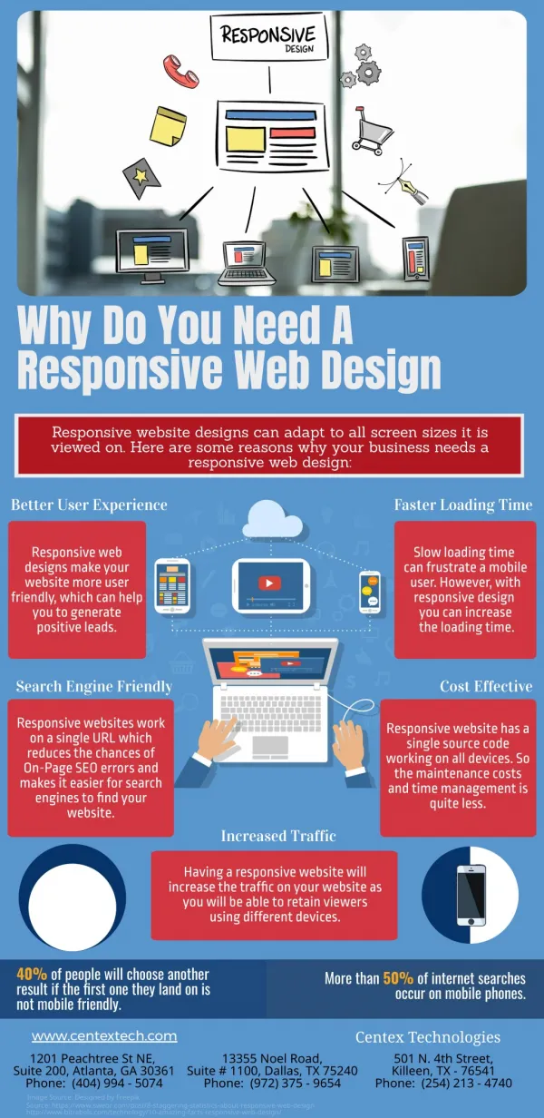
Some more features are listed below • 1. Reach more audienceIf you don’t offer your users or potential customers a good experience on the device of their choice, you may lose visitors or customers. On the other hand, if you make sure that the experience they will have on the various devices is good, you are more likely to retain them as visitors and later convert them to customers.
Some more features are listed below • 2. Your customers are already on mobile, stay in touch with themMost probably if you check your analytics, you will find out that already 10% – 40% of your visitors are coming from mobile/tablets and if you are not offering them a user friendly version you are losing customers. So, the added advantage of going responsive is that it will enable you to keep in touch with your customers and engage with them on every possible occasion.
3.SEO benefits from responsive designThere has been a long discussion in the SEO industry about responsive website and SEO. Some people say that it’s good for SEO; others believe that a responsive website is not the best solution for all businesses while Google is saying that having a responsive website is the recommended configuration for creating Smartphone optimized websites.In my opinion a responsive web site is good for SEO because: You have content published only once so there is no risk of getting into duplicate content issues. Any efforts you put on SEO for your desktop version are ‘automatically’ applicable for mobile as well.
- You are offering your mobile users an optimized version so you are more likely to rank higher on mobile search -It is recommended by Google – Although that does not mean that they will favor this method over the others, they do suggest that having a responsive website is the best practice. • 4. Increase conversions and earnings from adsBy going from a mobile friendly version to a responsive website you are more likely to increase conversions or earnings from ads. Migrating 3 Ad Sense websites to responsive design resulted in 20-30% increase in Ad Sense earnings compared to mobile friendly versions.
5. Stay in front of the competitionIt’s becoming an industry standard so by staying in synch you are a step closer to your competitors (or ahead if they are not following a responsive design). • 6. You are preparing now for the futureThe future of the web is mobile and it is estimated that by 2017 more than 5 billion people will use mobile phones. These are numbers and figures you cannot ignore and if you are not convinced that a responsive website can help your business now, it will certainly do in the next few years. • 7. Offer a consistent design across all devicesA responsive website can help you maintain a consistent design across devices rather than serving your users with a different set of pages for each type of device that may have a different look and feel.
We are a website design and development company in India. We can assist you with the help of digital marketing services & responsive web designs to get the more traffic for business growth. Please feel free to call us on – +91 9561770305 91 9860995414 You can write us on – info@techenvision.in Visit Us:- www.techenvision.in


