Color
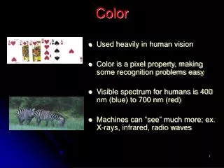
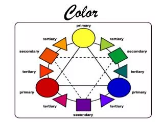
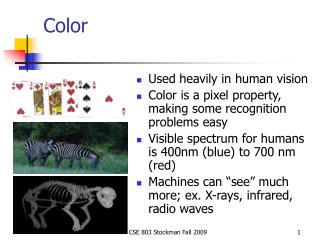
Color. Primary Colors: Red, Yellow and Blue. These are the colors that are used to mix every other color we can see. No other colors can be mixed to create primary colors. Secondary Color: Green, Orange and Violet. These are the colors you get by mixing primary colors together.

Color
E N D
Presentation Transcript
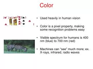
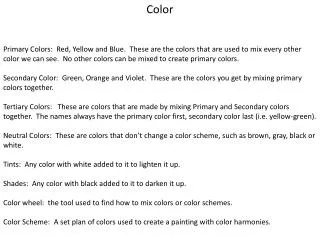
Color Primary Colors: Red, Yellow and Blue. These are the colors that are used to mix every other color we can see. No other colors can be mixed to create primary colors. Secondary Color: Green, Orange and Violet. These are the colors you get by mixing primary colors together. Tertiary Colors: These are colors that are made by mixing Primary and Secondary colors together. The names always have the primary color first, secondary color last (i.e. yellow-green). Neutral Colors: These are colors that don’t change a color scheme, such as brown, gray, black or white. Tints: Any color with white added to it to lighten it up. Shades: Any color with black added to it to darken it up. Color wheel: the tool used to find how to mix colors or color schemes. Color Scheme: A set plan of colors used to create a painting with color harmonies.
Color Schemes Monochromatic: color scheme that has 1 color with blacks and whites to create tints and shades. Complimentary: Color scheme that has two opposite colors on the color wheel (i.e. red and green) Triadic Color Scheme: Color scheme that uses 3 colors that make a perfect triangle (i.e. red, yellow, blue or green, orange and violet )
Warm Color Scheme: color scheme that uses only warm colors (Yellow through Red violet) Cool color Scheme: Color scheme that only uses cool colors (Violet to yellow green). Analogous Color Scheme: Color scheme that has 3-5 colors that are all next to each other on the color wheel (yellow to red, blue to yellow orange, Red to blue).
Unity and Composition Composition is how the Artist arranges their picture in order to control the way that the view looks at an image. The rule of thirds is a tool that an artist can use to plan out their composition by placing the focal points of their picture in the most ideal spot. Focal points should never be placed in the center of a compostion. The Focal Point is the center of interest of an image. Unity refers to how all of the different visual parts of a picture fits together. Unity can be achieved in three ways: Unity through repetition: Having the same shape repeated continuously throughout a picture. Unity through proximity: Having all of the same type of objects in a painting grouped closely together. Unity through continuation: Having a single line travel throughout the entire composition.
Balance and Contrast Contrast is a way that you can switch up the different visual elements of a picture so that everything doesn’t look the same. You can create contrast by: Having bright colors next to dull colors Having large shapes next to small shapes Having patterns next to flat values Having rough textures next to smooth textures. Balance is how you arrange the visual elements of your composition. There are 3 main types of balance that you can use. Symmetrical Balance: Also called Formal Balance. This happens when the visual elements are divided evenly between the right and left side of the picture. Asymmetrical Balance. This happens when the visual elements are all on one side of the picture. Radial Balance: This happens when the focal point of the picture is in the center of the composition, and everything radiates out from it (think of a bicycle wheel).
Art History Salvador Dali was a Spanish painter that was most famous for his work in the Surrealist style. Most well known for his dream like landscapes and melting figures, Dali worked in what he called the Paranoic Critical Method. Absract Art is a style of art that became popular in the beginning of the 20th Century. Abstract art is non-representational in nature, focusing on the use of line, shapes and patterns. Famous abstract artists include Pablo Picasso and Frank Stella. Sheppard Fairey is a modern day street artist that has become famous by making tonal portraits of various people. Fairey’s tonal paintings were original in that they use nothing but color in flat values to create the illusion of depth and form. Triptychs are a style of painting that originated during the Medieval times. They became very popular during the Renaissance as a way to decorate alters in churches. These three panel paintings were almost always religious in nature. Pop Art is an art movement that became Popular in the 1950’s through the artist Andy Warhol. Pop Art was different from classical art in that it focused upon popular culture as it’s subject matter, and was mass produced. Camouflage Art is an art movement that has become popular in the last 5 years. Artists camouflage different objects into different backgrounds, and them photograph the results.
Art Processes Under painting is an artistic process where the artist first paints a picture in nothing but neutral tones using a full range of values. First used with Oil Paints during the Renaissance, Under Painting allows the artist to create deeper amounts of contrast by layering up paint on top of the under painted areas. Gesso is a primer that you can put on top of any surface that you want to paint. Gesso soaks into the surface of the surface that is going to be painted on so that the colors of the paint you are using will be bright and evenly layered. Wet on wet is a watercolor technique where you paint wet watercolor on top of wet paper. Wet on dry is a watercolor technique where you paint wet watercolor on top of dry paper.