Download
1 / 12
120 likes | 324 Views
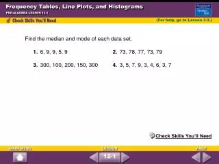
Objectives. Create stem-and-leaf plots. Create frequency tables and histograms. A stem-and-leaf plot arranges data by dividing each data value into two parts. This allows you to see each data value. Example1.

E N D
Objectives Create stem-and-leaf plots. Create frequency tables and histograms.
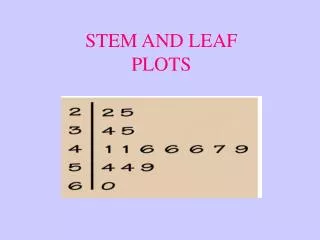
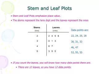
A stem-and-leaf plot arranges data by dividing each data value into two parts. This allows you to see each data value.
Example1 The numbers of defective widgets in batches of 1000 are given below. Use the data to make a stem-and-leaf plot. 14, 12, 8, 9, 13, 20, 15, 9, 21, 8, 13, 19
Example 2 The temperature in degrees Celsius for two weeks are given below. Use the data to make a stem-and-leaf plot. 7, 32, 34, 31, 26, 27, 23, 19, 22, 29, 30, 36, 35, 31
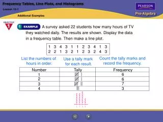
The frequency of a data value is the number of times it occurs. A frequency table shows the frequency of each data value. If the data is divided into intervals, the table shows the frequency of each interval.
Example 3 The numbers of students enrolled in Western Civilization classes at a university are given below. Use the data to make a frequency table with intervals. 12, 22, 18, 9, 25, 31, 28, 19, 22, 27, 32, 14
Example 4 The number of days of Maria’s last 15 vacations are listed below. Use the data to make a frequency table with intervals. 4, 8, 6, 7, 5, 4, 10, 6, 7, 14, 12, 8, 10, 15, 12
A histogram is a bar graph used to display the frequency of data divided into equal intervals. The bars must be of equal width and should touch, but not overlap.
Example 5 Make a histogram for the number of days of Maria’s last 15 vacations. 4, 8, 6, 7, 5, 4, 10, 6, 7, 14, 12, 8, 10, 15, 12
Cumulative frequency shows the frequency of all data values less than or equal to a given value. You could just count the number of values, but if the data set has many values, you might lose track. Recording the data in a cumulative frequency table can help you keep track of the data values as you count.
Example 6 The weights (in ounces) of packages of cheddar cheese are given below. 19, 20, 26, 18, 25, 29, 18, 18, 22, 24, 27, 26, 24, 21, 29, 19
Practice 1. The number of miles on the new cars in a car lot are given below. Use the data to make a stem-and-leaf plot. 35, 21, 15, 51, 39, 41, 46, 22, 28, 16, 12, 40, 34, 56, 25, 14 2. The numbers of pounds oflaundry in the washers at a laundromat are given below. Use the data to make a cumulative frequency table. 2, 12, 4, 8, 5, 8, 11, 3, 6, 9, 8 Use Range: 0-3, 4-7, 8-11, 12-15 3. Use the frequency table from Problem 2 to make a histogram.