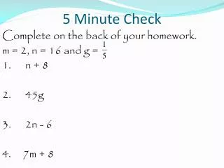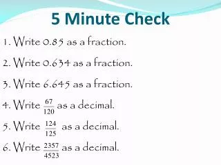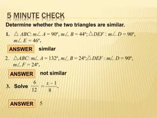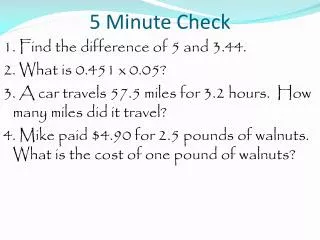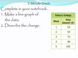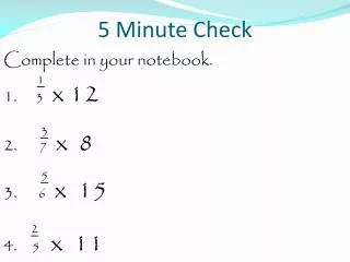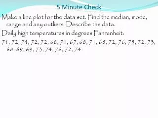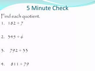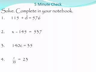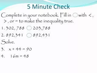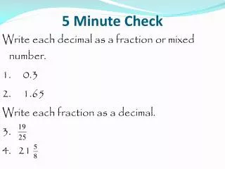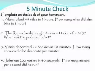
5 Minute Check
5 Minute Check. A double stem and leaf plot, where the stem is in the middle and the leaves are on either side, shows the high temperatures for two cities during the same week. Find the measures of center. Complete on homework. 5 Minute Check.


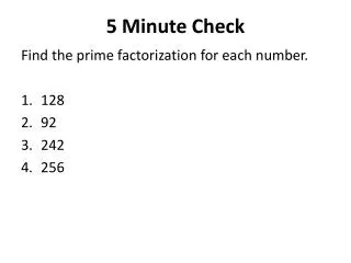
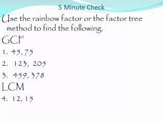
5 Minute Check
E N D
Presentation Transcript
5 Minute Check A double stem and leaf plot, where the stem is in the middle and the leaves are on either side, shows the high temperatures for two cities during the same week. Find the measures of center. Complete on homework.
5 Minute Check A double stem and leaf plot, where the stem is in the middle and the leaves are on either side, shows the high temperatures for two cities during the same week. Find the measures of center. Round to the tenth and complete on homework. Minneapolis - 20, 21, 23, 25, 34, 36, 43 Mean: 20+21+23+25+34+36+43 = 202÷7=28.9 Median: 25 Mode: none
5 Minute Check A double stem and leaf plot, where the stem is in the middle and the leaves are on either side, shows the high temperatures for two cities during the same week. Find the measures of center. Round to the tenth and complete on homework. Columbus - 25, 27, 29, 29, 37, 48, 62 Median: 25+27+29+29+37+48+62=257÷7=36.7 Median: 29 Mode: 29
Tueday, March 18 Chapter 12.1 Line Plots
Line Plots Objective: To construct and analyze line plots.
Line Plots At the end of this lesson you should be able to answer the following question. How is using a line plot useful to analyze data?
Line Plots A line plot is a visual display of a distribution of data values where each data value is shown a dot or other mark. Line plots are also known as dot plots.
Line Plots The results of a class survey are listed below. Make a line plot with the data. How to make a line plot. Step 1 – Draw a number line that includes all values in the data set.
Line Plots The results of a class survey are listed below. Make a line plot with the data. Since we have no values less than “0” or greater than “4”, these are the end points of the number line.
Line Plots The results of a class survey are listed below. Make a line plot with the data. How to make a line plot. Step 2 – Place an “x” above the value on the number line for each value in the data set.
Line Plots The results of a class survey are listed below. Make a line plot with the data. How to make a line plot. Step 3 – Label the line plot.
Line Plots The results of a class survey are listed below. Make a line plot with the data. Can you describe the data in this line plot?
Line Plots The results of a class survey are listed below. Make a line plot with the data. 24 member responded. No one has more than 4 pets and the most common number of pets is 2, which is the mode.
Line Plots A survey asked each 4-H member the number of project’s each is taking to the fair. Make a line plot with the data and describe the data in the graph. Do this on your own.
Line Plots A survey asked each 4-H member the number of project’s each is taking to the fair. Make a line plot with the data and describe the data in the graph. 15 members responded. No one is taking more than 5 projects and one member is not taking any projects. The most common answer is 2.
Line Plots You can also describe the data set using measures of center.
Line Plots The line plot shows the number of magazines each student council member sold. Find the median, mode, range and any outliers. Do this on your own.
Line Plots The line plot shows the number of magazines each student council member sold. Find the median, mode, range and any outliers. Median : 20 Mode : 20 Range : 25 – 17 = 8 Outliers : none
Line Plots Describe the data using the measures of center. Median : 20 Mode : 20 Range : 25 – 17 = 8 Outliers : none
Line Plots Describe the data using the measures of center. Median : 20 Mode : 20 Range : 25 – 17 = 8 Outliers : none 14 members sold magazines. A median of 20 indicates that about half the members sold less than this and about half sold more than this. A mode of 20 indicates more members sold this amount than any other.
Line Plots The line plot show the amount of money James deposited in his bank account each month. Describe the measures of center and variability. Do this on your own.
Line Plots The line plot show the amount of money James deposited in his bank account each month. Describe the measures of center and variability. 35, 35, 35, 40, 45, 45, 50, 50, 50, 50, 50, 75 Range: 75-35=40 Mode: 50 Median: 47.5 Q₁: 37.5 Q₃: 50 IQR: 50-12.5=12.5 Outlier: 75
Line Plots The line plot show the amount of money James deposited in his bank account each month. Describe the measures of center and variability. 35, 35, 35, 40, 45, 45, 50, 50, 50, 50, 50, 75 Range: 75-35=40 Mode: 50 Median: 47.5 Q₁: 37.5 Q₃: 50 IQR: 50-12.5=12.5 Outlier: 75 The median is 47.5 and the mode is 50, so the majority of the data is close to the measure of center. The IQR is 12.5, which indicates half the values are between 37.5 and 50. There is one outlier, 75.
Line Plots How is using a line plot useful to analyze data?
Line Plots Agenda Notes Homework– Homework Practice 12-1 Due Wednesday, March 19 Mid-Chapter Quiz – Thursday, March 20