Download
1 / 52
520 likes | 604 Views
Learn to create line graphs, interpret visual data displays, find measures of center, identify outliers, and describe data trends using graphs. Improve data analysis skills quickly.

E N D
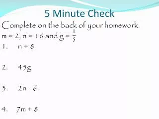
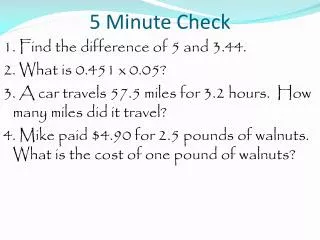
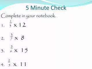
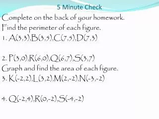
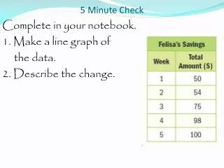
5 Minute Check Complete in your notebook. 1. Make a line graph of the data. 2. Describe the change.
5 Minute Check Complete in your notebook. 1. Make a line graph of the data. 2. Describe the change.
5 Minute Check Complete in your notebook. 1. Make a line graph of the data. 2. Describe the change. Her savings increased slowly for week 1 to 2, increased a lot for week 3and 4, and then slowed down for week 5.
Monday, March 24 Chapter 11/12 Review
Review Objective: To create and interpret visual displays of data.
Review At the end of this lesson you should be able to answer the following question. What are the advantages of graphs?
Review The line plot shows the ages of people in the local community play. Find the measures of center and any outliers, round to the nearest tenth. Describe the data.
Review The line plot shows the ages of people in the local community play. Find the measures of center and any outliers, round to the nearest tenth. Describe the data. Mean: 18.3 16, 16, 16, 17, 18, 18, 18, 19, 19, 20, 20, 20, 21
Review The line plot shows the ages of people in the local community play. Find the measures of center and any outliers, round to the nearest tenth. Describe the data. Mean: 18.3 Median: 18 16, 16, 16, 17, 18, 18, 18, 19, 19, 20, 20, 20, 21
Review The line plot shows the ages of people in the local community play. Find the measures of center and any outliers, round to the nearest tenth. Describe the data. Mean: 18.3 Median: 18 Mode: 16, 18, 20 16, 16, 16, 17, 18, 18, 18, 19, 19, 20, 20, 20, 21
Review The line plot shows the ages of people in the local community play. Find the measures of center and any outliers, round to the nearest tenth. Describe the data. Mean: 18.3 Median: 18 Mode: 16, 18, 20 Outliers: none Describe the data.
Review The line plot shows the ages of people in the local community play. Find the measures of center and any outliers, round to the nearest tenth. Describe the data. Describe the data. Thirteen people were in the play. The ages range from 16 to 21. Because there is no outlier, the mean will be a more accurate measure of center.
Review The line plot shows the price of sweaters in a store. Find the measures of center and any outliers, round to the nearest tenth. Describe the data.
Review The line plot shows the price of sweaters in a store. Find the measures of center and any outliers, round to the nearest tenth. Describe the data. Mean: 35 25, 25, 25, 25, 30, 30, 40, 40, 45, 65
Review The line plot shows the price of sweaters in a store. Find the measures of center and any outliers, round to the nearest tenth. Describe the data. Mean: 35 Median: 30 25, 25, 25, 25, 30, 30, 40, 40, 45, 65
Review The line plot shows the price of sweaters in a store. Find the measures of center and any outliers, round to the nearest tenth. Describe the data. Mean: 35 Median: 30 Mode: 25 25, 25, 25, 25, 30, 30, 40, 40, 45, 65
Review The line plot shows the price of sweaters in a store. Find the measures of center and any outliers, round to the nearest tenth. Describe the data. Mean: 35 Median: 30 Mode: 25 Outlier: 65 25, 25, 25, 25, 30, 30, 40, 40, 45, 65
Review The line plot shows the price of sweaters in a store. Find the measures of center and any outliers, round to the nearest tenth. Describe the data. Mean: 35 Median: 30 Mode: 25 Outlier: 65 Describe the data.
Review The line plot shows the price of sweaters in a store. Find the measures of center and any outliers, round to the nearest tenth. Describe the data. Describe the data. Ten people bought sweaters. The majority of the data is from $25 to $45. Because there is an outlier, the median will be a more accurate measure of center.
Review Describe the histogram.
Review Describe the histogram. 24 cyclists participated and no one finished With a time lower than 60 minutes.
Review Which interval has7 cyclists?
Review Which interval has 7 cyclists? 65-69 How many cyclists had a time of less than 70 minutes?
Review Which interval has 7 cyclists? 65-69 How many cyclists had a time of less than 70 minutes? 9 + 7 = 16
Review Describe the histogram.
Review About how many from both grades sold $600 or more?
Review About how many from both grades sold $600 or more? 6th Grade: 9 + 5 = 14 7th Grade: 7 + 3 = 10 24 students
Review Which grade had more students sell between $400 and $599?
Review Which grade had more students sell between $400 and $599? 6th Grade: 18 7th Grade: 16
Review Correlation of 6th Grade Cell Phone Use and Math Grades Describe the histogram. 0-19 20-39 40-59 60-79 80-99 minutes of cell phone use per day A B C D F Average math grade
Review Can you predict the winning time in 2012?
Review Can you predict the winning time in 2012? About 50 seconds.
Review Describe the graph.
Review Describe the graph. While the overall trend was in an increase in movie ticket sales from week 1 to 5, sales decreased from week 2 to 3.
Review Describe the graph.
Review Describe the graph. The overall trend is for the winning time to decrease, although it increased from 2009 to 2010.
Review Sometimes a double line graph is used to show two sets of data.
Review Describe the graph.
Review Describe the graph.
Review How much did housing prices increase?
Review What makes this graph misleading?
Review What makes this graph misleading?
Review What makes this graph misleading?
Review What makes this graph misleading?
Review What makes this graph misleading?
Review What makes this graph misleading?
Review What makes this graph misleading?
Review What makes this graph misleading?
Review Is there a purpose for creating a misleading graph?