Download
1 / 10
100 likes | 245 Views
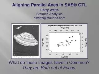
Aligning Parallel Axes in SAS® GTL. Perry Watts Stakana Analytics pwatts@stakana.com. What do these Images have in Common? They are Both out of Focus. Introduction. Instead defaults for two overlaid scatter plots are calculated independently in separate plotting statements:.

E N D
Aligning Parallel Axes in SAS® GTL Perry Watts Stakana Analytics pwatts@stakana.com What do these Images have in Common? They are Both out of Focus.
Introduction • Instead defaults for two overlaid scatter plots are calculated independently in separate plotting statements: layout overlay/ ...; scatterplot x=Height y=Weight/ xaxis=Xyaxis=Y; scatterplot x=HeightCM y=WeightKG / xaxis=X2yaxis=Y2; endlayout; • Using parallel axes is a good idea here. Only the USA, Myanmar and Liberia use the English System. Look at the unaligned gridlines While the Hubble telescope's focus problem was caused by an incorrectly ground mirror, we see double again with scatter plots from SASHELP.CLASS. The opposing axes for heights and weights are out of alignment. Unfortunately, Graph Template Language (GTL) does not have an Align=True|False axis option.
Aligning Axes for Heights and Weights: Fix #1 • Fix #1 is less than optimal. It is obvious that the fractional centimeters and kilograms are derived from integer inches and pounds. • Also each tick value for the metric version of heights and weights in this graph must be individually calculated and plotted with the TICKVALUELIST sub-option in GTL. Therefore Fix #1 can't be automated.
Aligning Heights and Weights: Fixes #2, #3 Fix #2 Fix #3 • All four axes contain whole numbers that are easy to read and compare. • Fix #2 can be automated since only thresholdMinand thresholdMaxhave to be set to zero. • Fix #3 is an improvement over Fix #2, but now customization is required with new minimum HEIGHTvalues along the Xand X2 axes.
How THRESHOLDMINand THRESHOLDMAX Work Height (Inches) Height (Centimeters) • ThresholdMin and ThresholdMaxcontrol the insertion of tick values along an axis. If thresholdMin=0 and thresholdMax=0, tick values areenclosed by data minimums and maximums. Parallel axes are aligned with value translations. • However, when thresholdMin=1 and thresholdMax=1, a reversal occurs; data minimums and maximums are enclosed by independently assigned tick values. Now the distance between minimum tick and initial data value is no longer fixed. Alignment is destroyed. • The default settings at thresholdMin=0.3 and thresholdMax=0.3 are unpredictable.
Add VIEWMINfor Fix #3 Height (Inches) Height (Centimeters) • By default ViewMinandViewMaxare set to data minimum and maximum values. However, ViewMin here is lowered to 50inches and to the equivalent 127 centimeters. Now left-most aligned tick values can be added to the plot. layout overlay/ ... Xaxisopts=(linearopts= (viewmin=50 thresholdMin=0 thresholdMax=0)) X2axisopts=(linearopts= (viewmin=127 thresholdMin=0 thresholdMax=0 ...)); ...; endlayout;
Additional Applications: Histogram of Baseball Data • Different bin heights in the first histogram reflect the presence of unaligned axes in the graph. ThresholdMin=0 and ThresholdMax=0 almost solves the problem. • However, ViewMaxis also required. It is obtained from an object data set that supplies the apex of the normal curve, the highest point on the graph. With a correct count for the apex, an equivalent percent can be calculated thereby bringing the graph back into alignment.
Additional Applications: Bar Chart of SASHELP.Heart • This time bar heights from the two BARCHART statements are staggered in the left-side chart with percent labels being crossed out. The solution is simpler than it was for the histogram in that there is no need to create an object data set. Instead, set Viewmaxto 40in the Y2 axis and to 0.40 X 5,199 subjects = 2079.6in the Y axis to correct the problem.
Additional Applications: Vector plot for Weather Chart • The two axes in this graph are brought into alignment by applying a solution similar to "Fix#1" shown earlier. Translations are made for every tick value from Celsius to Fahrenheit. Fortunately the translation results in whole numbers for both axes. An increase of 5° in Celsius results in a 9° increase in Fahrenheit after 32° is added. • A barchart statement cannot be used for the Fahrenheit axis, so two vectorplotstatements are used for the bars. The black outline is created with a barchartstatement that relies exclusively on Celsius coordinates.
Conclusion • While the presence of aligned parallel axes enhances a graph, the failure to define systems of measurement during project design and implementation can have disastrous consequences. Often cited is the Mars Climate Orbiter space probe that went silent in 1999. What happened? Lockheed Martin used English units of measurement whereas the NASA JPL team used the more conventional metric system to calculate key coordinates. Perry Watts Stakana Analytics pwatts@stakana.com SAS and all other SAS Institute Inc. product or service names are registered trademarks or trademarks of SAS Institute Inc. in the USA and other countries. ® indicates USA registration. Other brand and product names are registered trademarks or trademarks of their respective companies.