Analysis of Magnetic Field Dynamics and Density Distributions in Plasma Simulations
This study presents a detailed analysis of streamline traces of magnetic fields, highlighting areas of varying density in a plasma model. The magnetic field visualization utilizes fluid code outputs and analytical calculations to depict regions effectively, distinguishing between closed and open magnetic streamlines. The equilibrium density is outlined within specific ranges, and four distinct movies illustrate different scenarios of magnetic field interaction and density fluctuations. Observations reveal complex behaviors of magnetic dipoles under varying conditions, challenging initial expectations.

Analysis of Magnetic Field Dynamics and Density Distributions in Plasma Simulations
E N D
Presentation Transcript
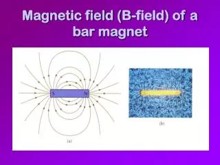
What You Are Looking At • You are looking at streamline traces of the magnetic fields (high – low ) (green – purple lines) along with the density at different points in space (high – low) (orange – blue dots). I have hidden the half of the space AWAY from the screen. • The magnetic field you are seeing has the output of the fluid code, where R > 1.5. It uses an analytical calculation (from our initial conditions) to fill in the region where R <= 1.5. Because of this, any video that shows streamlines entering the dipole will appear mostly purple… since the maximum B for those videos will be roughly 520. • The equilibrium density is this run is 10. I’m displaying densities in the regions: (0.5 – 8.5) & (12.5 – 20). • In the top right hand corner, is the axis. (+x,+y,+z) = (R,G,B) • At the bottom left corner, is the maximum and minimum values for B and Density. • At the top left corner is the Frame number. In this movie, I am displaying 1 frame for every 4 data snapshots.
4 Movies • Movie 1 (closed) • Depicts the closed B streamlines + density • Movie 2 (open 1) • Depicts the inward pointing open B streamlines + density • Both the ones bordering the closed streamlines AND the ones bordering the open streamlines • Movie 3 (open 2) • Depicts the outward pointing open B streamlines + density • Both the ones bordering the closed streamlines AND the ones bordering the open streamlines • Movie 4 (IMF) • Depicts the IMF streamlines + density
How were these streamlines chosen? I would walk from the origin to the edge of the simulation along radial spokes. At each point in my walk, I would draw a streamline. If the new streamline differed in topology from the previous streamline, I would save them both. After saving all of my ‘boundary streamlines,’ I would sort them into closed/open1/open2/imf. This movie has 40 spokes, stepping a distance of .01 along each radial line, before tracing/testing another streamline. It took roughly 30 minutes to generate these movies. I tried to generate a frame for every 2 data steps… the program ran out of memory and crashed after about 45 min of running.
How was the density done? • Monte Carlo. • Picked a point in space randomly, if it fit the window I was interested in, I saved it. • The space was R = 1.6 to the box edge
Basic Expectations • Initially density is constant • So, F = JxB Because I expect the field lines INSIDE of the separatrix to be stronger than those outside. I expect the net force to follow what the inner field lines say they should do… when there is a conflict. So, I kinda expect those rough flow regions. Green being slightly outward or a collision region between IMF & dipole. Yellow being a place where the dipole collapses inward FASTER than the IMF can collapse after it (since the force on the dipole lines is stronger).
First Video Look (click to run) You can see the basic side-view we looked at a second ago. At first glance, it looks like our basic expectations are wrong… because field lines appear to collapse inward on both sides of the upper dipole. (We expected it to only collapse in on the right)
Head on down the X-Axis But when I rotate the camera to look down the X-Axis… so that the dipole is pointed toward us. We see that in the Y=0 plane, our expectations are not met. The dipole holds its position, even though we expect it to collapse in. However, along the flanks of the top, it does collapse. On the bottom, where we anticipated all the forces to be either strongly or weakly outward. We see rapid collapse!
My (dumb) explanation for the Top • Consider this scenario: • If I take a bushel of copper wires, some short and some long and hang ornaments from their ends… like a Christmas tree. The longer wires will bend more than the shorter wires under the same load. • Likewise, if I apply the same load across the top of my dipole – the ‘long field lines’ will bend more than the ‘short field lines.’ Top View
My (dumb) explanation for the bottom • The question is – if there is an outward force on the edge of our closed dipole field, should the whole dipole bulge out? …Or should the skin of the dipole peel off and break away? • Well, if the skin peels off (and becomes open)… what we are witnessing is the receding line of what is left of the closed surface. Yes, the dipole has a receding hair line. Notice that the plasma density is high in the compression region. And it’s low across the bottom, where we expect an expansion. Except @ the hairline… we don’t see high/low density anywhere along that up/down line.
A look @ JxB : t = 0 The heads of the arrows are colored. Green = high force. Purple = low force. If you look at the borders of the sphere, you can see the radial components of the force much more clearly. These are plotted on the surface, R = 2.0
Side Views Our expectations match what we see. Outward Force :: up left and bottom right Inward Force :: up right and bottom left
Face on down the X-Axis The inward and outward flows are roughly the same size (bright green)… And seem pretty evenly distributed across the northern and souther crowns Yet… the resulting configuration is not so even.
Open Field Lines (top) Here are top views of the “Open Field” lines which form during the evolution of the system. The geometry becomes immediately clear. IMF field lines move into the space vacated by the collapsing compression regions. And expanding dipole fields (where the dipole surface was collapsing) break and become open lines. The system seems pretty symmetric about the Y-Plane.
Locks of hair (x-axis view) Here you can see pretty clearly – when the inner dipole recedes or is compressed inward, the vacant space inside of R = 2.0 is filled with Open field lines. I referred to these as pig-tails, because they sprout from the dipole like hair. The density changes seem to be mostly driven by the pair of compressed pig-tails… as opposed to the one which is filling the receding hairline.
The Wings What about these things? I’m not really sure… but when you look down the Y-Axis, you can see the inner dipole field lines trying to twist around to the IMF field lines. It makes a very pronounced ‘S’ shape.
The End This movie chooses random seeds in the system and traces the B-field from those seeds. (they drift). It gives a rough sketch of what the field lines look like… and it’s pretty quick to generate. Notice @ the end. The maximum B jumps quickly to 6.5 (from 4.5). In the twisted ‘S’ region. I’m thinking the crash has something to do with that region.