Download

1 / 24
240 likes | 477 Views
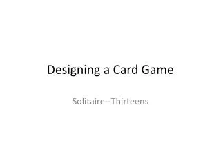
Designing a Business Card. How to Create One that Works Ms. Scales. Example of a BAD Business Card. Anatomy of a BAD Business Card. The color choice is a good one for a beauty salon. Red evokes cosmetics. The problem is everything is that color.

E N D
Designing a Business Card How to Create One that Works Ms. Scales
Anatomy of a BAD Business Card • The color choice is a good one for a beauty salon. Red evokes cosmetics. The problem is everything is that color. • The negative space on this card illustrates the total lack of focus and organization on this card.
Anatomy of a BAD Business Card • The lack of good alignment of elements on the business card distracts the eye from important elements. Likewise, lack of horizontal spacing disrupts the rhythm of the eye moving from one line to another. • The similar sizes of elements on the card confuses the eye where to start reading.
Reasons the New Card Works • Text Selection Mimics the shapes in the graphic providing unity.
Reasons the New Card Works • Text Selection Mimics the shapes in the graphic providing unity.
Reasons the New Card Works • Text aligns withelements in the graphic as a means of providing organization to the card. • Colors wereselected from thegraphic, which also adds unity.
Alternative Card Design • Alternative Design #2
Reasons the New Card Works • Elements in the graphic are used to advantage as repeats.
An Another Example of a Poor Design • The business cardfor this sleek, modern audiocompany does not give the sameimpression. • The card is static,heavy and its stylized appearance is opposed to the open airy look of their store.
Issues with this Design • The text has been pushed into a rectangular block. • This forces the spread of the letters to change from line to line. • This also “traps” space between some letters. • The blocky font does not match the logo. • The FX is unnaturally large.
Redesign Example 1 • The first remake gives the card more of the openspacious feel. • The FX fits better with the rest of the name. • White Space is dynamic and gives the card “light.” • The eye can locate information easier.
Redesign Example 1 • The block of text has been left aligned, which allows the eye to flow into the white space, rather than blocking it. • Lighting and separating the address from the persons name, gives the name more importance and gives the card a sense of calm and more seriousness.
Redesign Example 1 • The FX was also underwent a color change to lighter gray. • The lighter color again shifts its dominance and blends it better with the rest of the business name.
Redesign Example 1 • Spacing between individual elements as well are margins are consistent and add a sense of order.
Redesign Example 2 • This card has a strong focal point on each side. • The use of red for elements on both sides tie the two together and helps associate the employee’s name with the business. Front Back
Both Sides are Consistent • Commonalities between the two sides also allow them to work together. • The design was first constructed on the front of the card. • Then the spacing and alignments from the front were repeated on the back. Front Back
Redesign Version 3 • This versionof the card fulfills two purposes.It displays aproduct and identifies anemployee. Back Front
Design Features • The spacing on either side of the front logo is the same. • On the back the slightly offset position of the speaker adds tension to the design. • Notice that repeated elements even extend to the heights of the speakers on both each side of the card. Front Back Back
A Second Example of Using Repetition in a Business Card • The front and back of this card also illustrate the effective use of repetition in sizes of objects, color and font style. Back Front Back
Redesign Example 4 • In this version, the fields of color have been reversed. • Space does not have to be white. The emptiness of the field focuses the views eye on the main elements. • In both cases the focal point is off center, rising the “tension” in the design and making it more interesting. Front Back Back