Data Analysis for Physics: What do we do with all this data?
270 likes | 412 Views
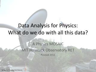
Data Analysis for Physics: What do we do with all this data?. A Physics MOSAIC MIT Haystack Observatory RET Revised 2011. Background Picture by Chris Clements. The Goal. Our goal in physics is to describe the physical world using as many means as possible. This includes… words data

Data Analysis for Physics: What do we do with all this data?
E N D
Presentation Transcript
Data Analysis for Physics:What do we do with all this data? A Physics MOSAIC MIT Haystack Observatory RET Revised 2011 Background Picture by Chris Clements
The Goal Our goal in physics is to describe the physical world using as many means as possible. This includes… words data graphs trends equation of best-fit/mathematical model “laws” In order to reach this goal, we need to be good observers of the physical world and careful collectors of data. In general, we use our carefully collected data to make a graph, which allows us to identify a trend, which we formalize with an equation (or mathematical model). With enough confirmation of a trend from repeated experiments from many physicists, this equation may be considered a “law.” DATA GRAPH TREND EQUATION LAW WORDS
MOSAIC MOSAIC stands for Mesospheric Ozone System for Atmospheric Investigations in the Classroom. MOSAIC data are collected by several small satellite dishes with electronics designed to make observations of the ozone located in Earth’s mesosphere. This is NOT the “good” ozone located in the stratosphere or the “bad” ozone located in the troposphere. The layers of the atmosphere are shown to the left. Ozone’s structure is shown below. Image from Wikipedia, public domain Image from NASA
Data at a Distance With the use of technology, the collection and analysis of data need not take place in the same physical place or even by the same group of people. The MOSAIC system for detecting mesospheric ozone is one example of data collected at a variety of sites and available for analysis by anyone via the internet. Image from Haystack www.haystack.mit.edu/ozone
Mesospheric Ozone Questions Things you (and many scientists) may not know about Mesospheric Ozone: (an incomplete list) What happens to it every day? Why can we detect it from Earth? What happens to it over the course of a year? How does mesospheric ozone get created and destroyed? What is the effect of solar activity on mesospheric ozone? What causes the seasonal variation in the mesospheric ozone concentration? What happens to mesospheric ozone over the poles, where the length of day and night is much more extreme? Do tides affect the mesospheric ozone? How does mesospheric temperature provide clues as to climate trends on Earth? The answer to these questions (and others like it) will be discovered, at least in part, through the graphing and subsequent analysis of data.
Questions without Answers Most of the experiments completed in Physics class have a well defined and accepted answer. For the most part, you investigate theories and laws that are well-verified by generations of students and scientists before you. This is not always the case, of course. When Newton did his experiments, there were no “Newton’s Laws” to consult and with which to check his answers. Similarly, when scientists today conduct experiments, they often do not know what the “accepted value” for their findings is. MOSAIC is a great example of an experiment without an accepted value. Image by SKMay
Making a Graph: Independent and Dependent Variables • This lesson assumes an existing knowledge of measurement and uncertainty, including error bars and standard deviation. See “Numbers in Science” for some thoughts of what constitutes “carefully collected data.” • Once data are carefully collected, you will need to decide how to plot your data. • What is the independent (x-axis) and dependent (y-axis) variable in these data? This may or may not be obvious, depending on the nature of the data. For example, MOSAIC data may be plotted with an independent variable of time or frequency. In either case, some measure of ozone signal strength is the dependent variable. • The independent variable is usually the quantity being changed by the experimenter over the course of the experiment. If time is one of the variables, it usually is the independent variable, since data is collected over a sequence of times. • The dependent variable is usually the quantity being measured, or the observed result of the change in the independent variable.
Examples: Determining Independent, Dependent Variables Identify the Independent and Dependent variables in each of the following. Photo by StuSeeger on Flickr, Creative Commons Photo by Mason Masteka on Flickr, Creative Commons Bethany records how many shots she makes from 5 different locations on the court. Photo by SKMay Gustavo records how many pages he reads and how much television he watches each day. Bill records his weight every morning.
Making a Graph: Labeling and Scale of Axes What scale for the axes makes sense? This will depend on the values for both independent and dependent variables. If Excel (or some other graphing program) is being used, this decision will likely be made automatically. Keep in mind, though that if the data covers a very large range (different by factors of 10), a logarithmic scale may make sense, and this will NOT be introduced automatically by Excel. Regardless of the scale, axes must be labeled with both the variable and its units.
Identifying Trends The relationship between two variables is often the first clue of the physical law or laws at work in an experiment. Identifying these relationships and expressing them in words is an important part of physics. Specifically, you should be very comfortable identifying the following relationships between variables: DIRECT: the two variables are proportional. If one is doubled, the other is doubled. INDIRECT: the two variables are inversely proportional. If one is doubled, the other is halved. QUADRATIC : one variable is proportional to the square of the other variable. If one variable is doubled, the other is quadrupled. INVERSE SQUARE: one variable is inversely proportional to the square of the other variable. If one variable is doubled, the other is quartered.
Identifying a Trend Once your data is graphed, you will want to identify any trends that are apparent in the data. This can often be qualitatively determined with just a cursory glance at the data. To be quantitative, we will use computing power to identify the equation that best describes the data. Appears to be linear; distance increases linearly with time. Or, there is a DIRECT relationship between distance and time. Not linear; decibels increase as intensity increases, but at what seems to be a decreasing rate. From just this graph it isn’t clear what the exact relationship is, but it looks like it might be logarithmic.
Rationale for Trendline Once the data is graphed, there are many good reasons to “fit” the data to an line (or curve) of best-fit. The equation of this best-fit line or curve is sometimes called the mathematical model for the data. Insight into general relationships: you may discover (or verify) a relationship between variables that is generally true in a variety of situations. Insight into physical quantities not measured: The equation of best fit often provides includes parameters that correspond to physical properties of the system not directly observed. Inferences: Using the equation of best fit, you can solve for a value for your dependent variable for a value of the independent variable not observed through a trial. When this interference takes place between observed data points, it is interpolation. When it takes place outside of the data points, it is extrapolation. BEWARE: you must consider whether your equation of best fit is valid for the range of data being inferred, especially for extrapolation.
Fitting a Trendline: Basics It will be necessary to have a hypothesis (based on physics or a cursory analysis of the data) as to what type of relationship exists between the variables before you start fitting. To use a graphing program (or calculator) to produce the trendline (and accompanying equation) you first need to input what form you expect the trendline to take. This form will have at least one (often two or three) parameters that are unknown. EXAMPLE: the form for a linear equation is y = mx + b. Because y and x represent the dependent and independent variables, the parameters that need to be fit in this equation are m (the slope) and b (the y-intercept). BEWARE: the more parameters the software is allowed to adjust, the better the fit will be, but this does NOT necessarily correspond to any physical situation. Next, you will allow the software to “fit” the data, finding the “best” values of the unknown parameters. The software does this by trial and error, changing the parameters slightly, computing the residuals (more on this to come), and repeating until the residuals are a minimum.
Residuals The residual for any data point is the difference between it and the value predicted by the best-fit equation. When a best fit line (or curve) is created, the average* of the magnitude of the residuals for all data points is minimized. Excel (and most other software that creates trendlines) will also compute some number that describes the closeness of the fit. For Excel, this is the R2 value. An R2 value of 1 means that all data points lie exactly along the trendline. If you compute the slope and intercept “by hand,” you can compute the uncertainty associated with each. The blue dots represent data points, while the red line represents the line of best fit. Note the residuals, represented by the length of the blue lines extending from the data points to the best fit line. * Technically, it is usually the RMS of the residuals that is minimized, or the square root of the mean of the square of the errors. Image from VSRT Memo #59, V. Fish
More on Fitting a Trendline: Formulas In order to find a linear equation of best fit (form is y = mx + b) for a set of data, we will want to employ the following formulas to minimize the residuals. In these formulas, x and y refer to the actual data, n refers to the number of data points, s is the standard error of the residuals, and Dm is the standard uncertainty associated with the slope.
Example: Fitting a Trendline with Formulas Here is an example of using Excel to find the slope, intercept, and associated uncertainty via the formulas given on the previous slide. While the slope and intercept could be more easily obtained by simply plotting the data and fitting a curve in Excel, this method allows the uncertainty associated with the slope to be calculated. Raw Data Goes Here
Example: Fitting a Trendline with Formulas, Continued The best fit linear trendline for this set of data is y = 164 (± 8.1) x – 0.513.
Four Trends in Graphical Form Trend: DIRECT Trendline: Linear Equation Form: y = mx + b Trend: INDIRECT Trendline: Hyperbolic (Power) Equation Form: y = k/x + b Trend: QUADRATIC Trendline: Parabolic (Power) Equation Form: y = ax2 + b Trend: INVERSE SQUARE Trendline: Inverse Quadratic Equation Form: y = c/x2 + b
More Examples For the distance vs. time graph, a linear fit is selected and fit to the data. Excel finds a slope of 164 and a y-intercept of -.51 provide the best fit to the data. What does the slope represent, physically? What are the units of the slope? For the decibels vs. intensity graph, a logarithmic fit is selected to fit the data. Excel finds a coefficient of 4.5 and an intercept of 122 provide the best fit for the data.
Example: Clarity in Variables Because x and y represent physical quantities that have been measured, it is often useful to write the equation of your trendline not in terms of x and y but in terms of the symbols associated with the quantities being graphed. For example,
Example: What NOT to do With a polynomial of order 5, Excel is able to fit 6 different parameters, resulting in a nearly perfect fit. This does NOT provide any useful scientific insight to the system, however. What would these constants represent, physically?
Example: Use Common Sense Here, I have fit an exponential trend to our data for distance vs. time. The fit, as demonstrated by the R2 value of 0.9588, isn’t bad. BUT--- consider what will happen for large values of time. Does this make sense? Picture extending the curve drawn in the graph below. Does it approximate the continuation of the data collected?
Cyclic Trends without Trendlines When the data being graphed is cyclic (repeats itself with a predictable period), it often will not have a trendline that is easily fit associated with it. Instead, the following parameters are often extracted by looking at the data: Period of cycle Amplitude of the cycle (difference between highest or lowest points and the midpoint) Changes in the amplitude (cycles?) Example: Temperature Data from Bedford, MA (2003- 2010) Data from www.wunderground.com Example: Sunspot Cycle (1610 – 1976) Image from NASA
Cyclic Trends: Ambiguity Of course, the inherent uncertainty in the data will lead to uncertainty in the equation. There may be times the trend is ambiguous and therefore uncertain. In these cases, you should consider each trend in relation to the errors. Error bars are useful for this. (See “Numbers in Physics” for more on error bars.) This is demonstrated with MOSAIC data for 2009 below. Is this evidence of a seasonal variation in mesospheric ozone concentrations? What other data would you want to see to confirm or deny your conclusion?
Observing Cyclic Trends Scientists agree that in order to conclude a cyclic trend exists, you must observe two full cycles. Does the mesospheric ozone data have a seasonal variation?
Observing Cyclic Trends Another trend to consider is the effect of the day/night cycle on mesospheric ozone production. Data for one week is graphed below. Is there a cyclic trend? How could you reduce the noise and make the trend more clear?
Observing Cyclic Trends by Averaging Once the period of the trend you are interested in observing has been determined by identifying two full cycles, it is often useful to average data from many cycles to more easily characterize the size of the fluctuation. Note that any information about cycle to cycle variation is lost with the averaging.