Download
1 / 13
130 likes | 637 Views
Exploratory Data Analysis is a method of examining and understanding data using multiple techniques like visualization, summary statistics and data transformation to abstract its core characteristics. EDA is done to get a sense of data and discover any potential problems or issues which need to be addressed and is generally performed before formal modeling or hypothesis testing.

E N D
Exploratory Data Analysis - A Comprehensive Guide to EDA leewayhertz.com/what-is-exploratory-data-analysis In today’s data-driven world, the ability to effectively analyze data is a key factor in the success of many enterprises. By leveraging data analysis tools and techniques, businesses can gain insights, identify trends, and confidently make informed decisions based on their data, improving efficiency and gaining an edge in the highly competitive business landscape. Exploratory data analysis (EDA), which is a preliminary method used for interpreting data before undertaking any formal modeling or hypothesis testing, is one of the most crucial procedures involved in data analysis. Exploratory Data Analysis is the process of detailing the key features of a dataset, frequently employing visual techniques. It entails exploring and analyzing data to comprehend its underlying patterns, connections and trends. EDA is important because it helps identify any issues or anomalies in the data that could affect the reliability of the subsequent analysis. Many industries benefit from EDA, including finance, healthcare, retail, and marketing, since it serves as a foundation for data analysis, pinpoints potential shortcomings in the data, and provides insightful analysis of customer behavior, market trends and business performance. In data analysis, EDA can assist data analysts in identifying missing or incomplete data, outliers and inconsistencies that can impact the statistical analysis of data. Conducting an EDA can also help determine which variables are crucial to explaining the outcome variable 1/13
and which ones can be excluded. Hence, EDA often serves as the first step in developing a data model because it provides insights into the characteristics of the data. In this article, we will explore EDA and its importance, process, tools, techniques and more. What is Exploratory Data Analysis (EDA)? Importance of EDA in data science EDA methods and techniques The EDA process Types of EDA techniques Visualization techniques in EDA Exploratory data analysis tools What is Exploratory Data Analysis (EDA)? EDA or Exploratory Data Analysis is a method of examining and understanding data using multiple techniques like visualization, summary statistics and data transformation to abstract its core characteristics. EDA is done to get a sense of data and discover any potential problems or issues which need to be addressed and is generally performed before formal modeling or hypothesis testing. It aims to identify patterns, relationships, and trends in the data and use this information to facilitate further analysis or decision-making. Data of different types, including numerical, categorical and text, can be analyzed using EDA. It is typically done before data analysis to identify and correct the errors in data and visualize the key attributes of the data. 2/13
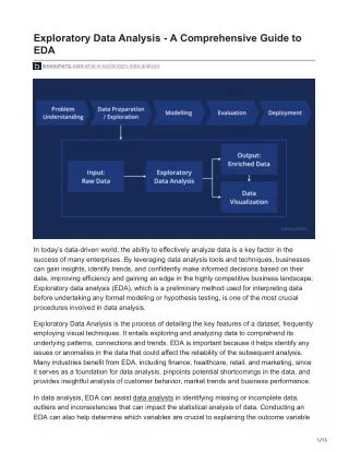
Business Question/ Problem Data Collection & Storage Business Decision EDA Data Data Analysis Visualisation & Storytelling LeewayHertz EDA is a scientific approach to understanding the storing of data. Data scientists can use it to discover patterns, spot anomalies, test hypotheses, or verify assumptions by manipulating data sources effectively. Importance of EDA in data science Exploratory data analysis is an important phase in the data science process because it enables data scientists to comprehend the data they are working with on a deeper level. Let us find out why EDA is important in data science by defining its objectives: 1. Conducting an EDA can confirm if the collected data is practicable in the context of the business problem at hand. If not, the data or the strategy adopted by the data analysts needs to be changed. 2. It can reveal and resolve data quality issues, like duplicates, missing data, incorrect values and data types and anomalies. 3. Exploratory data analysis plays a vital role in extracting meaningful insights from data by revealing key statistical measures such as mean, median, and standard deviation. 3/13
4. Oftentimes, some values deviate significantly from the standard set of values; these are anomalies that must be verified before the data is analyzed. If unchecked, they can create havoc in the analysis, leading to miscalculations. As such, one of the objectives of EDA is to locate outliers and anomalies in the data. 5. EDA unveils the behavior of variables when clubbed together, assisting data scientists in finding patterns, correlations, and interactions between these variables by visualizing and analyzing the data. This information is helpful in creating AI models. 6. EDA helps find and drop unwanted columns and derive new variables. It can, thus, assist in determining which features are most crucial for forecasting the target variable, assisting in the choice of features to be included in modeling. 7. Based on the characteristics of the data, EDA can assist in identifying appropriate modeling techniques. EDA methods and techniques Some of the common techniques and methods used in Exploratory Data Analysis include the following: Data visualization Data visualization involves generating visual representations of the data using graphs, charts, and other graphical techniques. Data visualization enables a quick and easy understanding of patterns and relationships within data. Visualization techniques include scatter plots, histograms, heatmaps and box plots. Correlation analysis Using correlation analysis, one can analyze the relationships between pairs of variables to identify any correlations or dependencies between them. Correlation analysis helps in feature selection and in building predictive models. Common correlation techniques include Pearson’s correlation coefficient, Spearman’s rank correlation coefficient and Kendall’s tau correlation coefficient. Dimensionality reduction In dimensionality reduction, techniques like principal component analysis (PCA) and linear discriminant analysis (LDA) are used to decrease the number of variables in the data while keeping as many details as possible. Descriptive statistics It involves calculating summary statistics such as mean, median, mode, standard deviation and variance to gain insights into the distribution of data. The mean is the average value of the data set and provides an idea of the central tendency of the data. The median is the mid- 4/13
value in a sorted list of values and provides another measure of central tendency. The mode is the most common value in the data set. Clustering Clustering techniques such as K-means clustering, hierarchical clustering, and DBSCAN clustering help identify patterns and relationships within a dataset by grouping similar data points together based on their characteristics. Outlier detection Outliers are data points that vary or deviate significantly from the rest of the data and can have a crucial impact on the accuracy of models. Identifying and removing outliers from data using methods like Z-score, interquartile range (IQR) and box plots method can help improve the data quality and the models’ accuracy. The EDA process Conducting EDA requires expertise in multiple tools and programming languages. In the example below, we would perform EDA using Python on the open-source web application, Jupyter Notebook. The EDA process can be summed up in three steps, which are: 1. Understanding the data 2. Cleaning the data 3. Analysis of the relationship between variables Let us understand the process of Exploratory Data Analysis (EDA) step-by-step: Understanding the data Import necessary libraries The first step is to import the required libraries. In this code block, the Pandas library is used to read and manipulate data and the Pandas-profiling library is used for EDA. The datasets module from the scikit-learn library is used to load the Iris dataset. import pandas as pd import pandas_profiling from sklearn import datasets Loading the dataset 5/13
Next, we have to load the dataset. Here, we will be using the multivariate dataset named the Iris dataset. iris = datasets.load_iris() Converting to Pandas DataFrame The scikit-learn dataset is loaded as a Bunch object, similar to a dictionary. To use this dataset with Pandas, we must convert it to a Pandas DataFrame. iris_data = pd.DataFrame(iris.data, columns=iris.feature_names) iris_data['target'] = iris['target'] Checking data attributes It is always a good approach to check the attributes of the data, like its shape or the number of rows and columns in the dataset. To check the shape of the data, run the following code: iris_data.shape To check the column names of the DataFrame, we use the columns attribute. iris_data.columns If your dataset is big, you can view the first few records of the DataFrame by running the below code: iris_data.head() Cleaning the data Once you are done with scanning the attributes of the data, you can make any necessary modifications in the dataset, like changing the name of the columns or the raws. Remember not to change the dataset’s variables, which can significantly impact the final result. Check for null values To clean the data, first, you must check for any null values in the variables. If any of the variables in a dataset have null values, it can affect the analysis results. If your dataset has missing data, handle them through approaches like imputation, deletion of observations or variables, or using models that can handle missing data. Dropping the redundant data and removing outliers Next, if you find any redundant data in your dataset that does not add value to the output, you can also remove them from the table. All the columns and rows are important in the iris dataset we have taken. So we would not be dropping the data. In this step, we must also find 6/13
any outliers in the data. Analysis of the relationship between variables The final step in the process of EDA is to analyze the relationship between variables. It involves the following: Correlation analysis: The analyst computes the correlation matrix between variables to identify which variables are strongly correlated with each other. Visualization: The data analyst creates visualizations to explore the relationship between variables. This includes scatter plots, heatmaps, etc. Hypothesis testing: The analyst performs statistical tests to test hypotheses about the relationship between variables. Run the following code to generate a report that includes various relationship analyses between variables. pandas_profiling.ProfileReport(iris_data) You can view the output of the above code from this Github repository. Types of EDA techniques Several types of exploratory data analysis techniques can be used to gain insights into data. Some common types of EDA include: Univariate non-graphical Univariate non-graphical exploratory data analysis is a simple yet fundamental method for examining information that includes utilizing only one variable to analyze the data. Univariate non-graphical EDA focuses on figuring out the underlying distribution or pattern in the data and mentions objective facts about the population. This procedure includes the examination of the attributes of the population distribution, including spread, central tendency, skewness and kurtosis. An average or middle value of a distribution is called the central tendency. A common measure of central tendency is the mean, followed by the median and mode. As a measure of central tendency, the median may be preferred if the distribution is skewed or concerns are raised about outliers. Spread shows how far off the information values are from the central tendency. The standard deviation and variance are two valuable proportions of the spread. The variance is the mean of the square of the individual deviations, and the standard deviation is the foundation of the variance. 7/13
Skewness and kurtosis are two more helpful univariate descriptors of the distribution. Skewness is a metric of the asymmetry of the distribution, while kurtosis is a proportion of the peakedness of the distribution contrasted with an ordinary dispersion. Outlier detection is also important in univariate non-graphical EDA, as outliers can significantly impact the distribution and distort statistical analysis results. Multivariate non-graphical Multivariate non-graphical EDA is a technique used to explore the relationship between two or more variables through cross-tabulation or statistics. It is useful for identifying patterns and relationships between variables. This analysis is particularly useful when multiple variables exist in a dataset, and you want to see how they relate. Cross-tabulation is a helpful extension of tabulation for categorical data. Cross-tabulation is preferable when there are two variables involved. To do this, create a two-way table with column headings corresponding to the number of one variable and row headings corresponding to the number of the other two variables. Next, fill the counts with all subjects with the same pair of levels. We produce statistics for quantitative variables individually for each level of each categorical variable and one quantitative variable, and then we compare the statistics across all categorical variables. The purpose of multivariate non-graphical EDA is to identify relationships between variables and understand how they are related. Examining the relationship between variables makes it possible to discover patterns and trends that may not be immediately obvious from examining individual variables in isolation. Univariate graphical A univariate graphical EDA technique employs a variety of graphs to gain insight into a single variable’s distribution. These graphical techniques enable us to gain a quick understanding of shapes, central tendencies, spreads, modalities, skewnesses, and outliers of the data we are studying. The following are some of the most commonly used univariate graphical EDA techniques: 1. Histogram: This is one of the most basic graphs used in EDA. A histogram is a bar plot that displays the frequency or proportion of cases in each of several intervals (bins) of a variable’s values. The height of each bar represents the count or proportion of observations that fall within each interval. Histograms provide an intuitive sense of the shape and spread of the distribution, as well as any outliers. 8/13
2. Stem-and-leaf plots: A stem-and-leaf plot is an alternative to a histogram that displays each data value along with its magnitude. In a stem-and-leaf plot, each data value is split into a stem and leaf, with the stem representing the leading digits and the leaf representing the trailing digits. This type of plot provides a visual representation of the data’s distribution and can highlight features such as symmetry and skewness. 3. Boxplots: Boxplots, also known as box-and-whisker plots, provide a visual summary of the distribution’s central tendency, spread and outliers. The box in a boxplot represents the data’s interquartile range (IQR), with the median line inside the box. The whiskers extend from the box to the smallest and largest observations within 1.5 times the IQR from the box. Data points outside of the whiskers are considered outliers. 4. Quantile-normal plots: A quantile-normal plot, also known as a Q-Q plot, assesses the data distribution by comparing the observed values to the expected values from a normal distribution. In a Q-Q plot, the observed data is plotted against the quantiles of a normal distribution. The points should lie along a straight line if the data is normally distributed. If the data deviates from normality, the plot will reveal any skewness, kurtosis, or outliers. Multivariate graphical A multivariate graphical EDA displays relationships between two or more data sets using graphics. When examining relationships between variables beyond two, this technique is used to gain a more comprehensive understanding of the data. A grouped barplot is one of the most commonly used multivariate graphical techniques, with each group representing one level of one variable and each bar representing its amount. Multivariate graphics can also be represented in scatterplots, run charts, heat maps, multivariate charts, and bubble charts. Scatterplots are graphical representations displaying the relationship between two quantitative/numerical variables. It consists of plotting one variable on the x-axis and another on the y-axis. On the plot, each point represents an observation. Scatterplots make it possible to identify outliers or patterns in the data and the direction and strength of the relationship between any two variables. A run chart is a line graph that shows how data changes over time. It is a simple but powerful tool for tracking changes and monitoring trends in data. Run charts can be used to detect trends, cycles, or shifts in a process over time. A multivariate chart illustrates the relationship between factors and responses. It is a type of scatterplot that depicts relationships between several variables simultaneously. A multivariate chart depicts the relationship between variables and identifies patterns or clusters in the data. 9/13
Bubble chart is a data visualization that displays multiple circles (bubbles) in a two- dimensional plot. The size of each circle represents a value of a third variable. Bubble charts are often used to compare data sets with three variables, as they provide an easy way to visualize the relationships between these variables. Visualization techniques in EDA Scatterplot Histogram Heatmap Bar Chart 1.2 600 25 1.0 5 500 20 0.8 4 400 0.6 15 300 3 0.4 200 10 2 0.2 100 5 1 0.0 0 1 2 3 4 5 0 -0.2 -3 -2 -1 0 1 2 3 -0.2 0.0 0.2 0.4 0.6 0.8 1.0 1.2 Line Chart Boxplot Pie Chart Bubble Chart 50 100 100 90 45% 40 80 80 18% 70 30 60 60 50 20 35% 68% 40 30 40 10 20 18% 10 20 0 10 20 30 40 50 0 JAN FEB MAR APR MAY JUN Jan 2015 Jan 2016 Jan 2017 Jan 2018 LeewayHertz Visualization techniques play an essential role in EDA, enabling us to explore and understand complex data structures and relationships visually. Some common visualization techniques used in EDA are: 1. Histograms: Histograms are graphical representations that show the distribution of numerical variables. They help understand the central tendency and spread of the data by visualizing the frequency distribution. 2. Boxplots: A boxplot is a graph showing the distribution of a numerical variable. This visualization technique helps identify any outliers and understand the spread of the data by visualizing its quartiles. 3. Heatmaps: They are graphical representations of data in which colors represent values. They are often used to display complex data sets, providing a quick and easy way to visualize patterns and trends in large amounts of data. 4. Bar charts: A bar chart is a graph that shows the distribution of a categorical variable. It is used to visualize the frequency distribution of the data, which helps to understand the relative frequency of each category. 10/13
5. Line charts: A line chart is a graph that shows the trend of a numerical variable over time. It is used to visualize the changes in the data over time and to identify any patterns or trends. 6. Pie charts: Pie charts are a graph that showcases the proportion of a categorical variable. It is used to visualize each category’s relative proportion and understand the data distribution. Exploratory data analysis tools Spreadsheet software Due to its simplicity, familiar interface and basic statistical analysis capabilities, spreadsheet software such as Microsoft Excel, Google Sheets, or LibreOffice Calc is commonly used for EDA. Using them, users can sort, filter, manipulate data and perform basic statistical analysis, like calculating the mean, median and standard deviation. Statistical software Specialized statistical software such as R or Python and their various libraries and packages offer more advanced statistical analysis tools, including regression analysis, hypothesis testing, and time series analysis. This software allows users to write customized functions and perform complex statistical analyses on large datasets. Data visualization software Visualization software like Tableau, Power BI, or QlikView enables users to create interactive and dynamic data visualizations. These tools help users to identify patterns and relationships in the data, allowing for more informed decision-making. They also offer various types of charts and graphs, as well as the ability to create dashboards and reports. The software allows data to be easily shared and published, making it useful for collaborative projects or presentations. Programming languages Programming languages such as R, Python, Julia and MATLAB offer powerful numerical computing capabilities and provide access to various statistical analysis tools. These languages can be used to write customized functions for specific analysis needs and are particularly useful when working with large datasets. They also enable the automation of repetitive tasks, besides bringing flexibility in data handling and manipulation. Business Intelligence (BI) tools 11/13
BI tools like SAP BusinessObjects, IBM Cognos or Oracle BI offer a range of functionalities, including data exploration, dashboards and reports. They allow users to visualize and analyze data from various sources, including databases and spreadsheets. They provide data preparation tools and quality management tools that can be used in business settings to help organizations make data-driven decisions. Data mining tools Data mining tools such as KNIME, RapidMiner or Weka provide a range of functionalities, including data preprocessing, clustering, classification and association rule mining. These tools are particularly useful for identifying patterns and relationships in large datasets and building predictive models. Data mining tools are used in various industries, including finance, healthcare and retail. Cloud-based tools Cloud-based platforms such as Google Cloud, Amazon Web Services (AWS) and Microsoft Azure offer a range of tools and services for data analysis. They provide a scalable and flexible infrastructure for storing and processing data and offer a range of data analysis and visualization tools. Cloud-based tools are particularly useful for working with large and complex datasets, as they offer high-performance computing resources and the ability to scale up or down depending on the project’s needs. Text analytics tools Text analytics tools like RapidMiner and SAS Text Analytics are used to analyze unstructured data, such as text documents or social media posts. They use natural language processing (NLP) techniques to extract insights from text data, such as sentiment analysis, entity recognition and topic modeling. Text analytics tools are used in a range of industries, including marketing, customer service and political analysis. Geographic Information System (GIS) tools GIS tools such as ArcGIS and QGIS are used to analyze and visualize geospatial data. They allow users to map data and perform spatial analysis, such as identifying patterns and trends in geographical data or performing spatial queries. GIS tools are used in a range of industries, including urban planning, environmental management and transportation. Endnote Exploratory data analysis, or EDA, is an essential step that must be conducted before moving forward with data analysis. It helps data scientists and analysts to understand and gain insights into the data they are working on. It helps discover missing or wrong data that may lead to bias or fault in the final analysis. Analysts can guarantee that the data used for 12/13
analysis is accurate and reliable by cleaning and preprocessing the data during the EDA process. EDA methods can also facilitate feature selection, identifying the vital features to be included in machine learning models and improving model performance. Overall, EDA allows for detecting anomalies, patterns and relationships within the data, which can help businesses make informed decisions and acquire a competitive edge in the fast-evolving tech sphere. Take data analysis to the next level! Contact our Data Scientists and Data Analysts to perform a comprehensive Exploratory Data Analysis (EDA) and unlock valuable insights from your data. 13/13