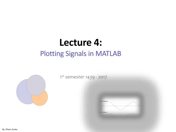
Lecture 4: Plotting Signals in MATLAB
Lecture 4: Plotting Signals in MATLAB. 1 st semester 1439 - 2017. By: Elham Sunbu. Outline. Creating Graph in MATLAB. Line Plot. Pie Charts, Bar Plots, and Histograms. Discrete Graph. 2-D Plotting. - Specify x-data and/or y-data - Specify color, line style and marker symbol

Lecture 4: Plotting Signals in MATLAB
E N D
Presentation Transcript
Lecture 4: Plotting Signals in MATLAB 1st semester 1439 - 2017 By: Elham Sunbu
Creating Graph in MATLAB LinePlot Pie Charts, Bar Plots, and Histograms Discrete Graph
2-D Plotting • - Specify x-data and/or y-data • - Specify color, line style and marker symbol • (Default values used if ‘clm not specified) • - Syntax: • Plotting single line: plot(xdata, ydata, 'color_linestyle_marker') Plotting multiple lines: plot(x1, y1, 'clm1', x2, y2, 'clm2', ...)
Line Specification • Three components can be specified in the string specifiers along with the plotting command. They are: • Line style • Marker symbol • Color
2-D Plotting - Example - Create a Blue Sine Wave » x = 0:.1:2*pi; » y = sin(x); » plot(x,y)
Adding a Grid - GRID ON creates a grid on the current figure - GRID OFF turns off the grid from the current figure - GRID toggles the grid state • grid on
Controlling the Axes - Setting Axis Limits & Grids The axis command lets you to specify your own limits: axis([xminxmaxyminymax]) You can use the axis command to make the axes visible or invisible: axis on / axis off The grid command toggles grid lines on and off: grid on / grid off
Using Basic Plotting Functions - The following commands are useful when plotting: Note that all text must be put within ' '.
Adding Additional Plots to a Figure PLOTTING MULTIPLE GRAPHS IN THE SAME PLOT Plotting two (or more) graphs in one plot: • Using the plot command. • 2. Using the holdon, hold off commands.
Formatting Plots - A plot can be formatted to have a required appearance. - With formatting you can: • Add title to the plot. • Add labels to axes. • Change range of the axes. • Add legend. • Add text blocks. • Add grid.