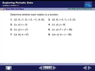
Exploring Data
In Lecture 4 of Stat 111, we explore various data graphics to understand relationships between variables. This session covers scatterplots for continuous variables, boxplots for categorical versus continuous variables, and contingency tables for categorical data analysis. We also discuss positive and negative associations, the importance of explanatory and response variables, and the significance of linear relationships in data analysis. Examples include the Old Faithful geyser data and mortality versus education statistics in US cities.

Exploring Data
E N D
Presentation Transcript
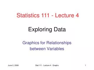
Statistics 111 - Lecture 4 Exploring Data Graphics for Relationships between Variables Stat 111 - Lecture 4 - Graphs
Administrative Notes • HW1 due right now • HW2 is on the website • Due Monday, June 8th Stat 111 - Lecture 4 - Graphs
Course Overview Collecting Data Exploring Data Probability Intro. Inference Comparing Variables Relationships between Variables Means Proportions Regression Contingency Tables Stat 111 - Lecture 4 - Introduction
Outline of First Half of Lecture • Scatterplots: relationships between two continuous variables • Interpreting scatterplots • Adding categorical variables to scatterplot • Comparison Boxplots: relationship between categorical and continuous variables • Contingency Tables: relationship between two categorical variables Stat 111 - Lecture 4 - Graphs
Continuous versus Categorical • Quantitative (continuous) variables are numerical measurements • Arithmetic operations (mean, sd, etc.) meaningful • Categorical variables place measurements into one of several groups • Not all numerical variables are quantitative! • Workforce study - mean has no meaning here Stat 111 - Lecture 4 - Graphs
Scatterplot of continuous variables • Old Faithful: Eruption duration and interval between eruptions (min) from July 1995 Stat 111 - Lecture 4 - Graphs
Associations between Variables • Positively associated if increased values of one variable tend to occur with increased values of the other • Negatively associated if increased values of one variable occur with decreased values of the other • Old Faithful: eruption duration is positively associated with interval between durations • Remember that association is not proof of causation! Stat 111 - Lecture 4 - Graphs
Another Example: US Cities • Properties of 60 United States Cities • Two variables of interest: • Mortality: Age-adjusted mortality (deaths/100,000) • Education: Median education (years) Stat 111 - Lecture 4 - Graphs
Scatterplot: Mortality and Education Philadelphia • Negative association between mortality and education • Potential outliers: York, PA and Lancaster, PA York Lancaster Stat 111 - Lecture 4 - Graphs
Explanatory and Response Variables • A response variable (Y-axis) measures an outcome of interest. Also called dependent • An explanatory variable (X-axis) explains changes in response. Also called independent • Explanatory does not mean causal: there are often several possible explanatory variables • Example: Study of heart disease & smoking • Response: death due to heart disease • Explanatory: number of cigarettes smoked per day • Example: City dataset • Response: mortality • Explanatory: education Stat 111 - Lecture 4 - Graphs
Another Example: Challenger Shuttle • Lower temperatures associated with higher number of O-ring failures • Temp. on day of Challenger accident: 31 degrees • NASA only looked at number of failures through time, which doesn’t show any relationship Stat 111 - Lecture 4 - Graphs
Linear Relationships • Some associations are not just positive or negative, but also appear to be linear Stat 111 - Lecture 4 - Graphs
Linear Relationships • A perfect linear relationship is Y = a + bX • Relationship will never be perfectly linear in real data • How do we calculate a and b? • Simple linear regression: later in this course Stat 111 - Lecture 4 - Graphs
Labeling Points on Scatterplots • Often we have an additional categorical variable that contributes to relationship between two continuous variables • Add this variable to scatterplots by labeling points with different symbols • Example: March 2002 report analyzing crack cocaine and powder cocaine penalties Stat 111 - Lecture 4 - Graphs
Sentences for Crack versus Cocaine • Critics claimed that sentences given for trafficking powder cocaine are much lighter than the sentences given for crack cocaine • Justice department argued that differences weren’t that big Stat 111 - Lecture 4 - Graphs
Sentences for Crack versus Cocaine • Compare sentence length for each quantity of drugs for both crack and cocaine groups • Clearly there is a large difference between the two labeled groups Stat 111 - Lecture 4 - Graphs
Comparison Boxplots • How does the distribution of a quantitative variable change between categories? • Divide quantitative variable into each category and construct separate boxplots • Eg. home runs for B. Ruth vs. M. McGwire Stat 111 - Lecture 4 - Graphs
Example: Vietnam Draft Lottery • Vietnam draft order was determined by putting 366 balls (one for each birthday) in tumbler. First birthday drawn out is drafted first • Scatterplot seems totally random Stat 111 - Lecture 4 - Graphs
Example: Vietnam Draft Lottery • Instead, can use comparison boxplots to look at distribution of draft order by month • Easy to see that later months have higher draft order • Why? Balls were loaded into tumbler by month and tumbler wasn’t mixed well Stat 111 - Lecture 4 - Graphs
Contingency Tables • Relationship between two categorical variables examined with a contingency table • Example: Vitamin C study (Linus Pauling, 1971) • Does vitamin C reduce incidence of common cold? • 279 people randomly given vitamin C or placebo Stat 111 - Lecture 4 - Graphs
Next Lecture • Exploring Data: Numerical summaries of the relationship between variables • Moore, McCabe and Craig: Section 2.2 Stat 111 - Lecture 4 - Graphs
Questions about homework? • Open to questions Stat 111 - Lecture 4 - Graphs