Explore Artistic Expression through Graffiti Tag Design in 8th Grade
In this engaging 8th-grade art project, students will explore the intersection of typography and visual expression by designing their unique graffiti tags. They will learn about the historical significance of graffiti as an art form, its applications in social commentary, and the principles of design that can elevate letter forms into artistic expressions. Using various materials, students will create vibrant, personalized designs that reflect their identity while incorporating learned techniques in color blending, lettering styles, and design elements.

Explore Artistic Expression through Graffiti Tag Design in 8th Grade
E N D
Presentation Transcript
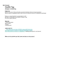
8th GradeGraffiti Tagdesign & letteringObjectivesExamine sources of ideas and make connections between ideas and visual expressionBecome aware of typography where letter forms are used as an element of expression and designDesign an original tag that is representative of selfBe able to incorporate the principles of design in tagDo some creative letteringMaterials1 sheet white paper pencil, erasersharpiescolored pencilsVIDEO HOW TO http://www.ehow.com/video_4979301_draw-graffiti-letters.htmlhttp://www.youtube.com/watch?v=OpNvJoR-qFk&feature=relatedhttp://www.youtube.com/watch?v=ufgdg8bwexI - blending techniques for color pencilsMake sure the students put their name and date on every project!
Intro: Students will design a personal and stylized signature or “tag.” The tag can be a given name, a nickname or something they’ve made up to represent themselves. This school version of graffiti shows students that lettering is not only important in communicating, but that it can also be an artistic expression. Students may know what graffiti is, but they may not know that graffiti has existed since ancient times, or that lettering is a genuine form of art. Sometimes graffiti is employed to communicate social and political messages. To some, it is an art form worthy of display in galleries and exhibitions. 1. Introduce the principles of art - use the Power Point called “Elements of Art and Principles of Design” from the SHS website on the art page. 2. Explain assignment: To create a personal graffiti tag.
Procedure: 1. Start with a balance plan – symmetrical, asymmetrical, radial2. Choose 2-3 other principles you want to emphasize3. Use the iPads to find reference for objective pictures, lettering or symbols or non-objective designs but make sure the final design is original and not a copy of something you have seen. 4. Make several thumbnail sketches to start brainstorming ideas in sketch book5. Demonstrate different lettering – basic block, bubble letters, stylized lettering6. Choose one of your sketches to create in full color – size 12X18 Plan and sketch graffiti-style names LARGE enough to fill their page Add design elements such as spray paint drips, arrows, starts, etc. to make it truly personal. Use at least 3 different colors (color pencil) with value shading and color blending technique to make them vibrant and exciting. Start lightly and keep adding layers of color pencil - blending different shades With more layers, the color will become more vibrant The color must be bold and vibrant - not light or too pastel-like Use black sharpies to outline the design Special Notes: Draw lightly so your pencil lines don’t show through Be careful of black color pencils because it can smear and make your colors dirty – use last! Permanent Black Marker could be used for outlining if desired.
From the very beginning, archaeologists noticed copious amounts of graffiti on the outsides of buildings throughout the ancient Roman world, including Pompeii.
In the ancient Roman world, graffiti was a respected form of writing—often interactive—not the kind of defacement we now see on rocky cliffs and bathroom stalls.
add style to letter forms vary letter size overlap letters exaggerate letter shape
add dimension with perspective with shading
add design elements (arrows, stars, swirls, etc) add interest and individuality
surround you tag with a border this helps “hold it together”
colors should be bold & vibrant bold, black outline helps it POP
Graffiti Evolution Make thick characters so you have lots of space for coloring. Overlap your characters and outline them. Two colors are almost always better than one color. This is a key to cool graffiti. A shadow can make your graffiti pop right off the page.
Graffiti Planning Ever had this problem? V e r y C l e v e r Draw two lines VERY LIGHTLY to identify the center of your sign. Count the letters and the lines. Start with the middle letters and lines and work out. Draw your letters very lightly so you can just barely see them. e r e v Your words will be centered and evenly spaced.
VOCABULARY graffiti - A drawing or an inscription made on a wall or other surface, usually so as to be seen by the public, and also called "Spraycan art" and "Subway art" at its height in the 1980s. Although it is sometimes mistaken for (or actually is) vandalism — a defacing of public or private property — and illegal; it may also be regarded as a form of art. Among the most highly respected of artists whose work emerged from graffiti are Keith Haring (American, 1958-1990) and Jean-Michel Basquiat (American, 1960-1988). typography - the style and appearance of printed letters

