Download
1 / 17
180 likes | 183 Views
Learn the best techniques for designing presentations online. Discover how to use Canva.com, graphic designers, or design templates to create professional presentations. Get tips on what to do and what not to do when designing PowerPoint presentations.

E N D
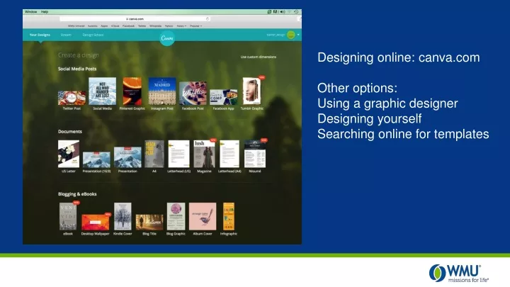
Designing online: canva.com Other options: Using a graphic designer Designing yourself Searching online for templates
DO THIS, NOT THAT Good and bad PowerPoint presentation techniques
DO: Keep It Simple • Keep bullet points and elements to a minimum • Break sentences into bullets and use them to emphasize what you are saying, but do not over do it • Try keeping elements down to three plus your background • Keep fonts consistent throughout the presentation
DON’T: Clutter Your Slide Don’t read your slides to the audience. Don’t add as many images as you can. Don’t type long paragraphs of words and words and words. Get to the point. Don't CHANGE fonts multiple TIMES on one slide.
DO: Use a Pleasing Color Palette • Choose a color scheme that is appropriate for your brand or organization • Choose backgrounds and colors that are easy to see and read • Font choices should be legible from a distance • Be careful with pattern and photo backgrounds
DON’T: Be Distracting Don’t use heavy photo backgrounds that make the message unclear. Don’t use neon or hard to read colors for your text. • Don’t use • Different • Types of • Bullets for • Every point • You make Don’t use super small type that is hard to read from a distance.
DO: Use Subtle Transitions • If transitions are added try to keep them consistent throughout the slides of your presentation • Effects should be subtle unless emphasis is needed
DON’T: Emphasize Everything Don’t use distracting animations. Don’t slow down animations and make them longer. Don’t add loud noises or unprofessional sound effects to your slide transitions.
DO: Add Appropriate Photos • When using photography keep the style consistent throughout your presentation • Photography enhancements/filters should be kept to a minimum
DON’T: Overdo It Don’t use different styles for images. Don’t use unnecessary image filters and shadows. Don’t distract from your message with too many images on one slide.
DO THIS, NOT THAT Top five tips for successful presentation handouts
DON’T: Overload the Audience • Focus on the key points of your presentation • Try to keep the handout to one page • Don’t print the bulleted slides of your PowerPoint presentation • Your handout should be able to stand alone • Helpful resource to those not attending the presentation • Refresher for attendees to look back at later
DO: Distribute Accordingly • Give before if: • You reference the handout during the presentation • As a resource to take notes • Give after if: • You feel the particular audience will be distracted by the handout during your presentation • NOTE: Make sure to tell the audience if information in your presentation is not in the handout
DON’T: Be Afraid of White Space White space on your handout gives the audience a place to take notes.
DO: Use Graphics if Applicable • Use a graphic to simplify an explanation • Use a graphic to remind the audience about a key point of the presentation • Use graphs or infographics on handout to help demonstrate facts
DON’T: Wait Until the Last Minute • Important part of the audience experience, so allow plenty of time to create • Proofread handout for mistakes and spelling errors • Make it look professional