Download
1 / 30
300 likes | 478 Views
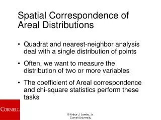
Spatial Correspondence of Areal Distributions. Quadrat and nearest-neighbor analysis deal with a single distribution of points Often, we want to measure the distribution of two or more variables The coefficient of Areal correspondence and chi-square statistics perform these tasks.

E N D
Spatial Correspondence of Areal Distributions • Quadrat and nearest-neighbor analysis deal with a single distribution of points • Often, we want to measure the distribution of two or more variables • The coefficient of Areal correspondence and chi-square statistics perform these tasks
Coefficient of Areal Correspondence • Simple measure of the extent to which two distributions correspond to one another • Compare wheat farming to areas of minimal rainfall • Based on the approach of overlay analysis
Overlay Analysis • Two distributions of interest are mapped at the same scale and the outline of one is overlaid with the other
Coefficient of Areal Correspondence • CAC is the ratio between the area of the region where the two distributions overlap and the total area of the regions covered by the individual distributions of the entire region
Result of CAC • Where there is no correspondence, CAC is equal to 0 • Where there is total correspondence, CAC is equal to 1 • CAC provides a simple measure of the extent of spatial association between two distributions, but it cannot provide any information about the statistical significance of the relationship
Resemblance Matrix • Proposed by Court (1970) • Advantages over CAC • Limits are –1 to +1 with a perfect negative correspondence given a value of –1 • Sampling distribution is roughly normal, so you can test for statistical significance
Chi-Square Statistic • Measures the strength of association between two distributions • Class Example • Relationship between wheat yield and precipitation • Two maps showing high and low yields and high and low precipitation
HIGH PRECIP HIGH YIELD
High Precip. High Yield
Chi-Square • By combining distribution on one map we can better understand the relationship between the two distributions • In this example we are using a grid • The finer the grid, the more precise the measurement • Four possibilities exist • Low rainfall, low yield • Low rainfall, high yield • High rainfall, low yield • High rainfall, high yield
Chi-Square • Record the total number of occurrences into a table of observed frequencies WHEAT High Low High Low PRECIP.
Chi-Square • Create a table of expected frequencies using probability statistics (% High rain * # of high yield cells) • Row total * column total / table total WHEAT WHEAT High Low High Low High Low High Low PRECIP. PRECIP.
Compute Chi-Square • Therefore, in our example we have High Low High Low High Low High Low Observed Expected High/High High/Low Low/Low Low/Low
Interpreting Chi Square • Zero indicates no relationship • Large numbers indicate stronger relationship • Or, a table of significance can be consulted to determine if the specific value is statistically significant • The fact that we have shown that there is a correlation between variables does NOT mean that we have found out anything about WHY this is so. In our analysis we might state our assumptions as to why this is so, but we would need to perform other analyses to show causation.
If you don’t have Chi-Square values • Yule’s Q • Value of Yule’s Q always lies between –1 and +1 • Value of 0 indicates no relationship • Value of +1 indicates a positive relationship • Value of –1 indicates a negative relationship
Analysis of Election 2000 Polygon to Polygon Point to Polygon
Assessing Our Cultural Divide: Results from the 2000 Presidential Election Arthur J. Lembo, Jr.; Ph.D. Cornell University Paul Overberg USAToday ANALYSIS OF SPATIAL AUTOCORRELATION JOIN COUNT ANALYSIS ANALYSIS OF SPATIAL CORRESPONDENCE OVERLAY ANALYSIS A second analysis was used to determine the likelihood of a county with urban areas voting for either candidate. For this study, four categories were evaluated: counties with small cities (under 50,000), medium sized cities (50,000 – 75,000), large sized cities (greater than 75,000), and no cities. Based on the percentage of counties won by each candidate (Gore: 22%; Bush: 78%) we computed the random probability that a city would fall within a Bush county or a Gore county. This probability allowed us to determine the expected number of cities that would be located within Gore counties or Bush counties. The actual number of cities located in a Gore county or Bush county was determined using overlay analysis with ArcView. Similar to the previous example, z-scores were computed for each of the categories as follows: where O is the observed number of cities falling within a county, E is the expected number of cities falling within a county, p is the probability of a city falling in a Bush county, q is the probability of a city falling in a Gore County, and n are the total number of cities. Table 2. Cities Falling Inside a County Won by Either Bush or Gore Expected Expected Observed Observed Z Z Gore Bush Gore Bush Gore Bush Large (> 75K) 66 238 184 119 267 272 Medium (50-75K) 54 196 147 98 470 55 Small (<50K) 544 1273 2030 1236 4,998 3 No City 427 1588 347 1690 18 29 As previously stated, a purely random sample drawn from a population whose true mean is 0 at the 95% confidence level would fall within a z-score range of +/- 1.96 in magnitude. Table 2 indicates that each of the z-score values exceed 1.96. Implied from this is that significant correlation among votes for Al Gore and counties with cities, and votes for George W. Bush and counties without cities (rural areas) exists. Join Count Analysis is a method of spatial autocorrelation that evaluates the statistical significance of clustering among neighboring polygons. Based upon the total number of counties won by each candidate (Gore: 588; Bush: 2214), the expected number of adjacent counties that voted for the same candidate (i.e. two adjacent counties voting for Bush) was computed . In addition, the actual number of adjacent counties that voted for the same candidate was also computed using spatial analysis techniques in ArcView GIS. The results were as follows: Table 1. Expected vs. Actual Joins of Adjacent Counties Voting for the Same Candidate Expected Actual Expected Expected Actual Gore/Gore Joins Gore/Gore Joins Bush/Bush Joins Bush/Bush Joins 438 879 5516 6253 Assuming an independent random process, we computed the z-score, or number of standard deviations away from the mean for each candidate’s specified number of joins (ZGore/Gore15.47; ZBush/Bush8.75). A purely random sample drawn from a population whose true mean is 0 at the 95% confidence level would fall within a z-score range of +/- 1.96 in magnitude. Both numbers were significantly higher than 1.96, indicating significant positive spatial autocorrelation. Therefore, the join count analysis showed that clustering exists within the county voting patterns. Inferred from this analysis is the observation that regionalized voting patterns existed in the 2000 Presidential Election. ABSTRACT Although the 2000 Presidential election was one of the closest in recent history, many commentators noted that the voting patterns appeared to exhibit a “cultural divide”, with urban areas voting for Al Gore, and rural areas voting for George W. Bush. Because most of the comments are based on a subjective view of the county voting patterns, this project attempts to provide a quantifiable measure of the voting patterns exhibited during the 2000 election. Specifically, we were interested in determining if a statistically significant clustering pattern existed based on county-wide results, and if each candidate won their assumed cultural association (Gore: Urban; Bush: rural). To test these hypotheses, two separate spatial analysis methods were performed on county-wide voting patterns within the United States. The first method utilized a principle of spatial autocorrelation called join count analysis to determine if voting patterns exhibited evidence of spatial clustering. The second method used map overlay to determine the likelihood of cities falling within either Bush or Gore counties. Conclusion This analysis provided quantifiable evidence that positive spatial autocorrelation (clustering) of voting patterns existed during the 2000 Presidential Election. Also, the analysis showed a high statistical correlation between urbanized areas and county votes for Al Gore. Further analysis is necessary to better understand causation (i.e. ethnicity, income, age), however both analyses indicate that geographic regions (i.e. urban areas) may have played a large role in the vote determination for Election 2000. Data Provided Courtesy of Election Data Services, and USAToday Figure 1. Examples of Cities in Relation to the Distribution of Counties. These examples from New York and Minnesota show that although Bush (in red) won a majority of the counties, the cities appear clustered primarily within the few counties in which Gore won (in blue). For example, in Minnesota, a majority of the cities exist within Hennepin County, while in New York, virtually every county Gore won has a city within its border.
Election 2000 Results • Join Count Analysis Table 1. Expected vs. Actual Joins of Adjacent Counties Voting for the Same Candidate Expected Actual Expected Expected Actual Gore/Gore Joins Gore/Gore Joins Bush/Bush Joins Bush/Bush Joins 438 879 5516 6253 ZGore/Gore15.47; ZBush/Bush8.75 • Overlay Analysis Table 2. Cities Falling Inside a County Won by Either Bush or Gore Expected Expected Observed Observed Z Z Gore Bush Gore Bush Gore Bush Large (> 75K) 66 238 184 119 267 272 Medium (50-75K) 54 196 147 98 470 55 Small (<50K) 544 1273 2030 1236 4,998 3 No City 427 1588 347 1690 18 29 Not mutually exclusive from large cities. We must account for this
Election 2000 Results • There was obvious spatial autocorrelation in the way way people voted. That is, Bush counties and Gore counties were highly clustered • Also, there are a very high correlation between urbanized counties voting for Gore, and non-urbanized counties voting for Bush
Analysis of Environmental Justice Point in Polygon Analysis By Greg Thorhaugcss620 project – Spring 2001
Summary • Spatial Data Analysis is possible, through basic statistical methods • More in-depth analysis is possible using spatial statistics • GIS software may be used to prepare data for statistical analysis • Spatial data analysis techniques provide a powerful tool for analyzing GIS data, and enable users to solve creative problems
Cross Tabulation Ground Reference Data Interpreted Land Cover Data Cross Tabulated Grid • Assume we have a 9 cell land cover map, one from 1980 and one from 2000 with three categories: A, B, and C. • You can see that the resulting cross tabulation provides a pixel, by pixel comparison of the interpreted land cover types with the two dates. So, for the upper left hand cell, the 1980 land use was A, and the 2000 land cover also indicated the value of A. Therefore, this is a match between the 1980 data and 2000 data. However, in the lower right cell you can see that the 1980 data indicated a value of C, while the 2000 value was B. This is not a match, and would indicate an error between the two sources. • We can now quantify the results into a matrix as shown below. This matrix, is oftentimes called a confusion matrix A B B A A B AA BA BB Cross Tabulate B B C B C C BB BC CC B A C A A B BA AA CB A B C A B C 2 2 0 0 2 1 0 1 1
Confusion Matrix Ground Reference A B C A B C 2 2 0 Map Classification 0 2 1 0 1 1 • The matrix on the right shows the comparison of the two hypothetical data sets. The 1980 data set and the 2000 data set . • As an example, geographic features that were classified as A on the map in 1980, and actually were still be A in 2000, represent the upper left hand matrix with the value 2 (there were two pixels that met this criteria). This means that 2 units in the overall map that were A, actually is A. Similarly, the same exists for the classifications of B and C. • But, there may have been times where the 1980 value was A and the 2000 value was B. In this case, the 2 represented in the top row of the matrix says that there are 2 units of something that was A in 1980, but is now B in 2000. • We can begin to add these number up, by adding an additional row and column. But what do these numbers tell us? Ground Reference A B C A B C 2 2 0 4 Map Classification 0 2 1 3 0 1 1 2 2 5 2
Comparing the maps • The bottom row tells us that there were two cells that were A, five cells that were B, and two cells that were C. The rightmost column tells us that we mapped four cells as A, three cells as B, and 2 cells as C. Adding up the Diagonal cells says there were 5 cells where we actually got it right. • So, the overall map comparison is really a function of: • Total cells on the diagonal / total number of cells. • (2 + 2 + 1) / (2 + 2 + 0 +0 + 2 + 1 + 0 + 1+1) = 5/9 = .55% agreement Ground Reference A B C A B C 2 2 0 4 Map Classification 0 2 1 3 0 1 1 2 2 5 2
Other Accuracy Assessment • The total correspondence of our example is 55%. But, that only tells us part of the story. What if we were really interested in classification B? Where there changes in classification B? Even here, there are two different ways of interpreting that question: • If I were interested in mapping all the areas of B, how well did I get them all? This is called the map Producer’s Accuracy. That is, how well did we produce a map of classification B. • If I were to use the map to find B, how successful would I be? This is called the Map User’s Accuracy. That is, much confidence should a user of the map have for a given classification. • To compute the map user’s accuracy, we would divide the total number correct within a row with the total number in the whole row. Staying with our example of classification B: • We said that we had two cells where B was correct. However, we actually said that there were three cells that contained B (in other words, we incorrectly called a cell B, when it should have been C). Therefore, we have: • 2 correct B values / 3 total values = .66 user’s accuracy. • This means that if we were to use this map and look for the classification of B, we would be correct 66% of the time. • To compute the map producer’s accuracy, we would divide the total number of correct within a column with the total number in the whole column. Staying with our example of classification B: • We said that we had two cells where B was correct. However, we actually said that there were five cells that should have been B. Therefore, we have: • 2 correct B values / 5 total values that should be B = .4 producer’s accuracy • This means that the map produced only 40% of all the B’s that were out there. Ground Reference A B C A B C 2 2 0 4 Map Classification 0 2 1 3 0 1 1 2 2 5 2
User and Producer Accuracy Users Accuracy Ground Reference • To test your understanding of all this, compute the user’s and producer’s accuracy for classifications A and C. • This also gives us some indication of the nature of the errors. For instance, it appears that we confused classification A with classification B (we said on two occasions that B was A). By understanding the nature of the errors, perhaps we can go back, look over our process and correct for that mistake. A B C A B C 2 2 0 4 Map Classification 0 2 1 3 .66 0 1 1 2 2 5 2 Producers Accuracy .4