Download
1 / 34
390 likes | 731 Views
Brief History of Color Theories/The Color Wheel.

E N D
Artists develop Color theories in order to create rules for harmonious color relationships, to understand how colors relate to one another, and to visualize how colors mix. In many cases, a circle is the convenient format for Color Models tools depicting color relationships, as it allows us to visualize each color individually as well as how colors relate to one another (green is between yellow and blue and is created by mixing the two).
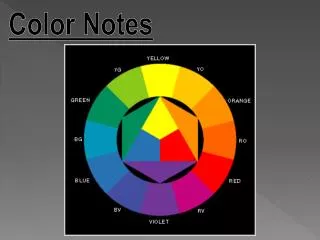
The Color Wheel Our standard color wheel includes twelve pieces, made up of three primary colors, three secondary colors, and six tertiary colors (mixtures of primary and secondary colors)
Colors on the ‘red’ half of the color wheel tend to read as warm. Colors on the ‘blue’ half of the color wheel tend to read cool. This is relative, not absolute!!
PrimaryColors Secondary Colors RED + Yellow = Orange Blue + Yellow = Green Red + Blue = Purple/Violet • RED • BLUE • Yellow Tertiary Colors= A primary + a secondary Red-Orange; Red-Violet; Blue-Violet; Blue-Green; Yellow-Green; Yellow-Orange Always lead with the primary color, when it comes to names of tertiary colors.
Color TemperatureThe tendency of certain colors to read as warm (red)or cool (blue).
Warm Colors • Are colors associated with fire. • Hues in the ‘red’ section of the color-wheel are considered warm colors– orange, red-violet, yellow are all considered ‘warm’ colors • Warm colors TEND to be stimulating, especially red.
Cool Colors • Are blue-based colors—blue, green, blue-violet • These colors suggest water and trees • They tend to be soothing and relaxing. • Most Americans claim to prefer blues and green
To change a color’s saturation, as well as it’s value: TINTS: Color +White • Shades: Color + Black • Tones: Color + Gray
Aristotle Developed a theory of colors based on observing color in nature. He believed color was perceived through combinations of light and dark, and represented how the elements of nature behaved in the physical world. The elements of color were: Sunlight, Firelight, Air and Water
Colors were made by mixing the elements: for example, red was a mixture of sunlight and darkness. This explained why the sky turned red at sunrise and sunset—the sun was mixing with the approaching or receding night. His base hues were red, yellow, blue, green, violet, black, white and brown
Leonardo da Vinci Developed his own palette of basic hues, each hue relating to the natural world. NIGHT AIR WATER FIRE EARTH LIGHT His palette was a spiritual manifestation of the physical world through paint.
Isaac Newton (1642-1727) Was the first color theorist to approach color from a scientific, rather than spiritual standpoint. (Mostly. Originally, he observed seven, not six spectral hues, including indigo, possibly basing this on the seven musical tones and the seven spheres of heaven. When measuring sunlight, there is not a seventh wavelength for indigo recorded) Newton created the first color wheel.
Newton discovered color was a function of light. He observed the spectral hues when he bent light through a prism. Because his color system was based on light, his ideas were somewhat theoretical (at the time). He was never able to reproduce all his theories through paint (for example, mixing all primaries together to create white) because the pigment system works different than the light system does.
Johann Wolfgang von Goethe (1749-1832) Reacted against Newton’s theories because they didn’t translate to mixing pigments. He theorized that color phenomenon happened in the human eye, rather than in white light.
Goethe observed that under strong midday sun, shadows were black or gray, but that in other conditions, cast shadows were the complement of the hue of light, candles would make different colored shadows than sunlight, for example.
This observation was important to the Impressionist painters.
Richard Diebenkorn Wayne Thiebaud And later, to Bay Area Expressionists in California during the ’50s.
Goethe’s models of color relationships is the six-hue color wheel Which demonstrates primary and secondary colors (depicted as triangles) and complementary relationships (depicted as straight lines).
…and the Color Triangle In this model, primary colors (red, yellow, blue) are the points of the triangle, and secondary colors (orange, yellow, green) are on the inside edge of the triangle. For Goethe, tertiary colors are mixtures of the three colors surrounding them. They are nameless, non specific colors, mixtures of red, violet, and orange, for example.
Otto Runge Attempted a three-dimensional depiction of color, to demonstrate that color was not only a function of hue, but also value and saturation
In his sphere, the equator (center line) was made up of pure saturation colors, and they traveled as tints and shades towards the two poles, which were pure black and pure white.
Johannes Itten • Was a teacher at the Bauhaus school in Germany prior to World War II. The Bauhaus teachings are the foundation for modern color theory: Color phenomenon, simultaneous contrast relationships, contrasts of hue, saturation, value.
Shortcomings of the Bauhaus model are that they tend to look at color in a vacuum, focusing on color perception without considering it’s relationship to imagery, psychology, or communication. Joseph Albers
Itten’s Model for Color Relationships: The Color Star Itten’s color star is a flattened representation of Runge’s color sphere, allowing the viewer to see all colors, values, and saturation at once. He favors hard, geometric edges to allow us to perceive the effects colors have on one another in their pure forms.
Albert Munsell Expanded on Runge’s three-dimensional color model with his COLOR TREE
In Munsell’s color tree, value is represented along the center axis and saturation is represented across the horizontal axis. The tree is not symmetrical like the rest of our color models, because colors reach full saturation at different values.
Munsell’s system began with 5 basic hues: Red, Yellow, Green, Blue, and Violet. And create a ten-part color wheel
His complementary pairings are: Red--blue/green Yellow--Blue/violet Green—Red/orange And Blue—Orange: the only pairing we recognize from the traditional color wheel. He developed his complementary pairings from after-images, observing the ‘ghost’ image we see after staring at a highly saturated form
Munsell’s color tree was the basis for the expanded color palettes we work from with digital and industrial colors, where multiple values of hues are readily available.