Regression Analysis with Excel for Spectroscopy Calibration Line
260 likes | 434 Views
Learn how to use Excel for precise calibration line plotting and regression analysis in spectroscopy pre and post-1975. Calculate slopes, intercepts, and errors efficiently with step-by-step guidance.

Regression Analysis with Excel for Spectroscopy Calibration Line
E N D
Presentation Transcript
Regression Analysis Using Least Squares Using Microsoft Excel
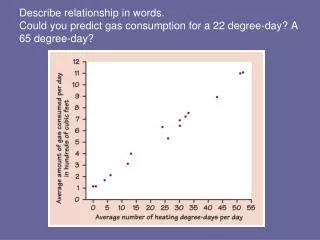
CalibrationLine • In olden days (pre 1975) we would have plotted this data on a sheet of graph paper and then used a straight edge to determine the best straight line through this data. • When unknowns were analyzed the resulting absorbance would have been found on the line and the resulting concentration would have been read off the graph. (Using a ruler) • This was not very precise but it was difficult to do much better. • A linear regression could have been calculated like is presented in Harris. The calculations were laborious without a pocket calculator or computer
Calibration • After 1975, a calculator could be used to find the best fit. This was done with a least squares method. That is - the sum of the value of the deviations of the fit line and the actual data was made a minimum value. • Data plotting was still required since it is very easy to see problems such as nonlinear fits and bad data points from the plot. • More recent calculators have this function built in and can even plot the fit for you. • The problem that remained was that most calculators would not give the error associated to the fit line.
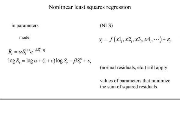
Calibration • In analytical chemistry we usually strive to work with linear lines. • Most analytical procedures will give us the functional relationship • R = kC • Where R is the measured analytical response • C is the concentration of analyte • k is the proportionality constant for this analysis • In some procedures there is a response with no analyte, so we modify the equation as R = kC + constant • So if we do a regression analysis we use R as the y term, C the x term and we find that the slope is k and the intercept is the constant.
Calibration • Slopes and intercepts could be read from plot by measuring rise and run and intercept points with a ruler but the availability of calculators has allowed us to rule out rulers. • Excel has now become the method of choice since it gives us the data to assess error in our fit lines and also provide the ability to plot our graphs. • Let’s revisit the data we have.
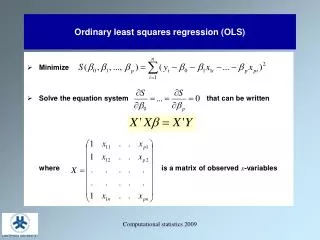
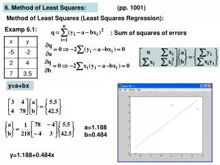
Calculating the Best Line • There are a number of ways that you can do these calculations. • First, you could use any spreadsheet and follow the instructions in your text book. There are two options here. You can generate columns for x2, x*y and sum these as well as the x and y columns. Then just do the calculation outlined in that section. • Second you could use the linest function in Excel. • Or ……….
Calibration • We now go to the Excel sheet and use the Data Analysis tool pack. • This is a option under Tools and if not present then you will need to install it. • It can be installed by going to the Tools menu. Selecting Add-Ins… and checking the AnalysisToolpac box. This option (Data Analysis…) will now appear in your Tools drop down box. • You will need to select this option and then scroll down and select Regression. • This option will open a box which you will enter the location of your data. • You will need to enter the input X range, input Y range and let Excel know where you wish to put the result. (I would recommend that no other boxes be ticked at this time)
Calibration • X-variable is the slope • Value in next column is the standard deviation of slope • Intercept • Value in next column is the standard deviation of the intercept • R square is a measure of the quality of the fit. The closer to one the better fit.
Calibration • So our fit line would be A = (0.0156 + 0.006)C + (0.1091 + 0.0084) and would be reported that way. • To find the error of a value (Concentration) determined from reading the Absorbance one would use the following.
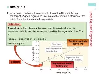
Calibration • The d term is the deviation between the fit and the experimental point. This is also called the residual. yexperiment – yfit = d • A plot of the residuals vs the x value can sometime show us information that is very useful in our understanding of the data • Let’s look at the data, with the fit values.
Calibration • Now we can plot in Excel. We will plot the experimental points as points and the fit as a line. This can be done as a linear trend line also.
Calibration • I strongly suggest that you avoid plotting a colored background and you should also avoid grid lines. Always plot in the xy format. Label you axes for a clear presentation.
Plotting in Excel • For plotting you should highlight your x and y data columns. • Then click the plot icon on the top toolbar. • Select xy scatter plot and from this selection click on the format box that has points and no line. • Continue with each menu page. Add a good Title and proper axes Titles. • Select where you want the plot to go. (A new sheet, or as a inset on the current page.)
Plotting in Excel (Wrap up) • Now click on the plot and finish your formatting. • Right click the grey background. Select the tab for background color and select white. • Right click a gridline and select a white color for this also. • Right click any point and select the option to plot a linear trend line. • There is another tab on this page. You will want to apply an equation to the trend line (yet another way to get the regression line). You might also wish to add a correlation coefficient. Do not select the option for the plot to go through zero. • These plots and be copy/pasted into Word reports.
What are residuals? Most of the time the fit line will not go directly through your data points. The difference between the data point and the line is called a residual. These can be plotted and can often tell you much about your data.
Method of Standard Additions • Many times you will have a solution with the analyte already present. This can be analyzed by the Standard Additions method. In many cases the matrix will effect the analysis so we can add small amounts of the analyte in known amount and use this to determine how much is initially present. • For a single addition you can use the relationship of R = kC. Since k should be a constant for this analysis then we can set this up as.
StandardAdditions • You can see from the plot that is does not pass through the origin. • The amount of analyte to start can be found from the –x axis.
Internal Standard • You add a compound of similar characteristics of your analyte and take the ratio of the two responses. • This is very useful when you have methods that can have variability from run to run. (Injection volume in HPLC)