Download
1 / 12
120 likes | 237 Views
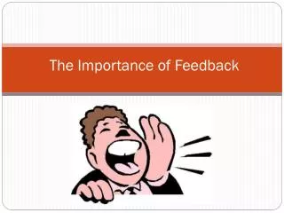
Before constructing our horror teaser trailer, we gathered audience feedback through a questionnaire to align with their desires and expectations. The results guided crucial decisions, such as age certification preferences and key elements like masks, shadows, and flashbacks. Insight revealed that audiences value a strong storyline over excessive gore. Reactions to our first edit were encouraging, highlighting effective use of iconography and narration. We recognized areas for improvement, including refining specific shots to enhance the trailer's sinister tone, ensuring we maintain engagement and suspense.

E N D
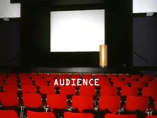
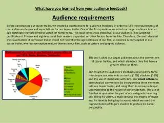
What have you learned from your audience feedback? Audience requirements Before constructing our teaser trailer, we created a questionnaire for audience feedback, in order to fulfil the requirements of our audiences desires and expectations for our teaser trailer. One of the first questions we asked our target audience is what age certificate they preferred to watch for horror films. The result of this was indecisive, as our audience liked watching certificates of fifteens and eighteens and their reasons depended on other factors from the film. Therefore, Elle and I decided the classification of our teaser trailer would not resemble the age certificate of our film, as violence is only applied in our teaser trailer, whereas we explore mature themes in our film, such as torture and graphic violence. Elle and I asked our target audience about the conventions of teaser trailers, and which elements they find have a greater effect on them. The result of the audience’s feedback conveyed the three most important elements as masks, (16%) shadows (16%) and the use of Flashbacks with 33%. We would adhere to stereotypical conventions by incorporating these elements into our teaser trailer, and using them to convey a deeper understanding to the nature of our antagonists. The use of flashbacks symbolise the past of our antagonist haunting and killing his victim, a mask conveys the enigma of Roger and his identity being kept a secret, whilst we used the representation of Roger’s shadow to portray his darker personality.
We asked another question concerning the narrative of our teaser trailer, and whether a good storyline is most important, or adhering to horror conventions by conveying lots of gore. The audiences feedback told Elle and I, our audience were more interested in a good storyline overall. Our teaser trailer adheres to their requirements, as we exclude gore and focus on the action between our antagonist and victim in chase scenes. If we were to focus on conveying gore alone, then our film would resemble every other American horror film with no plot line, and we wanted to avoid this stereotype completely. 23% of people thought gore was more important and we will adhere to their requirements in our film, as we will have the freedom to present graphic scenes, with the classification of an eighteen. 26% of the audience feedback specifically like the aspect of horror films being ‘scary,’ and 20% of people like narratives to have twists. We adhere to these conventions by using our antagonist to provoke fear from the audience, as his violent actions may reflect a minority group of people who challenge rules and laws in our society. Furthermore, we twist reality by the use of light and darker shots to convey our antagonists confusion, between knowing what is reality and his dream world. Additionally, the audience feedback told us the majority of people did not like a twist to be conveyed in a teaser trailer. Elle and I subverted this, by using the contrast of lighter and darker images to symbolise a shift in time and provoke confusion to the audience. The contrast in images allowed us to conceal our subtle twist, as the audience may assume the dark images convey Roger fantasising about killing his victim, but does not reveal his actions are reality. Therefore, the twist of Roger’s dreams being reality is concealed, without our audience feeling disappointed that the plot is revealed.
Audience feedback on 1st draft film edit Encouraging responses: Our first edit for our teaser trailer had some positive and encouraging responses from our target audience. A comment written by EKMC spoke positively about the representation of Roger and said, ‘Your use of iconography is great with the mask, as it really provides it with a sinister edge.’ This gave Elle and I the confidence to progress with our teaser trailer, as we knew we were heading in the right direction, and the audience understood Roger’s sinister actions. It also confirmed that our audience conveyed Roger’s representation as a villian, by recognising the conventions of horror films, as we used the generic codes of a mask and knife. Another positive comment was from Kain who said, ‘I really like the narration, it helps set the scene and have a creepy tone.’ In our first edit, we used a voice over of Roger describing his dreams to a psychiatrist, to allow the audience into his inner thoughts about his dreams to kill. The use of a voice over immediately creates the audience to feel distant and wary of Roger, as he does not conform to the stereotypes of society. Improvements To improve our first edit for our teaser trailer, Kain suggested to re edit the scene where our victim is being blind folded, as Elle or I can be seen in the shot. This was important for us to change, as it lowered the tone of our teaser trailer and made our antagonists actions not appear as sinister. Whilst constructing our teaser trailer we filmed each scene at least three times, which allowed Elle and I to choose a similar clip without Elle and I being present.
Audience feedback on 3rd draft film edit Our target audience made further suggestions of how we could improve our 3rd edit teaser trailer. Kain commented, ‘The pace of the whole compilation is very slow and doesn’t grab my attention as it should.’ At this stage in our editing, we were not adhereing to the conventions of teaser trailers, as our scenes were not fast paced and appeared to drag on a little. It was important that Elle and I re edit our teaser trailer in Final Cut Express, to fit the conventions of a teaser trailer. To create a faster pace, we used a combination of the ‘razor blade’ in Final Cut Express to cut unnecessary bits out and adjusted the speed of clips. This would make our teaser trailer more enjoyable to watch because the new pace would convey greater action. The pace of our film appeared to be a recurring issue in our teaser trailer as another comment by EKMC said, ‘A couple of shots could be shorter, like the last shot with the car.’ Elle and I used the razor blade to crop the car scene and create more emphasis of Roger’s threatening behaviour, as Roger lurks in front of his victims car. The fast pace shots reflect Roger’s erratic behaviour and conveys him t invading his victims personel space. Laura commented that our film ‘could use some music.’ We subverted conventions by excluding music from our teaser trailer, as we wanted the audience to focus on the intense action between our antagonist and victim, and thought music would take the focus away from the action of chase scenes.
Audience feedback on final draft film edit Compared to our previous edits, both EKMC and Kain commented that our teaser trailer had more pace, which adhered to conventions as we teased our audience to watch our film and provoked curioisty as our sequence is not in chronological order and creates confusion for the audience to find out if Roger’s victim survives. A positive comment from Kain said, ‘I like the use of both protagonist and the antagonist voice in the trailer.’ We convey Roger’s narrative in the beginning of our sequence to portray his dominance and power over his victim, and convey his obsession to capture her by the use of whispers. The narrative reminds the audience of Roger’s mental condition and suggests that he can not escape his suppressed desires to kill in his dreams. After the end credits of our teaser, we convey our victim trying to phone for help and emphasize heavy breathing, to convey she is distressed and panicked. We structure our victims narrative at the end to tease the audience into wathcing our film and symbolises her isolation.
Audience requirements for poster What grabs your attention in a promotional film poster? (E.G. One centred image, dominating with little writing or A text based image) Response: ‘1 centre image with other smaller images around them.’ Our poster adheres to this, as we have mimicked other magazines, such as EMPIRE and used one dominant image of our antagonist to attract the audience and smaller images on our right column, to tease our audience to know exclusives about other horror films. Does a promotional film poster encourage you to watch the film or are you more swayed by trailers and twitter blogs? Response: ‘I do like posters, but I see them as a build up.’ Our poster adheres to this response, as we convey Roger differently to the iconic image used in our magazine and poster, and present Roger by the use of a shadow figure. We conform to poster conventions in the 1920’s and use an unusual image of our anatgonist to provoke curiosityand hype up the release of our film. Do the stars of films influence you more to watch the film? Our target audience gave a mixed response to this question. Elle and I subvert Hollywood films as we do not have the resources to use well known actors to advertise our film, and rely on our audience being appealed by the unusual representation of our anatgonist. Arguably, our poster is more effective by excluding well known actors, as our film can not be stereotyped by actors repuatation and appeals to new audiences who want a grittier storyline and a film completely different to others.
Do you like the enigma of a poster? The majority of our target audience like the enigma of a poster and one reposnse said: ‘Yes – it makes you want to watch the film more.’ Elle and I create the enigma of our poster by conveying our antagonist through a shadow figure. This conceals his identity and the audience recognise him as a villian by the use of a knife in his hand. Furthermore, the audience can convey the dark connatations of the shadow to be associated with ‘evil,’ and provokes fear as they can not see his face, and therefore Roger can not be identified within society. Do different styles of text / fonts grab your attention? We adhere to the audience’s expectations, as our poster conveys limited variations of fonts and styles, as we wanted to keep the simplicity of our poster. Furthermore, we convey our brand image of our film title AWAKEN as the only narrative text, in order to draw the audience’s attention and allow them to recognise our brand image in other tasks.
Audience feedback for poster First edit: A comment from EKMC said: ‘ The first draft of your poster is effective as it simply delivers its narrative. However, the main problem with this if that it gives a general overview of the concept of story... Gives away most of the story.’ The comment from EKMC influenced Elle and I to change our first idea for our film promotional poster, as it did appear that we gave away the storyline for our film. Our initial image captured our antagonist holding a knife down to our victim, as she laid on the floor. The image alone was not powerful enough to entice our audience into watching our film, as the audience would feel distant from Roger and his victim because they were captured in a mid to long camera angle. Furthermore, the image did not have one focus and would not appeal to our audience as there is too much going on and they would not know where to look. From previous research, EMPIRE magazine use the iconic image of IRON MAN 2 for their front cover, which attracts the audience as the image dominant. After this comment, we decided that we wanted to develop the same idea of using a dominant image for our poster, to ensure we attract our audience. 2nd edit Another comment made from EKMC said: ‘The light is very bright, so it decreases the sinister atmosphere.’ The second edit for our poster conveyed the shadow figure of our antagonist and used the contrast in colours of red and yellow. Elle and I conveyed a bright yellow light behind our antagonist to convey the idea that authorities are searching for him and that he leads a life on the run. Elliot who made the comment, picks up on the idea of Roger being presented in a different light and almost victimised to his own thoughts, that he can not escape him dreams. This may cause the audience to sympathise with Roger and that he is not made to look so sinister.
Final poster edit ‘The mask...portrays a disturbing image as we do not know the identity, but we can associate it will death due to the image of the skull. As mention before, the image of our antagonist will provoke fear from the audience because they can not associate Roger’s image with a face. Therefore, we play on the idea that society will not be able to recognise a murderer who lives among them. This comment suggest that Roger’s image is associated with the connotations of death, due to his head looking similar to a skull, and creates assumptions to whether Roger is alive in his dreams but ‘brain dead’ in reality, conveying that he lives a lonely life and has nothing to live for. Further more, in our poster we exclude Roger’s physical body, which may be interpreted that he is dead and plays on conventions of existing in another life / dreams. ‘One main problem is that compared to your previous draft, it does not provide a lot of information for the narrative... Leaving the audience with an ambiguous image. We subvert our poster by not conforming to stereotypical conventions of narrative and rely on our ‘ambiguous’ image of our antagonist to interest the audience to go and watch our film. Arguably, by excluding different forms of narrative on our poster, our audience is left with one powerful and dominant image and this will provoke further interest to want to know more. Our film poster resembles posters in the 1920’s which were successful by the simplicity of their narrative and arguably more effective, because the image was left up to the wild assumptions of the audience, whereas if there are hints in narrative, then the audience may be turned off.
Magazine Unlike our teaser trailer and promotional poster research, we did not create a questionnaire for our magazine and decided to mimic other well known magazines, as they are successful and capture broad audiences world wide. Audience feedback on 1st draft of magazine ‘You challenge the rule of thirds by placing the killer in the centre of the page, therefore creating an imposing image that stands out.’ Our first edit of our magazine conveyed our antagonist in the centre to resemble his powerful and dominant image, as we wanted the audience to be drawn to him. However, we subverted magazine conventions, as his image became dominated by the size of the magazine front cover and took away his threatening position. Furthermore, our image challenged the rule of thirds in a negative way, as Roger is positioned in a different direction and is not looking straight forward, which loses his dominance and does not work in terms of the image. ‘There is also a strong use of colour, and you have developed it to be bold yet fit the conventions of horror by making it blood like and sinister. For our magazine, we subverted stereotypical conventions by not conveying the colour red to conform to connotations of blood and death. However, we used a dark background to symbolise Roger’s natural environment to kill and creates an eerie and creepy tone to the magazine. However, we subvert conventions by using vibrant colours such as yellows and oranges to attract the eye of the reader and use the yellow to portray dream like imagery associated with our film AWAKEN.
Audience feedback on 2nd draft of poster ‘ The title ‘ACTION’ is also effective, as it is bold with red but the appearance is distinctive as it is broken up, which could be interpretated as the man slicing it up, further portraying a sense of danger.’ We used the font ‘silem’ for our magazine title, as it conformed best to horror conventions and appears to convey the actions and damages a knife can create. Furthermore, our antagonist is represented with a knife on the front cover, and therefore, the magazine title prefigures Roger’s actions in our film. Additionally, we stereotypically conform to conveying our title in red, for audience’s to recognise the special edition horror genre of the magazine. ‘One problem is there is a lack of titles which does not meet conventions of front covers, as the audience require other information to accompany the film. In contrast to our first edit of our magazine, Elle and I focused on combining the dominant images we wanted to convey in Photoshop and therefore hadn’t progressed in adding titles. We structured our first edit of magazine as a plan for our layout and did not use Photoshop properly to edit our image. For our second edit, we used Photoshop to merge our three dominant images together to make it look professional and spent a lot of time playing around with the layers of each image, therefore at this stage we were not conforming to conventions of magazines.
Audience feedback on 3 rd draft of magazine ‘ You have improved in terms of adding title.’ We conform to magazine conventions in our final magazine edit by using variations of narrative on our front cover. Furthermore, we adhere to magazine layouts by using short, snappy slogans at the top and bottom of our magazine, and exclusive information to draw people in. Our magazine is colourful and adheres to the rules of thirds to convey the two images of our antagonist and victim, and symbolise Roger’s dominance over her to prefigure the action in the film. ‘The use of language is effective within these titles as you convey a sense of excitement and enthusiasm, one example was ‘54 pages of epic reviews.’ Our target audience is between fifteen to eighteen years old and therefore we have adapted the language on our magazine to meet the needs and appeal to our audience. For example, we have used the word ‘epic’ to reflect the present dialect in the youth society and that our audience can connect with our magazine.