Humbucker: Rock Magazine with a Classic Twist
Humbucker magazine aims to captivate classic rock fans aged 16-50 by challenging conventions with a dynamic front cover, vibrant content structure, and intriguing double-page spread featuring 'The Cover' band.

Humbucker: Rock Magazine with a Classic Twist
E N D
Presentation Transcript
As Evaluation George Matten
“In what ways does your media product, use develop or challenge the forms and conventions of real media products?”
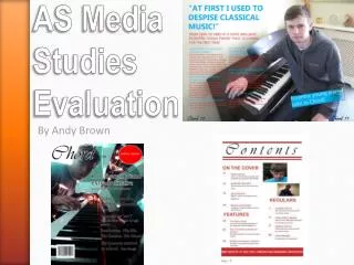
Front cover • I chose to do quite a simple yet intriguing front cover, with little writing and one large picture to grab attention. • The title of my magazine is Humbucker which I thought of because it is a classic component in rock guitars founded by Gibson, one the most influential guitar brands ever. Its significance is due to my magazine being aimed at a wide audience of 16-50 who are classic blues or rock fans. I originally came up with idea A Minor, but this proved to be unpopular in my questionnaire, so I brain stormed new names. • The title is In a font I downloaded as the standard fonts didn’t give the message I wanted. I found a font called District which was perfect. It conveyed the messy idea of rock without compromising its readability. I made it Large and in the forms and conventions of other media magazine with bold colours like black an blue. This combined with white back ground made it stand out especially on a magazine rack. • The Main photo is of “The Cover “ a new ‘up and coming’ rock band made of Kingwoods school boys. The photo was taken at Badminton house, with the stately manor in the back ground. Coupled with the suits, it portrays the image the Young men are not a hardcore rock and roll band, which could jeopardise my target audience. The Band members facial expressions are also a point of interest possibly attracting the audience. One Member was looking into the distance with mouth open as if shocked where as the the member opposite him is lucking happy towards the camera , and the third has a cigar in his mouth. These together create a very varied an interesting photo.
Front cover continued • The sell line “Baths best new band” is in blue with a thin black bordering to give emphasis. I used size in the word Best a well as putting it in capitals to show it is the important word and intrigue readers. The name of he band is in a different colour, font and is much bigger. This follows many of the convections of normal magazines and gives the band presence and identity. I especially like the use of drop shadow to made the words “ The Cover” stand off the page. The Red used for the band name is also red, used classically in rock magazines , showing passion in this case. • I decided to place a competition advertisement on the front cover to try and appeal to readers or people who just want the ‘Signed Pink Floyd drum sticks’. I put this photo in a circle because the square I originally tried , took to much attention away from the main photo and main sell point. I then overlapped the bold red writing so it didn’t appear to be rudimentary and boring shape.
Contents page • I used a lot of the forms and conventions based around the drummer magazine contents page. • The structure allows for eyes to scroll down the page with ease. First is the features section with 4 stories as well as the main story on ‘The Cover’. The Cover is in the same font and colours as on the front cover continuing the brand image. Then there is the Regulars section which I chose to make different from the rest of contents as it is always used. All the stories have a page number and some have a picture accompanying them as well as a page number on the photo. • The purpose of this , is that any reader of any age can find what they are looking for with ease and have the 2 sections for an even quicker way of finding what they are looking for. Particularly effective with the older bracket of my target audience. • I have balanced the information with pictures and made it interesting without all the information/pictures on one page. This guide the readers eyes around the page. • I chose the fonts carefully after experimenting with a couple of colours. I used the bold bright red colour used often in magazines especially in rock , such as NME and Q. The fonts are the same through out for the sub headings with the colour change to show differant levels of importance. • I used the parchment background to give the old effect as well as giving the colours something blan to stand off.
Double page spread • My Double page covers the band ‘The Cover’ giving an in depth history and a ‘question and answer session’ • I have kept brand image on my double page through using a similar parchment back ground and font and font/colour scheme. I also used similar black and white photos of the band. • To really clarify brand image I used the trade mark ‘Humbucker’ symbol on the bottom left hand side of the double page spread. • I used the space effectively I feel to draw eyes to writing and then connecting pictures. For example , the large old outlined, piece of writing is the first attention grabber. This quote is a classic convention of most magazines interviewing some one giving a general theme to the piece, and immediately below this is the heading giving back ground to the entire page. “ The cover come to Badminton house for a private gig and photo shoot. • The eyes are then immediately drawn to bright writing and pictures and then on to bold stances of the cut outs. Giving a firm impressive impression of the band. • I tried to make photos appear a if they are form the photo shoot as well as putting in the visually attractive and impressive cut outs to add body and interest to the page
Double page spread continued • There is clear hierarchy in the page with the top to bottom , left to right reading style. This is easily read by all ages and audiences. The quote and its caption are at the top and biggest , with the smaller writing all below. The interview part is mostly on its own on the next page with a different coloured sub heading and slightly bigger font. • The Cut out photos have high priority on the page as they take up allot of the bottom with large space around them , drawing attention and power. • The language has to appeal to my large audience with old and young readers so I chose to use a formal interview style with some colloquial language. Family complex and detailed interview with long question and answer section.
“Who would be the audience for your media product?” • My initial target which the magazine is aimed at through the use of its colour scheme, language, and pictures/graphics is 16-50 year olds, predominantly male, with a strong interest in classic rock or blues music. • It is also appealing to anyone who likes rock music, be it modern or classic and other similar forms of music, often catorgised into sub genres. • The language is formal with little slang or colloquial terms appealing to a western European and American ( rock culture is strongest) geographical term with education.
“How did you attract/address your audience?” Firstly I used a clear font that could be read by all ages groups and a series of attractive bright colours to attract the younger reader but with out comprising the aesthetics to the whole. The Red is appealing and is complemented by the black border, and despite the boldness, it is still easily legiable. The pictues are mainly in black and white to add to the general feel and brand of the magazine as well as neing in Badminton house , attracting a more proper audience , as opposed to a dark club stage. The lyout of the magazine in general has been carfeully layedout to be appealing yet easily understood. For example on the contents page i moved the “regualrs” section from under the “feartures” to the botttom right of the page as it creratd a more interesting page.
“What have you learnt about technologies from the process of consrtucting this product?” The first thing i learnt about the technoglies i was using was that at point it could be unrealiable but despite this i learnt to use a variety of new programmes effectivley in creating the 3 main pieces and blog which they are presented on. Photoshop was the first programme I used with limited skills . I learnt that by adapting the lighting of pictures i could greatly alter the image to be a much easier piece to work with. For example , my preliminary piece had grba lines, that very much contrasted with the bright back ground, where as in ‘Humbucker’s’ cover, i alltered the lighting to allow every important piece of information on the page to stand out. I developed my skills in photo shop thrououghly , being able to add drop shadows, cut images and imports into the programme. I went to complete the cover and contents page with this. For the Double page spread, i editied some photos on Photoshop and imported them and Miscrsoft word for the writing, but i organised it all on indesign. The layout is similar to Photoshop allowing me to adapt to it quickly.
