Download
1 / 20
210 likes | 250 Views
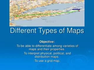
Discover the various types of maps used in social studies, including Political, Physical, Population, and more. Learn how each map displays different information and explore examples of maps like Physical, Population, and Agriculture/Industry maps.

E N D
6th Grade Social Studies Types of Maps
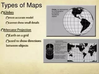
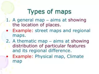
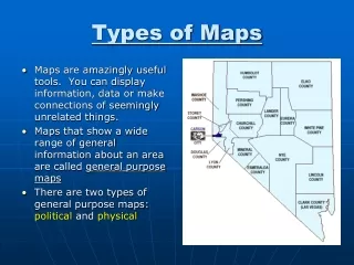
Maps • Different types of maps are used to show many types of information. • *Some types of maps include Political maps, Physical maps, Population maps, • Economicmaps, agriculture/industry maps, and topographic maps.
Political Map • Shows countries, states, capitals, and major cities.
Political Map • Some maps use different colorsto show the separate statesor countries. • The map below shows the states in the southeastern part of the United States.
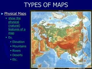
Physical Map • Shows features like mountains and rivers. • Emphasizes the natural features of the earth. • Continents • Oceans • Islands • Lakes • Rivers • Mountains • Plains • Deserts
Physical Map • Physical maps show the Earth's landforms and bodies of water. • The maps use lines, shading, tints, spot elevations, and different colors to show elevation and distinguish physical features. • The map to the right shows physical features found in the state of California.
Population Map • Indicates how many people live in an area. • Shows how crowded or densely populated regions are. • Each color represents a certain number of people living within a square mile or square kilometer.
Population Map • The map below shows the population density of the Greater New Orleans area. • The areas colored in red have more people living there than the areas colored in green.
Population Map • Also uses symbols to show metropolitan areas with populations of a particular size, these symbols and colors are shown in a legend.
Land Use/Natural Resources Map • Shows the important natural resources of a region. • Symbols and colors are used to show information about the type of resourcesfrom that area. • minerals, oils, forests, natural gas, nuclear power, coal, iron, gold, silver, hydroelectric power, seafood, etc.
Agriculture/Industry Maps • Agricultural/Industry maps use symbols and colors to show the different industries or crops grown in an area. • The map to the left shows the location of different industries in Indiana.
Robinson Projection Map • Most distances, sizes, and shapes are correct.
Climate Map • Shows the general type of weather or weather patterns in a given area. • Marine • Mediterranean • Highland • Desert • Steppe • Humid-continental • Humid-subtropical • Tropical • Tundra • Subarctic
Climate Maps…continued • Uses color to identify different climate types. • Boundaries between climate regions do not indicate an immediate change in the main weather conditions between 2 climate regions, instead boundaries show the general areas of gradual change between climate regions.
Weather Map • Shows storm fronts, precipitation, temperatures, etc.
Road Map • Shows routes to get from place to place. • Shows highways and cities.
Topographic/Map • Has contour lines to show elevation. • How the earth’s surface varies from place to place. • May use color to show parts of the earth that are mountains, hills, and plains. • Land elevations.
Topographic/ Maps • Topographic maps show elevation, which is whether land goes up or down. • These maps use "contour lines" (lines of equal elevation) to show elevation. • Lines that are close together mean there is steep terrain, while lines far apart mean there is flat terrain. See the example below.
Historical Maps • Can show growth of a city • Population growth/expansion • Urban or rural areas
Video • Maps and Map Projections