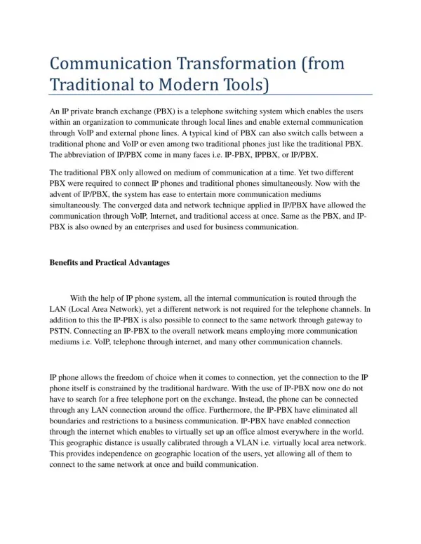
Download
1 / 43
430 likes | 474 Views
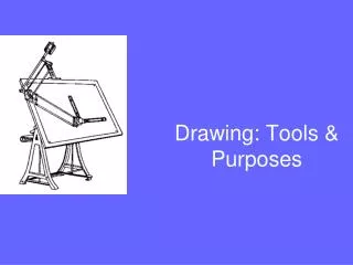
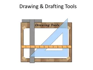
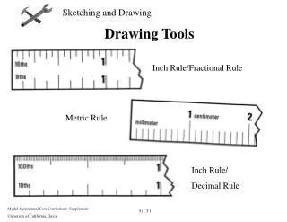
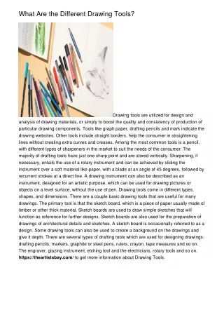
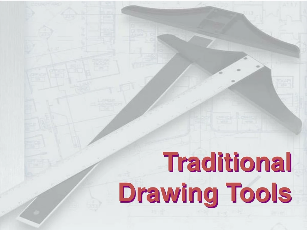
Traditional Drawing Tools. DRAWING TOOLS. DRAWING TOOLS. 1. T-Square. 2. Triangles. DRAWING TOOLS. 2H or HB for thick line. 4H for thin line. 3. Adhesive Tape. 4. Pencils. DRAWING TOOLS. 5. Sandpaper. 6. Compass. DRAWING TOOLS. 7. Pencil Eraser. 8. Erasing Shield.

E N D
DRAWING TOOLS 1. T-Square 2. Triangles
DRAWING TOOLS 2H or HB for thick line 4H for thin line 3. Adhesive Tape 4. Pencils
DRAWING TOOLS 5. Sandpaper 6. Compass
DRAWING TOOLS 7. Pencil Eraser 8. Erasing Shield
DRAWING TOOLS 9. Circle Template 10. Tissue paper
DRAWING TOOLS 11. Sharpener 12. Clean paper
ABCDEFGHIJKLMNOPQRSTUVWXYZABCDEFGHIJKLMNOPQRSTUVWXYZABCDEF Lettering ABCDEFGHIJKLMNOPQRSTUVWXYZABCDEFGHIJKLMNOPQRSTUVWXYZABCDEF
To communicate nongraphic information. As a substitute for graphic information, in those instance where text can communicate the needed information more clearly and quickly. - shape - space between letters and words Legibility - size- line thickness Uniformity Text on Drawings Text on engineering drawing is used : Thus, it must be written with
Dimension & Notes Title Block Notes Example Placement of the text on drawing
Use only a vertical Gothic text style. Use a Gothic text style, either inclined or vertical. Use both capital and lower-case letters. Use all capital letters. Use 3 mm for most text height. Same. For letters in title block it is recommend to use 5~8 mm text height Space between lines of text is at least 1/3 of text height. N/A.Follows ANSI rule. Lettering Standard ANSI Standard This course
Basic Strokes Straight Slanted Horizontal Curved Examples : Application of basic stroke 4 5 1 “I” letter “A” letter “B” letter 1 2 1 6 3 3 2
Suggested Strokes Sequence Upper-case letters & Numerals Straight line letters Curved line letters Curved line letters & Numerals
Suggested Strokes Sequence Lower-case letters The text’ s body height is about 2/3 the height of a capitalletter.
Stroke Sequence T F L I E H
Stroke Sequence V X W
Stroke Sequence Z M K N 4 Y A
Stroke Sequence G Q C O
Stroke Sequence U P B D R J 1 2
Stroke Sequence 7 5
Stroke Sequence 6 0 3 S 8 9
Stroke Sequence i l
Stroke Sequence w x k v z
Stroke Sequence y f t j r
Stroke Sequence o a b c d p q e
Stroke Sequence n m h g u s
J I R A P O N G Word Composition Look at the same word having different spacing between letters. A) Non-uniform spacing JIRAPONG B) Uniform spacing Which one is easier to read ?
| | | \ ( ) | | | | Space between the letters depends on the contour of the letters at an adjacent side. Good spacing creates approximately equal backgroundarea between letters. Word Composition JIRAPONG Spacing \/ )( Contour General conclusions are:
Space between Letters 1. Straight - Straight 3. Straight - Slant 2. Straight - Curve 4. Curve - Curve
slant slant slant straight Space between Letters 5. Curve - Slant 6. Slant - Slant 7. The letter “L” and “T” ≡ ≡
Example : Good and Poor Lettering GOOD Not uniform in style. Not uniform in height. Not uniformly vertical or inclined. Not uniform in thickness of stroke. Area between letters not uniform. Area between words not uniform.
Sentence Composition Leave the space between words equal to the spacerequires for writing a letter “O”. Example O ALL DIMENSIONS O IN O ARE MILLIMETERS UNLESS O SPECIFIED. O OTHERWISE
Straight Line 1. Hold the pencil naturally. 2. Spot the beginning and end points. 3. Swing the pencil back and forth between the points, barely touching the paper until the direction is clearly established. 4. Draw the line firmly with a free and easy wrist-and-arm motion
Vertical line Horizontal line
Nearly vertical inclined line Nearly horizontal inclined line
Small Circle Method 1 : Starting with a square 1. Lightly sketching the square and marking the mid-points. 2. Draw light diagonals and mark the estimated radius. 3. Draw the circle through the eight points. Step 2 Step 3 Step 1
Small Circle Method 2 : Starting with center line 1. Lightly draw a center line. 2. Add light radial lines and mark the estimated radius. 3. Sketch the full circle. Step 2 Step 3 Step 1
Large Circle • Place the little finger (or pencil’ s tip) at the center as a pivot, and set the pencil point at the radius-distance from the center. • Hold the hand in this position and rotate the paper.
Arc Method 1 : Starting with a square Method 2 : Starting with a center line
Steps in Sketching 1. Block in main shape. 2. Locate the features. 3. Sketch arcs and circles. 4. Sketch lines.