Download
1 / 3
30 likes | 287 Views
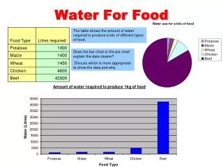
Water For Food. The table shows the amount of water required to produce a kilo of different types of food. Does the bar chart or the pie chart explain the data clearer? Discuss which is more appropriate to show the data and why. This is called a legend and is the key to the pie chart.

E N D
Water For Food The table shows the amount of water required to produce a kilo of different types of food. Does the bar chart or the pie chart explain the data clearer? Discuss which is more appropriate to show the data and why.
This is called a legend and is the key to the pie chart Global Water Use The table shows how water is used globally. Does the bar chart or the pie chart explain the data clearer? Discuss which is more appropriate to show the data and why.
What’s missing? This bar chart shows the average water use per day for one person in three different countries. Discuss the following questions. 1. Work out what is missing from the chart.2. Why is a bar chart more appropriate to show this data than a pie chart? Average water use per day (in litres) Chart title: water usage (in litres) Y axis title: X axis title: Countries